Top 10 Best Creative Retail Product Packaging Ideas for Fragile Items 2025
August 25, 2025 · YL
If you sell fragile products such as alcohol, light bulbs, fruit, glassware, bouquets, artworks, ceramics, or electronics, you already know how crucial damage-resistant packaging is. In this article, we’ll share some creative product packaging design ideas for fragile items.
Top 10 Best Creative Retail Packaging Ideas for Fragile Products 2025
Fragile items share common characteristics: if mishandled during transport or display, or exposed to harsh environments, they are easily damaged. These items often have delicate structures or are made from materials with low compressive strength, making them prone to breaking, cracking, shattering, or other forms of damage. They may be made of glass, ceramics, precision electronics, sensitive instruments, or even certain types of plastics that are particularly susceptible to temperature fluctuations or pressure changes.
To protect fragile goods during long-distance shipping, the outer transport packaging should be strong and durable enough to withstand external impacts. Corrugated cardboard boxes are widely used for their strength and shock-absorbing properties; choose the right board grade based on the package’s weight and type. Reinforced corners or double-walled boxes can provide extra protection. You can also add cushioning materials such as paper, bubble wrap, foam boards, and EPE foam to create additional protective layers that absorb shocks and prevent direct contact between the items and the outer packaging.
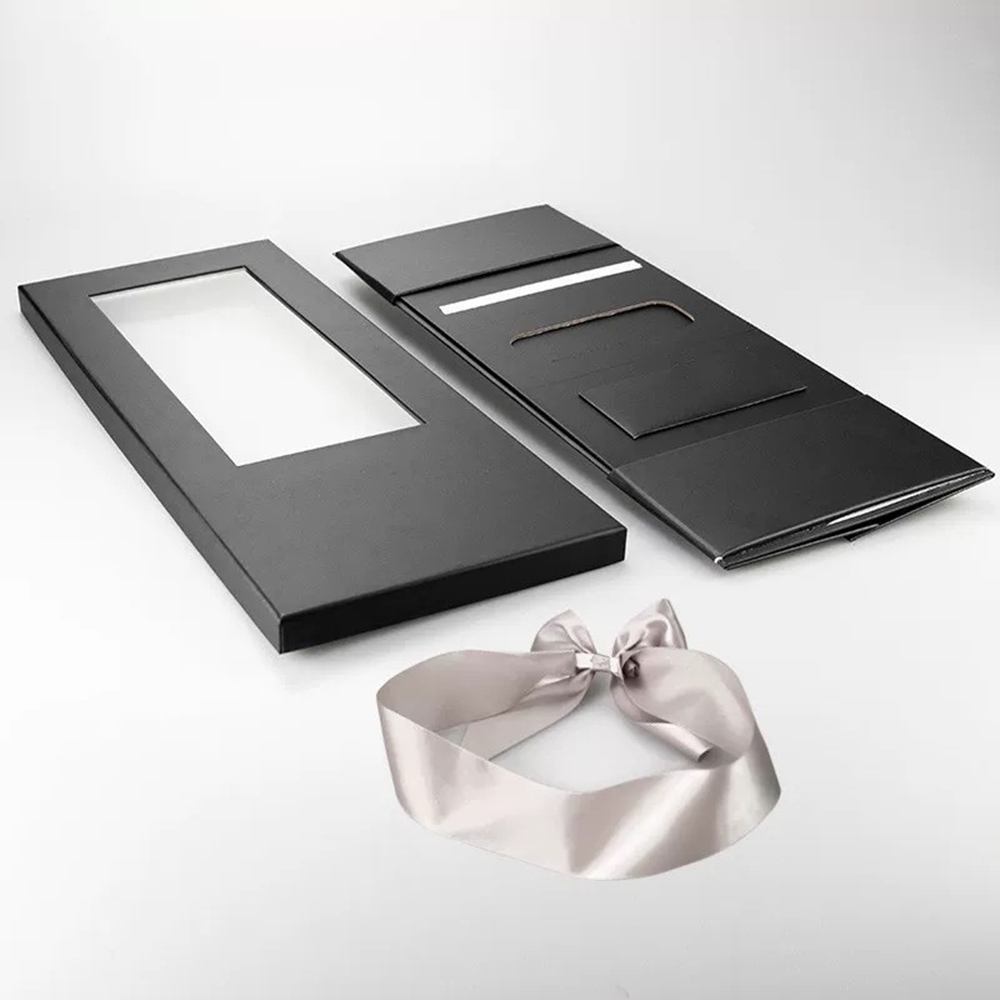
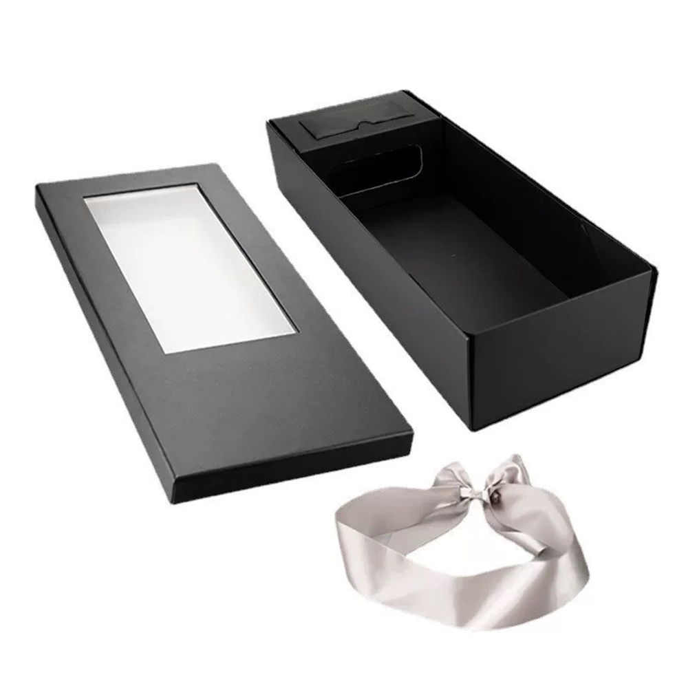
For fragile products, retail packaging – used for in-store sales – must not only meet marketing, shelf-display, and carry-convenience needs, but also deliver functional performance such as impact resistance, barrier properties, and heat resistance. Therefore, if retail packaging for fragile goods is to boost your sales and brand value, it needs a memorable, creative design both in appearance and functionality.
How to achieve that? We’ve curated a selection of what we consider highly creative market examples for your reference.
1. Bzzz Honey White Wood Packaging
The most delicious honey is hidden in the honeycomb, yet it’s hard to buy honey in this form on the market. Inspired by the shape of a honeycomb, the designer used wood to create the product’s outer packaging, with a glass jar inside. The raw, natural packaging conveys messages of nature, eco-friendliness, and pure taste.
Cavallum wine’s outer packaging can transform into an elegant table lamp. It’s made from renewable cardboard and wood sourced from reforestation projects. This unique “wine lamp” works as a festive gift and has attracted more customers.
3. Happy Eggs Hay Packaging
Targeting consumers who care about both product quality and sustainability, this “Happy Eggs” packaging uses a sustainable material – thermoformed hay. The shape mimics a hen’s nest, as if returning the eggs to their original home. Beyond the appearance, the packaging’s distinctive aroma can also attract customers.
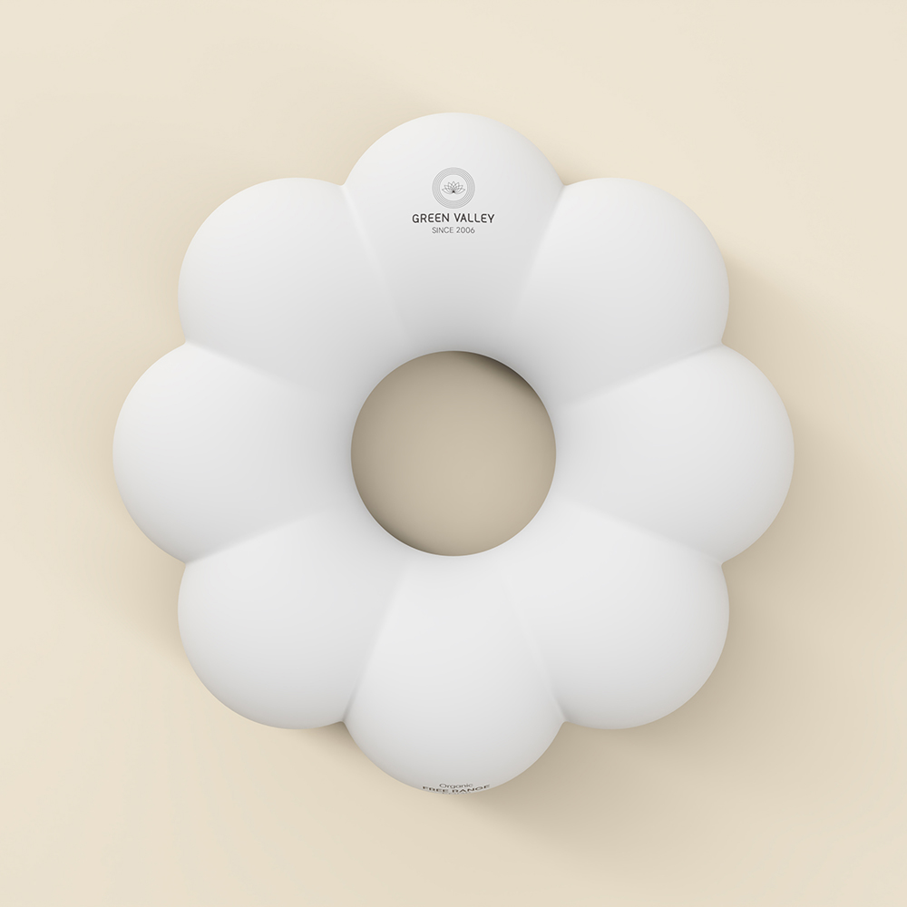
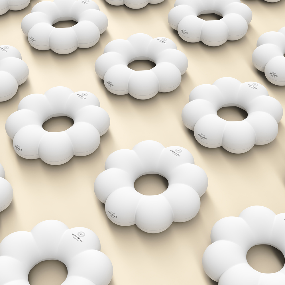
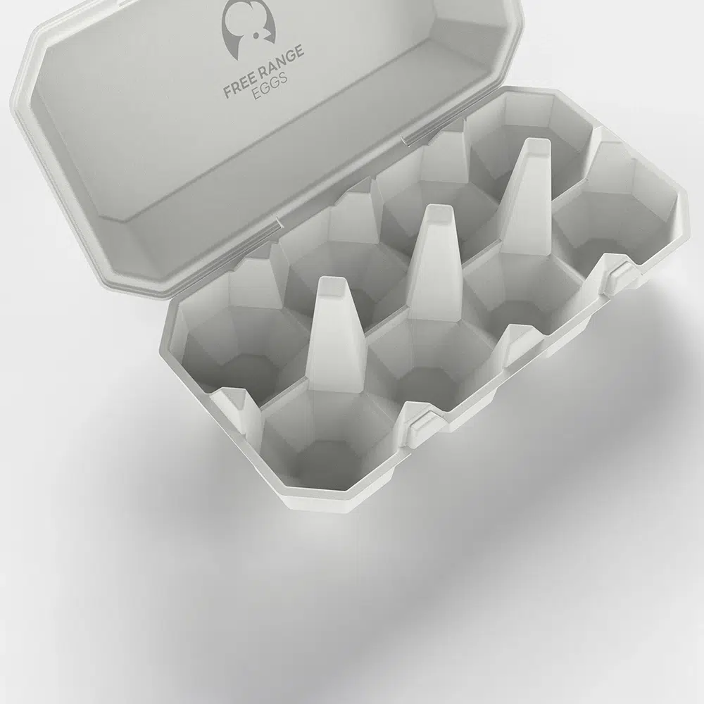
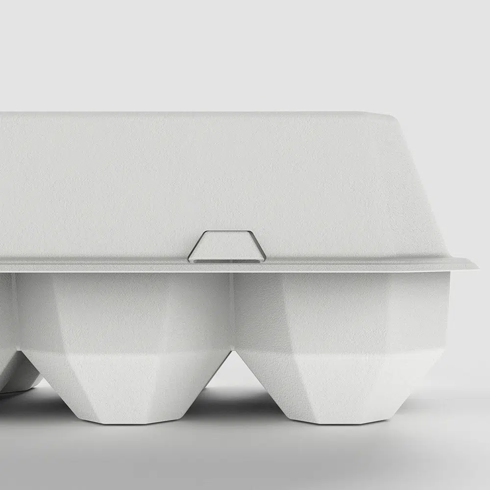
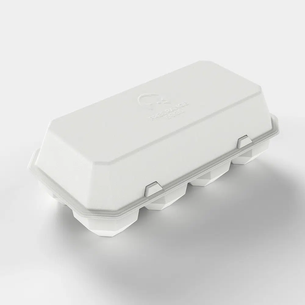
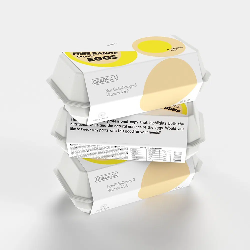
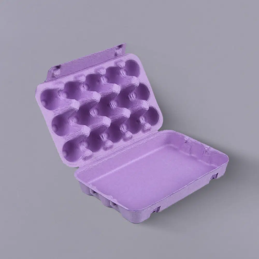
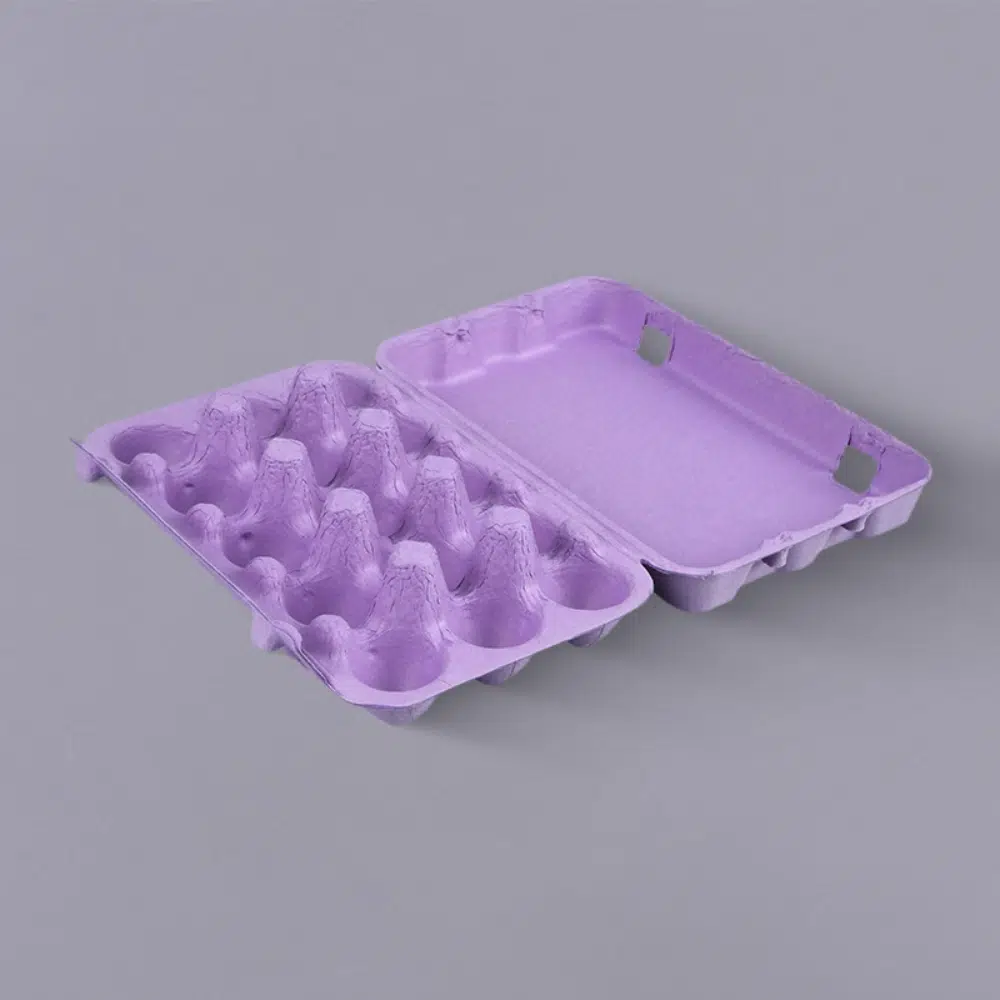
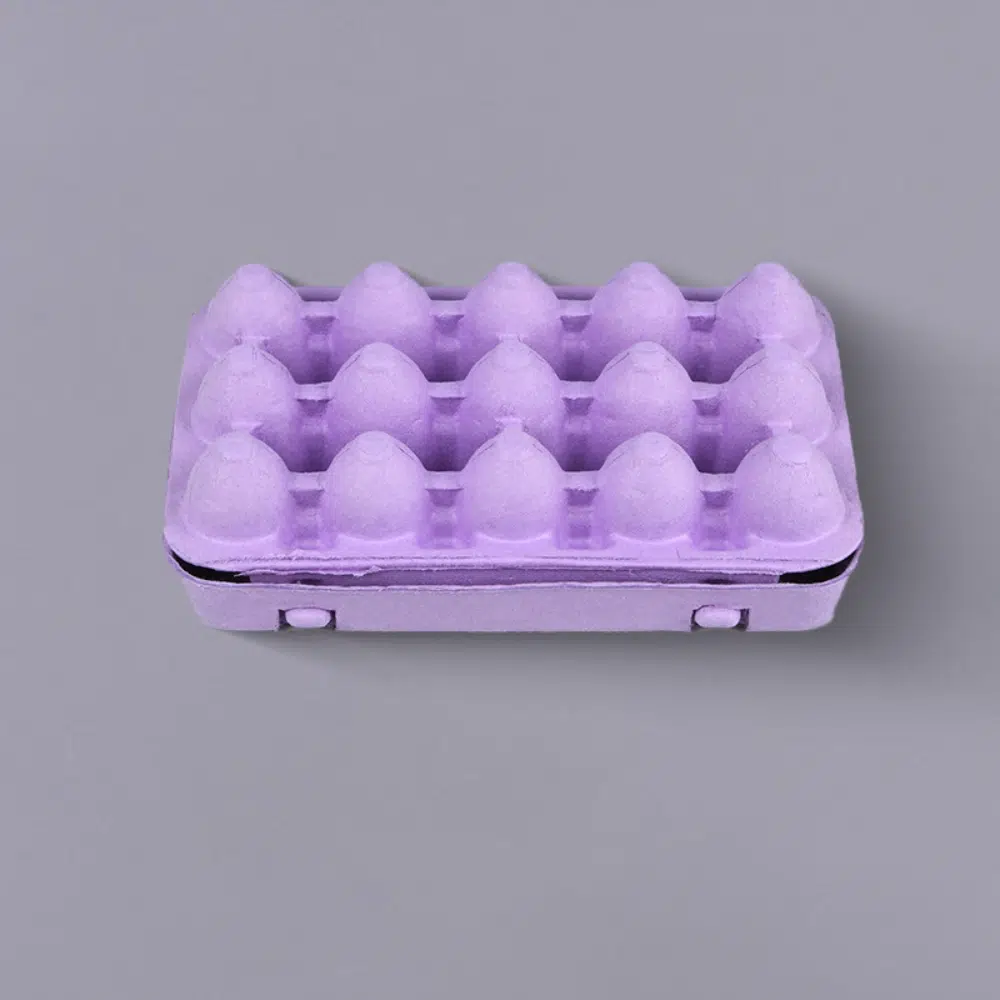
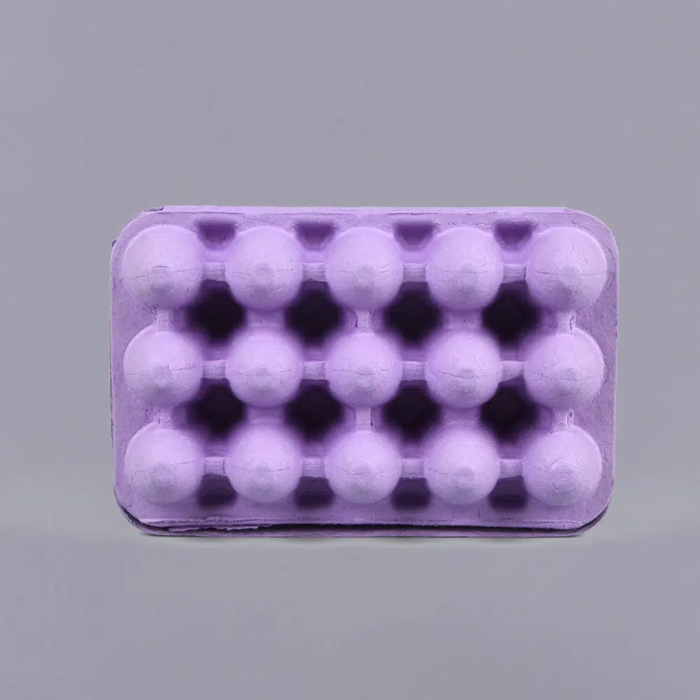
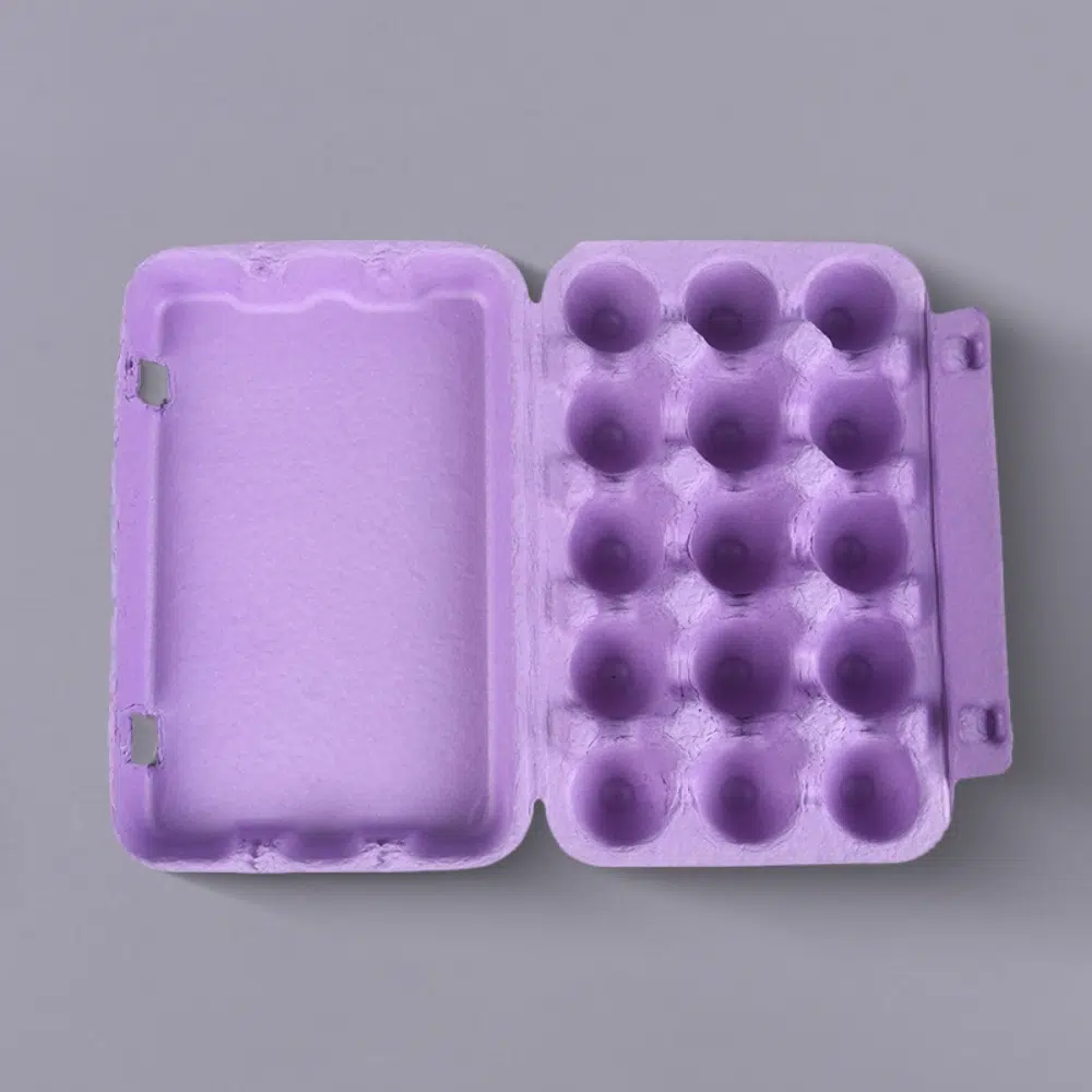
Looking for an eco-friendly and creative solution for egg packaging? GVPACK offers an innovative Egg Packaging Tray made from sustainable pulp material. This pulp egg packaging not only provides excellent protection for fragile eggs, but also highlights your brand’s commitment to environmental responsibility. The unique tray design ensures both safety and visual appeal, making it perfect for brands focused on sustainability and a memorable unboxing experience. Choose GVPACK’s pulp egg packaging to combine functionality, eco-consciousness, and creative presentation for your egg products.
This packaging is tailored to the characteristics of grapes, fully addressing the problem of grapes being easily crushed, while also solving the need for breathability in fruit packaging, an exceptional example of food packaging design.
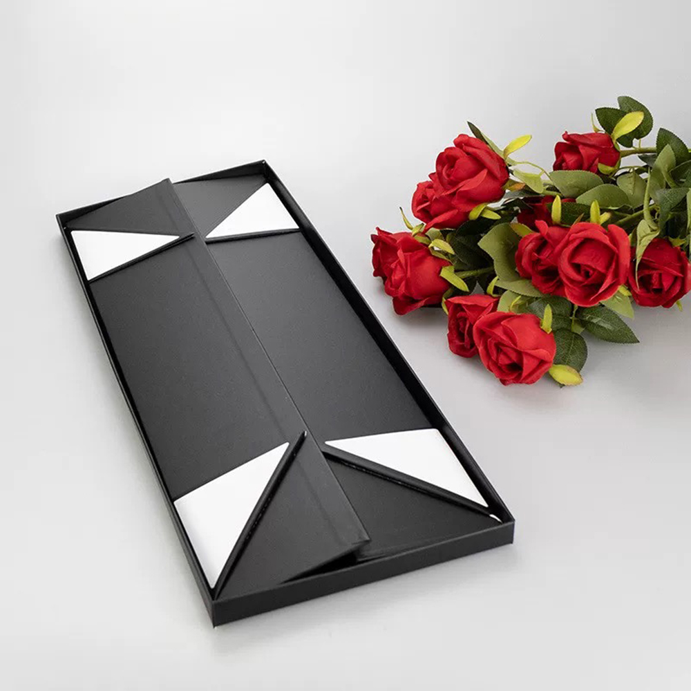
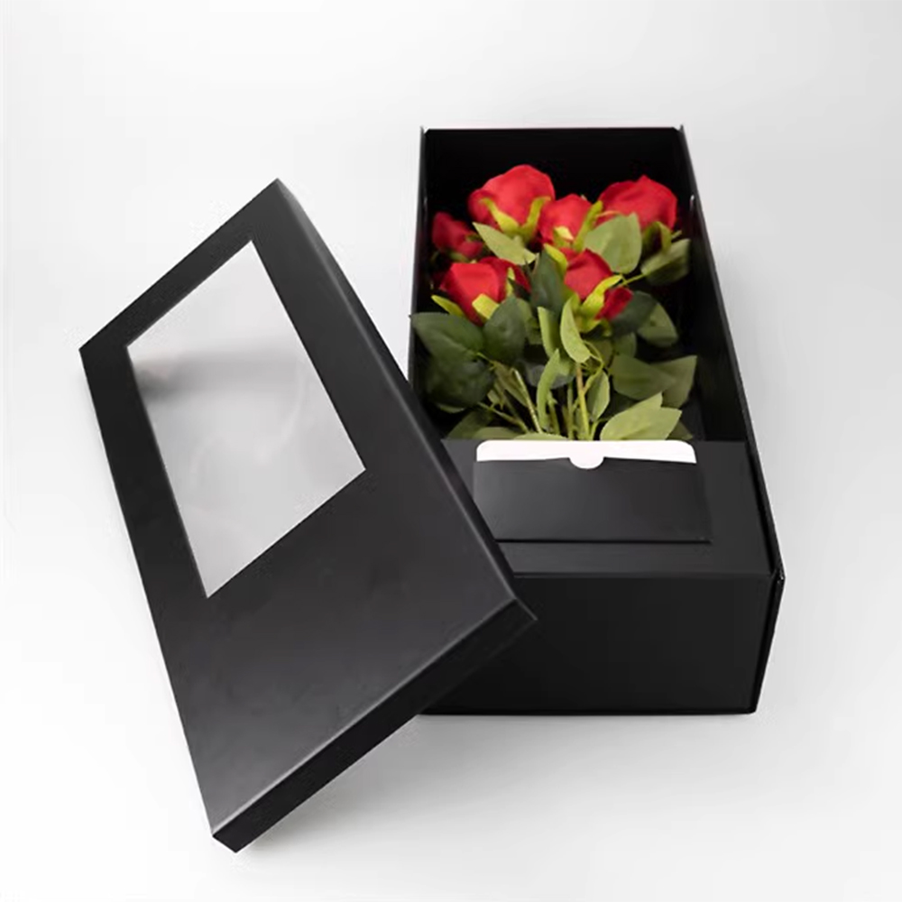
5. Bouquet WaveBloom Wrap Packaging
Bouquet wrap? Flowerpot? This Japanese-style bouquet packaging, made of molded pulp and created by designer Niangui Cai, may not appear overtly romantic at first glance for Valentine’s Day, but it exudes a simple, soothing Japanese aesthetic. The concept is eco-friendly: when you receive such a bouquet, there’s no need to worry about finding a vase, the packaging itself is a flowerpot. If you want to plant it in a pot, that’s no problem either; you can confidently place the whole thing: flowers and pot into the planter. Don’t worry about practicality; the trash bin is not its final destination. Because the packaging is biodegradable!
This niche wine, designed by Portuguese designer Rita Rivotti, embodies the concept of animal protection. The animal in question is the barn owl, Tyto alba, which also lends its name to the wine. After the wine is removed, its wooden box can be hung on a tree and used as a birdhouse for barn owls.
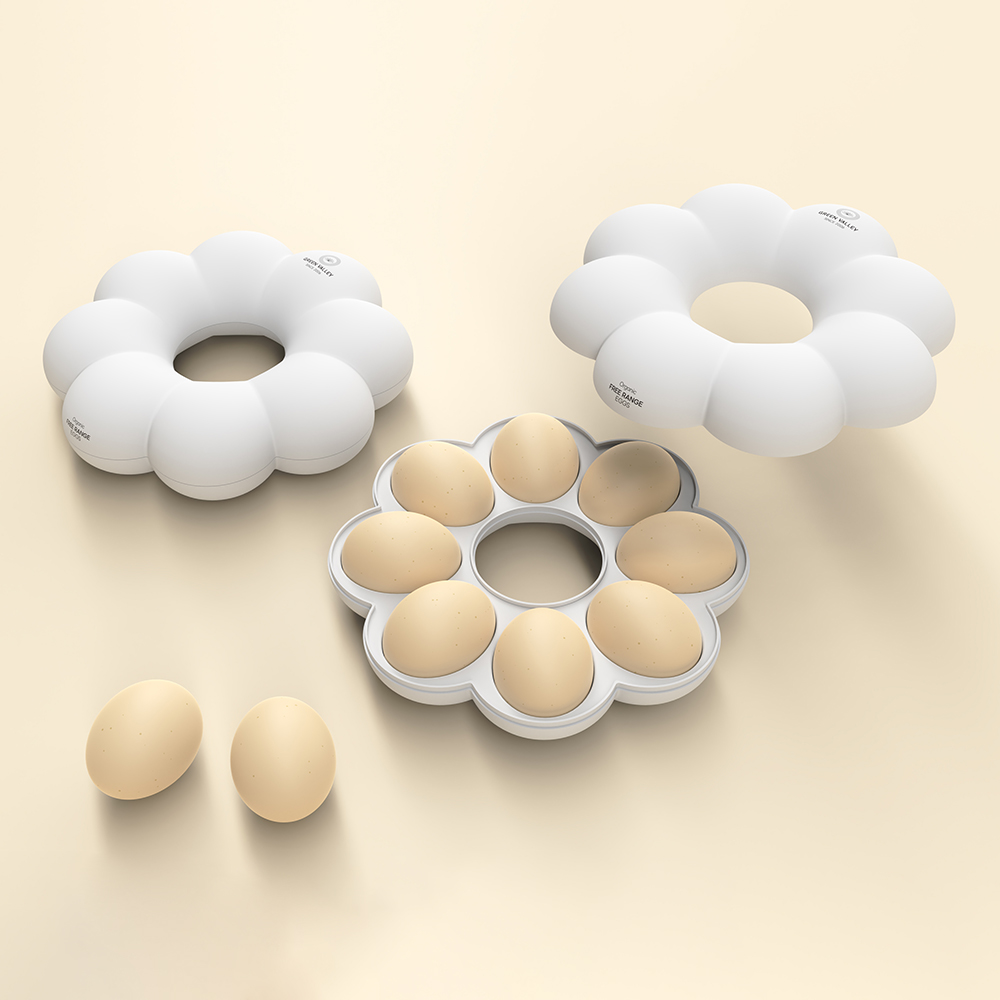
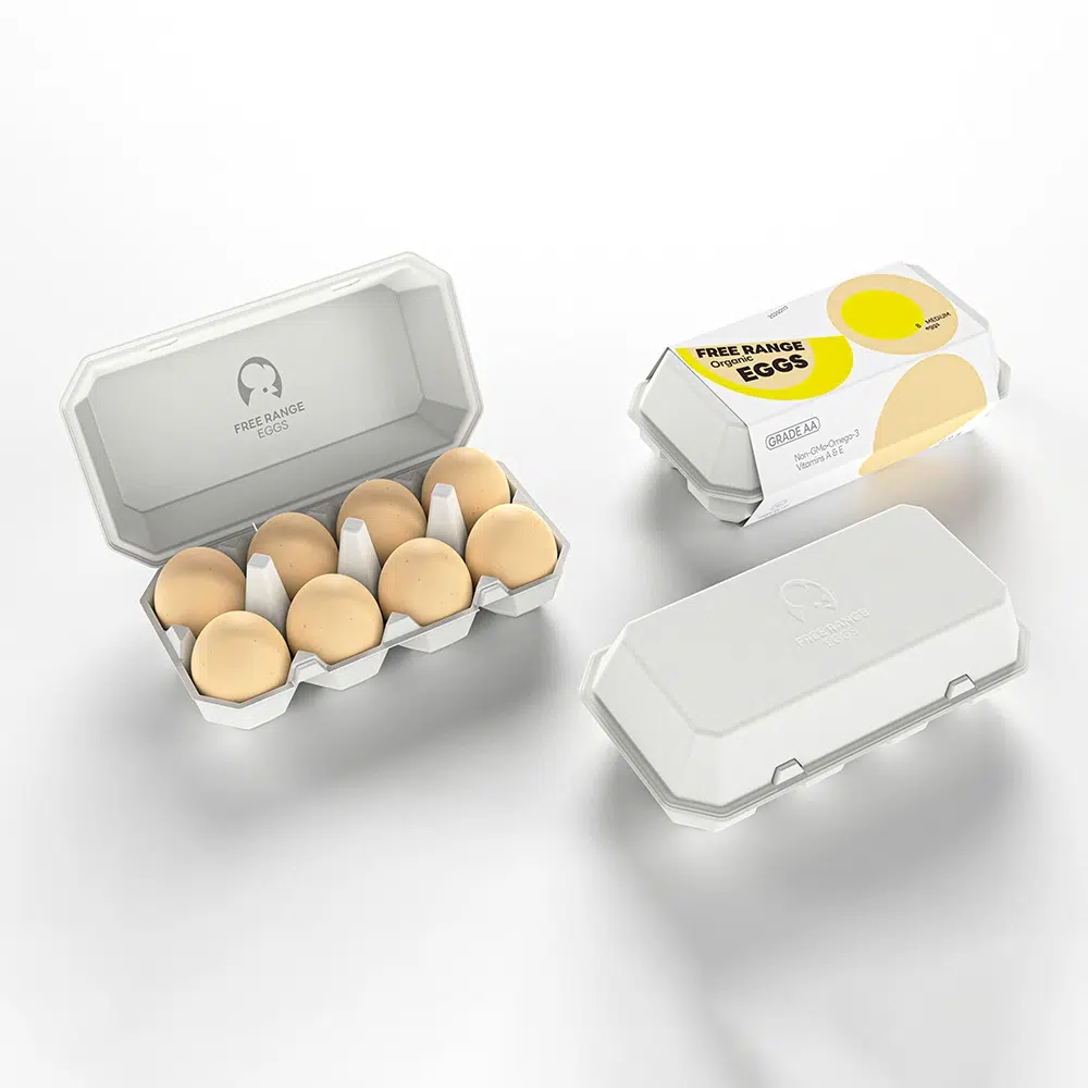
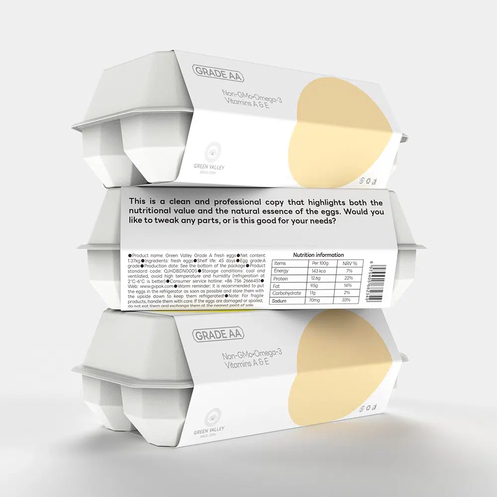
7. Clara y Ema Pulp Clamshell Egg Tray
Shaped like a playful splash silhouette, this molded-pulp clamshell features two interlocking trays, each with six hemispherical nests, that cradle half a dozen eggs snugly while absorbing shocks and preventing point pressure; the fiber-based material is lightweight, biodegradable, and textured for a natural, farm-fresh feel, while the outer sleeve and handle carry chick and fried-egg graphics to echo the brand’s idea that eggs share one shape but land in many delicious forms; a front pull-tab reveals the inner tray for easy loading and removal, ventilation dots help regulate moisture, and the rigid lid aligns precisely with the base to resist crushing in transport, delivering a cute, eco-friendly, and highly protective carrying experience.
Calm holm is the conceptual source of this packaging, reflecting the quiet and ordinary moments that life is full of. Since the product itself is hard, the designer used mortar-like material for the packaging. Its matte, wrinkled texture presents a rugged industrial vibe that echoes the product’s minimalist look, with colors closely matching the item’s own hues. Vacuum-formed trays and molded pulp are used to create tooling based on the product’s dimensions and shape, allowing a snug fit that secures the contents and reduces vibration and impact during transport and retail handling. Molded packaging materials are generally lightweight and soft with a certain thickness; the formed structure gives them elasticity, making them well-suited to absorb vibration with good cushioning performance.
9. Keita Palace Modular Sleeve Board Box
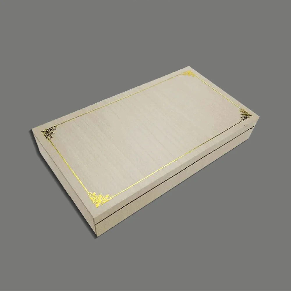
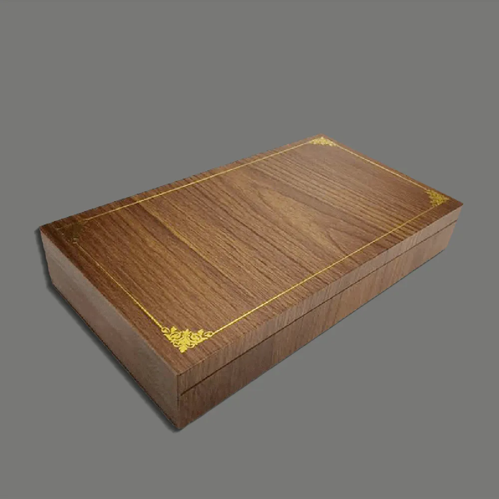
This packaging project by pmdesign was created for the Palace series of ceramic works by Daciano da Costa (1930–2005), one of Portugal’s most prominent designers. Made of compact gray paperboard, the packaging, like the ceramic pieces themselves, uses a modular design to form multiple combinations. The semi-hexagonal shape is designed to fit the pieces perfectly, serving as an exercise in optimizing space and materials. The board’s color is its natural fiber gray, imparting simplicity that contrasts with and balances the vibrant colors of the works. Numerical labels identify the size of each piece; the square opening at the bottom allows checking the product’s color, adding interactive detail to the packaging. The gray board is a flat paperboard whose thickness must be strictly uniform, used for precise die-cut products and packaging for important items, often laminated with finely printed coated paper for premium boxes.
10. Aesop Ivory Cream Kraftboard Carry-Frame Pack
kennethkuh.info designed packaging for a fictional ceramic tableware line under skincare brand Aesop. For Aesop, conveying a natural, elemental feel is essential. This packaging preserves that brand impression with a minimalist look that is both portable and protective. The core idea is to create packaging that’s easy to store and assemble without taking up much space. An integrated handle is an excellent solution, allowing customers to carry ceramic purchases home safely and easily. Using as few colors as possible to maintain a natural feel, the designer envisioned the packaging as an almost empty vessel into which customers can pour their emotions. In this sense, the packaging itself should not be overly distinctive; it should be concise, presenting the product’s clear, unique aura and inviting customers into that atmosphere.
Best Retail Packaging Design Solutions for Fragile Products
From the above design ideas we shared, you should know packaging for fragile goods is much more than a protective shell; it’s an opportunity to fuse artistry with practical engineering. The right packaging transforms a delicate item’s journey, offering both security and a memorable presentation that reflects your brand’s philosophy. Our designers, with years of experience providing packaging design services to clients worldwide, offer the following professional inventive ideas and smart retail packaging solutions for materials, structural design, and functional features that help safeguard and showcase fragile products with ingenuity and style.
1. Material Selection
Molded Pulp: Molded pulp packaging, made from recycled paper or sustainable fibers, is lightweight, shock-absorbing, and biodegradable. It is suitable for forming trays, inserts, and entire boxes that cradle fragile products such as eggs, glass, ceramics, and electronics.
Corrugated Cardboard: Double-walled or reinforced corrugated cardboard offers strength and cushioning for outer boxes, ideal for long-distance shipping.
Bagasse and Other Plant Fibers: Packaging made from bagasse (sugarcane residue) or hay provides a natural, eco-friendly alternative with unique texture and aroma, appealing to environmentally conscious consumers.
Rigid Paperboard/Wood: For premium products like wine or luxury gifts, rigid paperboard or sustainable wood can enhance protection and boost perceived value.
Foam, EPE, and Paper Cushioning: For extra-sensitive items, supplementary inserts such as foam, EPE, or crumpled kraft paper may be used for additional shock absorption.
2. Structural Design
Custom-fit Inserts: Molded pulp or vacuum-formed inserts designed to precisely fit the product’s shape minimize movement and absorb vibration.
Modular and Stackable Structures: Modular boxes and trays (such as hexagonal or sleeve-based forms) optimize space, improve shelf presence, and enable multi-product displays.
Ventilation and Moisture Control: For perishable or moisture-sensitive goods (fruits, eggs), packaging should include ventilation holes or moisture-regulating features to maintain product quality.
Multi-functional and Reusable Design: Structures that transform into secondary uses (e.g., wine box as a lamp or birdhouse) add value and reduce waste.
Easy Carry and Display: Integrated handles, concise shapes, and minimalistic forms make carrying, storing, and displaying fragile products easy and attractive to customers.
3. Functional Features
Impact and Compression Resistance: Reinforced corners, double walls, and thick molded pulp formations protect against drops and stacking pressure.
Sustainability: All materials should be recyclable, biodegradable, or reusable, supporting brand commitments to eco-friendliness and reducing environmental impact.
Branding and Shelf Appeal: Creative shapes (flower, honeycomb, splash form), natural textures, and minimalist color palettes can distinguish the packaging, attract attention, and strengthen brand identity.
Barrier Properties: For sensitive contents, coatings or multi-layered designs can provide moisture, oxygen, or UV barriers.
Consumer Experience: Memorable unboxing, natural aromas, tactile finishes, and interactive details (such as modular combinations or visible product windows) elevate perceived value and engagement.
If you need custom retail packaging solutions for your goods, consult with our professional packaging designers who can help bring your creative vision to life while ensuring optimal protection for your fragile products.
Dedicated to providing customers with one-stop solutions, from creative design to meticulous production and secure delivery, ensuring perfection at every step.