


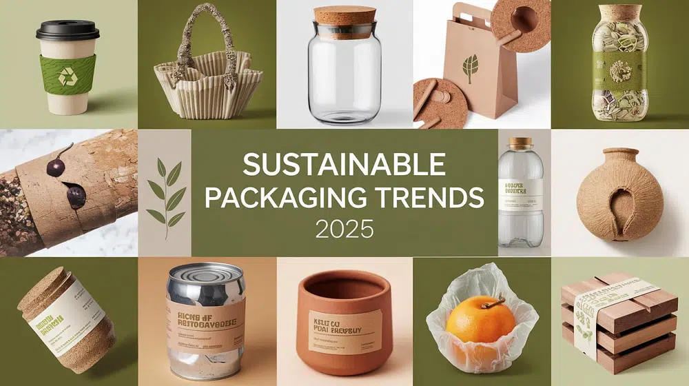
Sustainable packaging used to come with a quiet trade-off. You either looked refined, or you looked responsible. That gap has narrowed a lot — and the best examples in 2026 prove you don’t really have to choose.
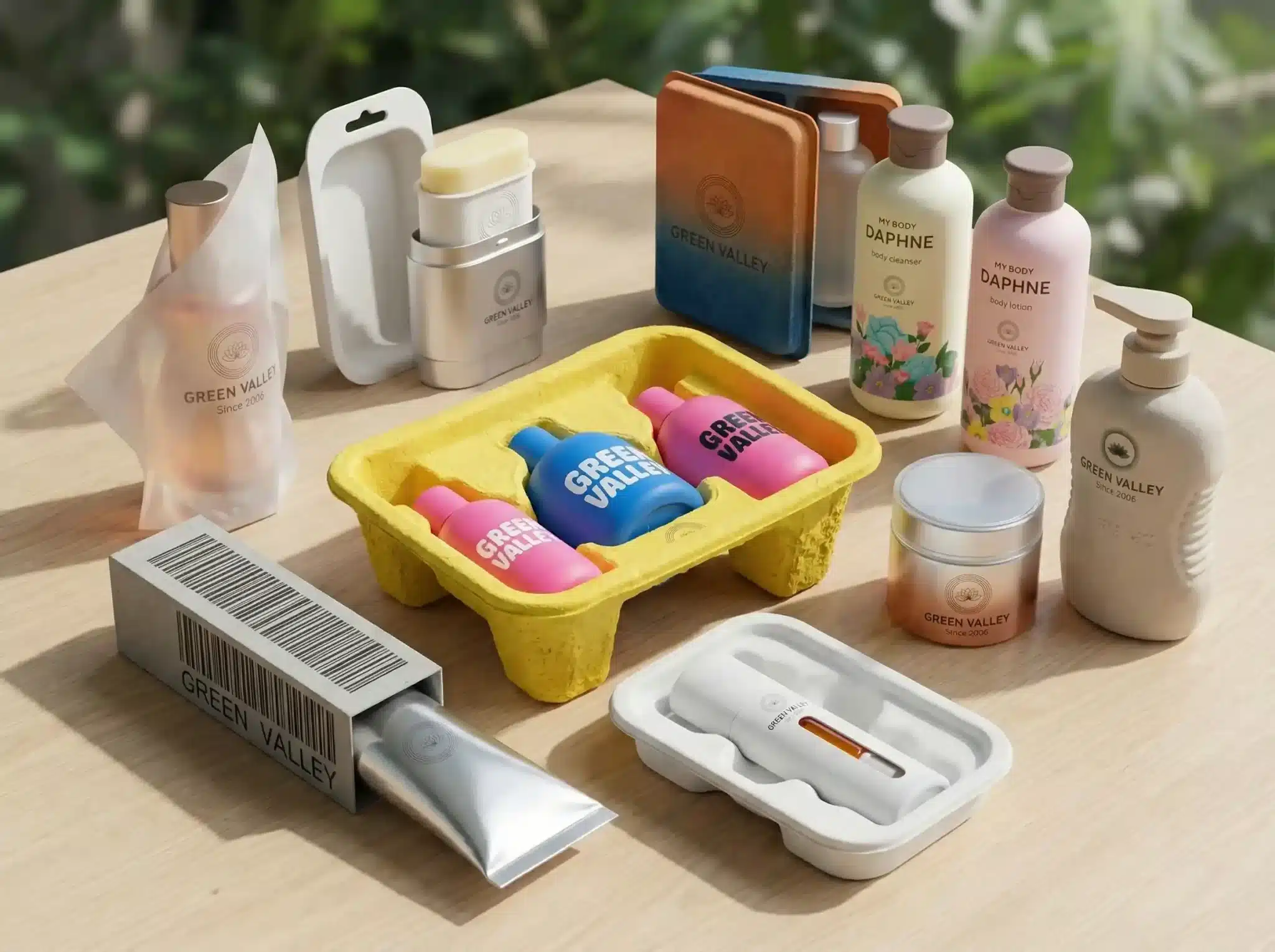
If you work on a beauty, fragrance, jewelry, or food brand, you’ve probably had this conversation: the marketing team wants something that feels expensive on the shelf, while operations and sustainability want fewer materials, simpler structures, and recyclable parts. Both sides are right. The problem isn’t ambition — it’s that a lot of “eco” packaging examples online still look like compromise pieces. Kraft, plain, a little flat.
The ten examples below take a different route. They show that paper, molded pulp, mono-material cartons, and refill systems can carry real premium cues when the structure, texture, and detailing are done with care. Use them as a reference point when you’re briefing a designer or evaluating a supplier.
What Actually Makes Sustainable Packaging Feel Premium
Before the list, a quick frame. Premium feel is rarely about more material. It’s about how the few materials you’ve chosen are treated. From looking at hundreds of recent launches, four principles keep showing up:
- Tactility over print. A deep emboss on uncoated board reads as more considered than four-color gloss.
- Structure over fillers. A well-engineered fiber tray feels engineered. A foam insert feels disposable.
- Restraint over decoration. Quiet typography on a single-material carton ages better than ornament.
- Clarity over green claims. Specific disposal language earns more trust than a leaf icon.
Keep these in mind as you read through the examples. They’re grouped by approach — material, structure, unboxing, and storytelling — so you can find the one closest to your category.
Material-Led Examples
1. Uncoated Paperboard with Deep Emboss
One of the easiest ways to lift fiber-based packaging is to skip the lamination and lean into the paper itself. A heavier uncoated board, blind embossed, with a small foil-free logo, reads as confident rather than understated. The cost is often lower than full-color print, the recyclability story is cleaner, and the texture survives shipping better than glossy finishes do.
Where it fits: fragrance outer cartons, jewelry sleeves, supplement boxes, anything where you want the box to whisper, not shout.
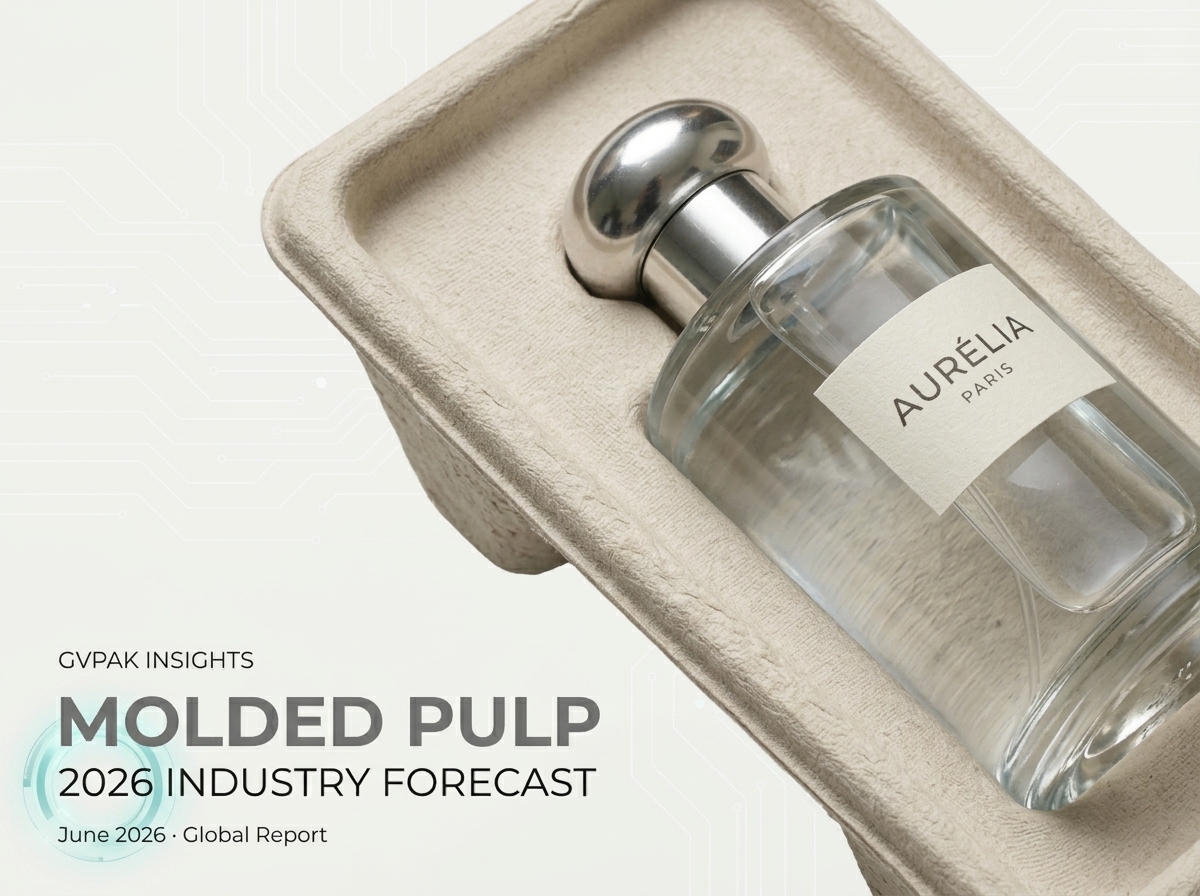
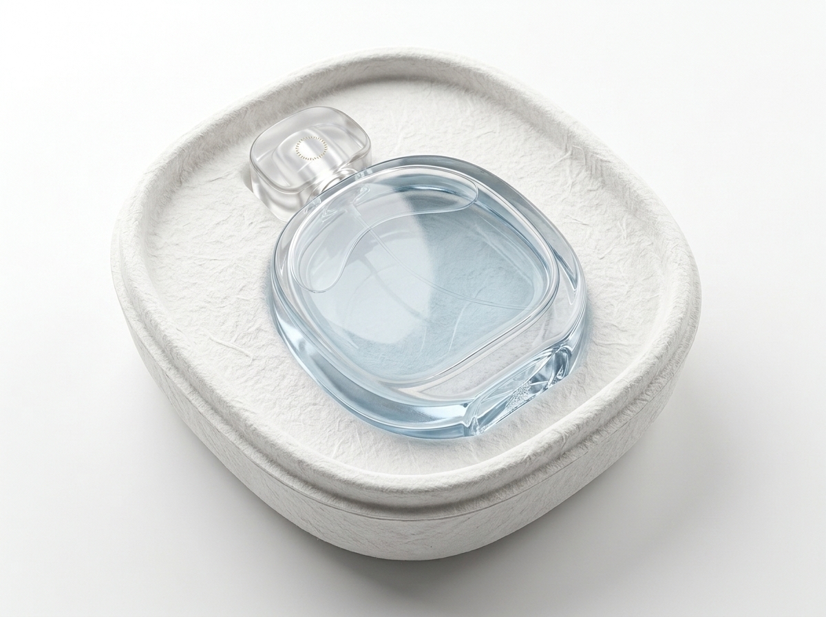
2. Refined Molded Pulp Inserts
Old-school molded pulp was rough, fuzzy, and meant to be hidden. New molded pulp can carry a smooth surface, crisp edges, and color through the fiber. When the tray is shaped tightly around the product, holds it without rattle, and shows visible fiber texture rather than fake plastic-finish, it suddenly belongs in a premium box instead of replacing one. This is one of the bigger shifts of the past two years.
3. Single-Fiber Mono-Material Cartons
The cleanest stories come from cartons that are just one material the whole way through. No plastic window, no metallic foil layer, no PE coating. The brief is harder for designers — you can’t lean on shiny add-ons — but the result feels grown-up. And when a buyer asks “what happens to this after use,” the answer is short.
Structure-Led Examples
4. Origami-Style Folded Inserts
Instead of foam or plastic trays, some brands use single sheets of paperboard cut and folded into precise cradles. Done well, this reads as a small piece of engineering. The product sits firm, the box stays light, and the consumer can flatten everything when they’re done. It works especially well for electronics, cosmetics palettes, and small fragrance sets.
5. Magnetic Closures, Minimal Material
Rigid boxes with magnetic closures are a long-running premium signal. The sustainable update is to swap mixed-material rigid boxes for fiber-forward versions — a thinner board structure, paper wrap, and a small recessed magnet you can remove for end-of-life. Same opening ritual, lighter footprint.
6. Right-Sized Boxes That Hug the Product
This sounds boring. It isn’t. A box that’s clearly built around the exact shape of the product looks intentional. A box with two inches of dead space and a wad of paper inside looks careless. Right-sizing reduces freight emissions and makes the unboxing feel curated at the same time. It’s the cheapest premium upgrade a brand can make.
Unboxing-Led Examples
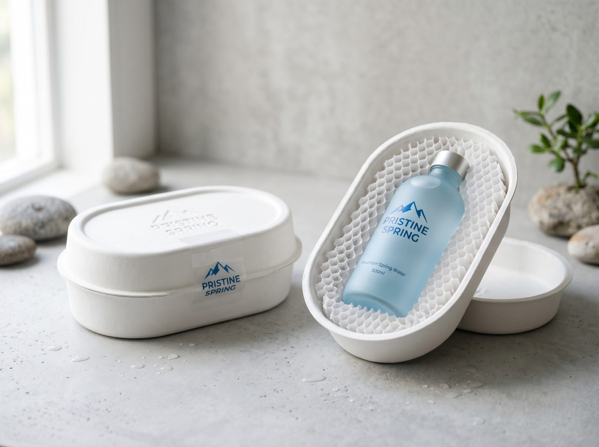
7. Honeycomb Paper as the Hero Layer
Honeycomb kraft used to live inside cartons as silent protection. A few brands have started showing it — using it as the visible inner sleeve, with the product nested in a circular cavity. It looks structural, almost architectural, and you don’t need to print anything on it. The honeycomb does the work.
8. Pull-Tab Reveal on a Plain Sleeve
A flat, almost anonymous outer sleeve — and then a small tab the consumer pulls to release the inner tray. That single moment of action is what most “luxury unboxing” videos turn out to be about. You don’t need ribbons, tissue paper layers, and printed thank-you cards to create it. You need one designed gesture.
Storytelling-Led Examples
9. Refill Architecture Built Into the Pack
Refillable packaging is having a strong moment in beauty and fragrance. The premium versions don’t treat the refill as a sad sachet — they design the outer vessel as the heirloom piece, and the refill as a neat, well-engineered cartridge that clicks in. The story shifts from “we use less” to “we built something worth keeping.”
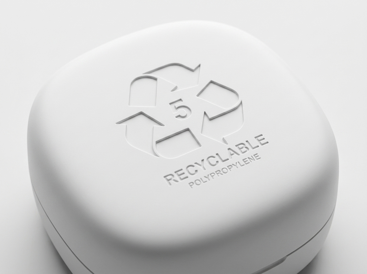
10. On-Pack Disposal Guidance That Reads as Design
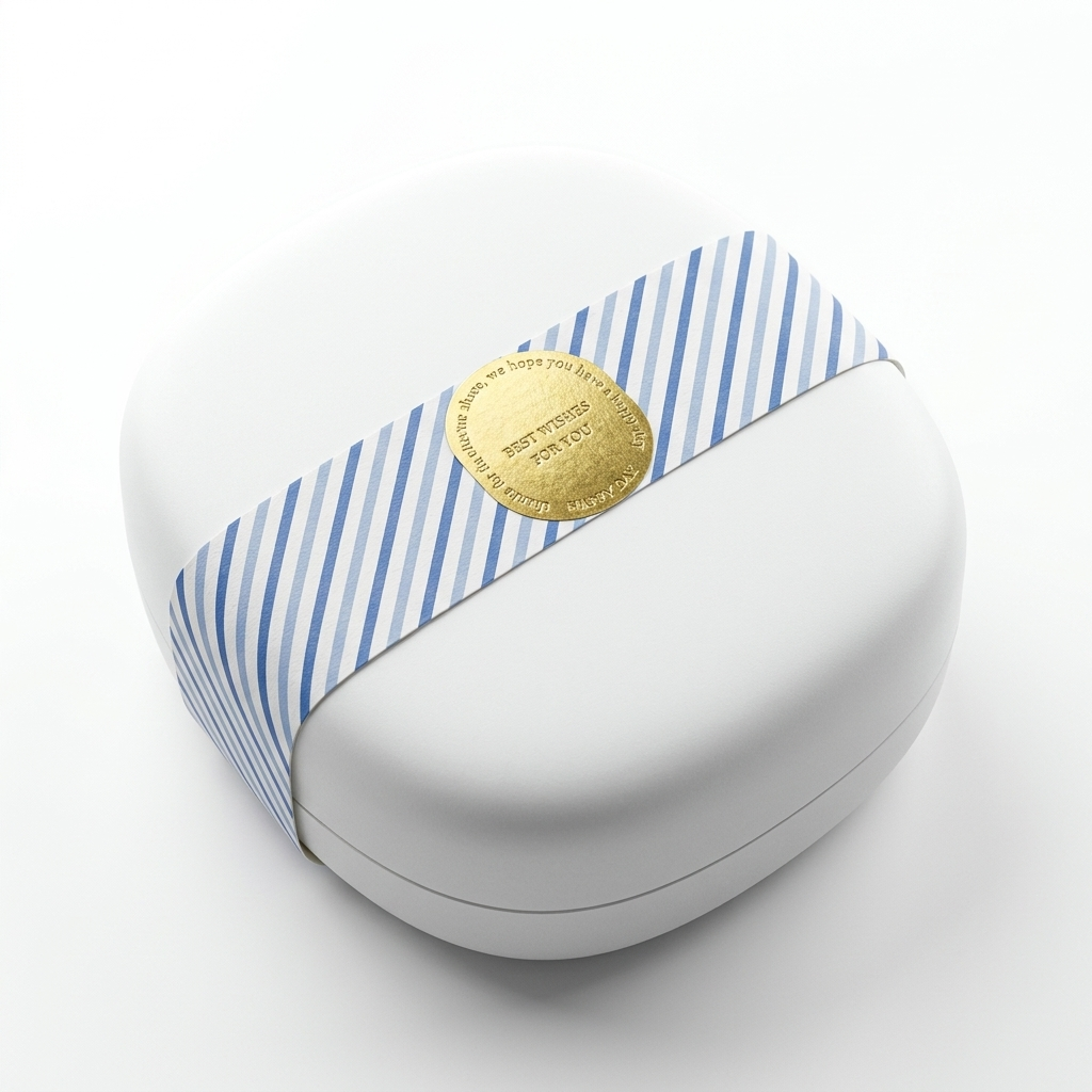
Most packs hide their recycling icon at the back, in 6pt type. A small number of brands have started treating disposal guidance as part of the typographic system — clear, calm, and confident. It feels like the brand respects the consumer enough to explain what to do next. That’s a quiet luxury signal that costs almost nothing.
Quick Reference: What Each Approach Is Best For
| Approach | Strongest For | Watch Out For |
|---|---|---|
| Uncoated emboss | Fragrance, jewelry sleeves | Soiling during transit |
| Molded pulp trays | Cosmetics, electronics, gifting | Tolerance on tight-fit shapes |
| Mono-material carton | Supplements, skincare | No windows, no foil shortcuts |
| Origami inserts | Small electronics, palettes | Die-cut precision needed |
| Right-sized boxes | Any DTC shipper | SKU variety adds tooling |
| Honeycomb hero | Premium gifting, fragrance | Looks heavy if overused |
| Refill architecture | Beauty, fragrance, home care | Refill clarity for the user |
Where the Premium Cues Actually Come From
Looking across the ten examples, the premium feel doesn’t come from where most brands assume it does. Here’s a rough breakdown of what readers and customers actually respond to, based on patterns we’ve seen in recent unboxing reviews and design press coverage:
High impact
High impact
Medium-high
Medium
Low
Relative weighting based on observed design cues in 2025–2026 premium sustainable launches. Indicative, not measured.
How to Apply These Ideas to Your Brand
You don’t need to copy ten things at once. Most launches we’ve seen succeed by picking two — usually one material choice and one structural choice — and committing to them properly.
A useful starting point is to ask three questions before the next packaging brief goes out:
- Which single material do you want to be the hero of the pack, and what does it deserve to look like when it’s done well?
- Which moment of the unboxing should feel like the pack is talking to the buyer — the sleeve, the lift, the reveal, the refill?
- What will the consumer actually do with each part when they’re finished, and how will the pack help them get it right?
Answering those three questions usually narrows the design space down quickly. From there, the structural and material choices start making themselves.
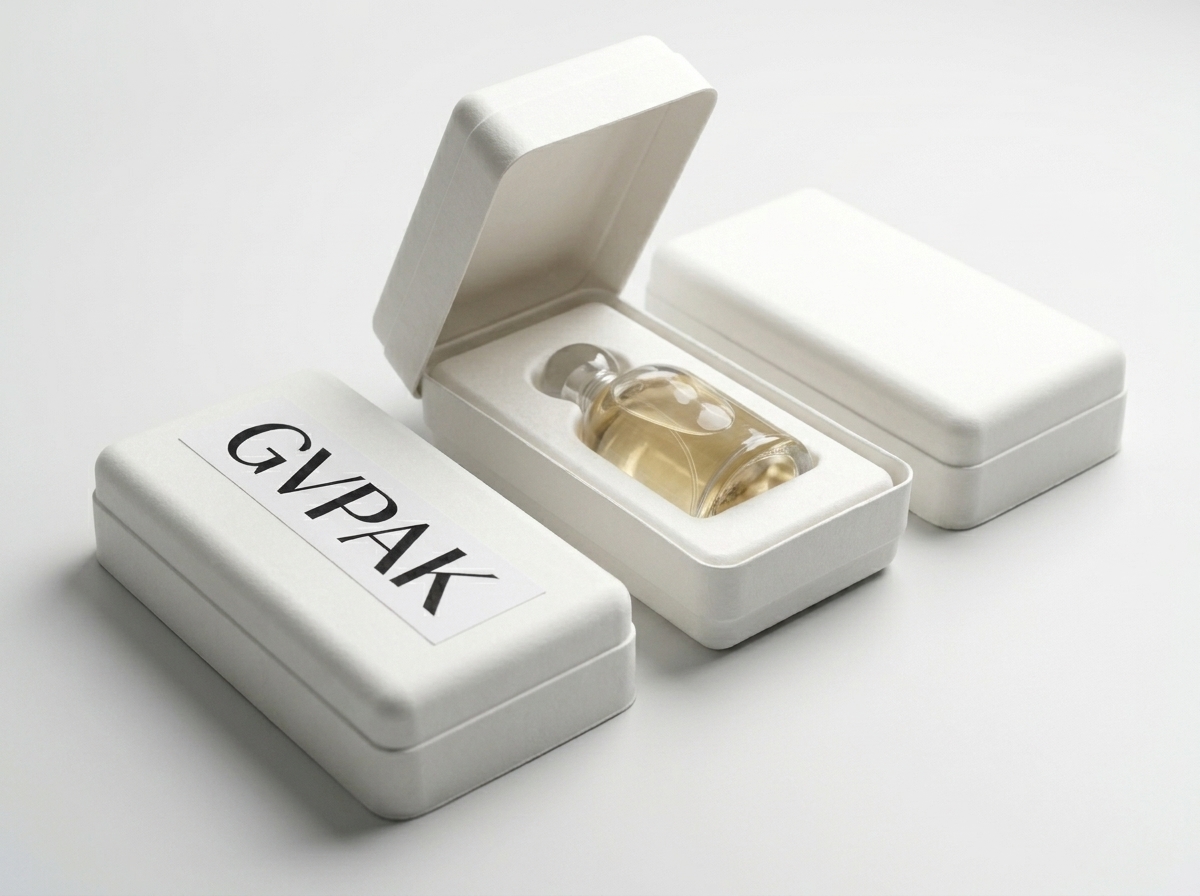
Want a second opinion on your current pack?
GVPAK works with beauty, fragrance, and lifestyle brands on paper-based and molded pulp structures that don’t lose their premium edge. If you’d like us to review your current packaging from a “premium without excess” angle, send us the structure and we’ll come back with notes.

