Last updated: June 2026 | 12 min read
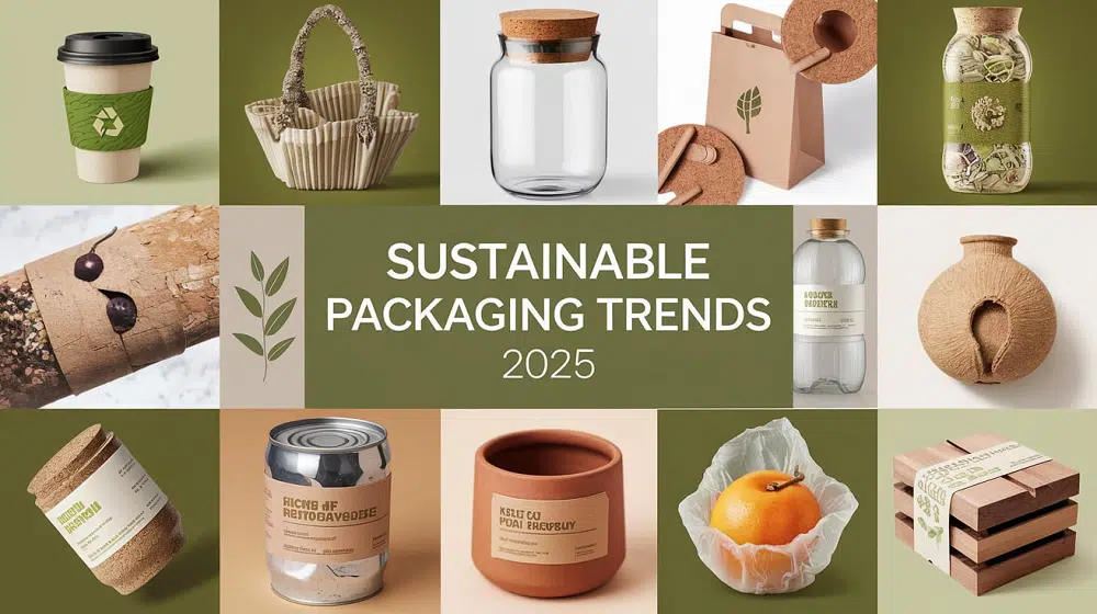
There’s a misconception that won’t go away: paper-based packaging looks cheap. Molded pulp feels like egg cartons. If you want premium, you need rigid boxes, thick foam inserts, and maybe a magnetic closure.
That assumption made sense ten years ago. It doesn’t anymore.
The materials haven’t just gotten better—the design thinking around them has shifted entirely. Brands in beauty, fragrance, electronics, and wellness are now using paper and molded pulp not as a compromise, but as a deliberate design choice. One that communicates restraint, intention, and yes, luxury.
This article collects ten packaging ideas that show how fiber-based materials can create a genuinely premium unboxing moment. Not “premium for eco packaging.” Just premium.
Why Fiber-Based Packaging Feels Different Now
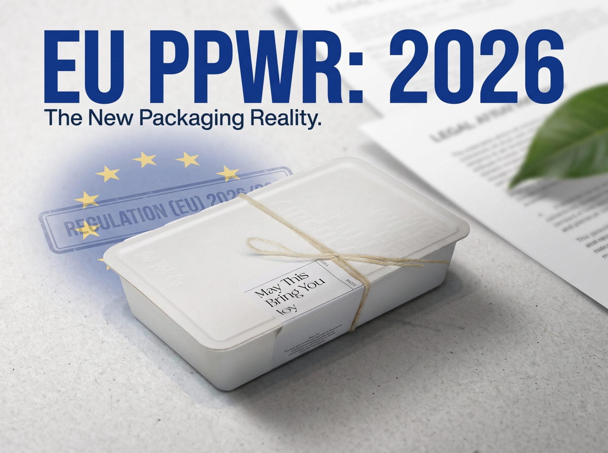
A few things happened at once. Regulations like the EU’s Packaging and Packaging Waste Regulation (PPWR) started pushing brands toward mono-material structures and easier recyclability. Consumers started ranking “easy to recycle” as one of the most important packaging traits. And designers got much better at working within material constraints.
The result: fiber-first is no longer a sustainability footnote. It’s a design direction. Alzamora’s 2026 packaging outlook calls it a defining theme. GVPAK’s own product development has moved steadily in this direction. And luxury consultancy Bain points out that high-end packaging is now seeking a new balance between creativity and environmental impact.
The ten ideas below are organized by what they actually achieve in the unboxing experience—not just what they’re made of.
| Design Approach |
Material |
Best For |
Premium Signal |
| Sculptural molded pulp insert |
Molded fiber |
Fragrance, skincare |
Precision fit, tactile depth |
| Textured kraft with blind emboss |
Uncoated paperboard |
Jewelry, wellness |
Understated elegance |
| Mono-material rigid paper box |
Paperboard + paper wrap |
Cosmetics, gifting |
Clean lines, weight in hand |
| Layered paper reveal |
Multi-sheet paper layers |
Premium supplements, beauty sets |
Ritual, discovery |
| Fiber-formed protective cradle |
Wet-pressed pulp |
Electronics, watches |
Engineering precision |
10 Paper and Molded Pulp Packaging Ideas for Premium Unboxing
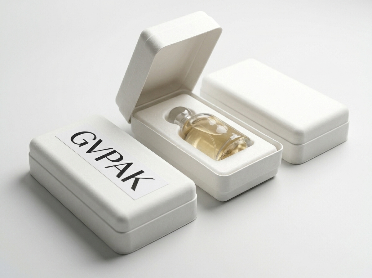
1. The Sculptural Pulp Insert That Replaces Foam
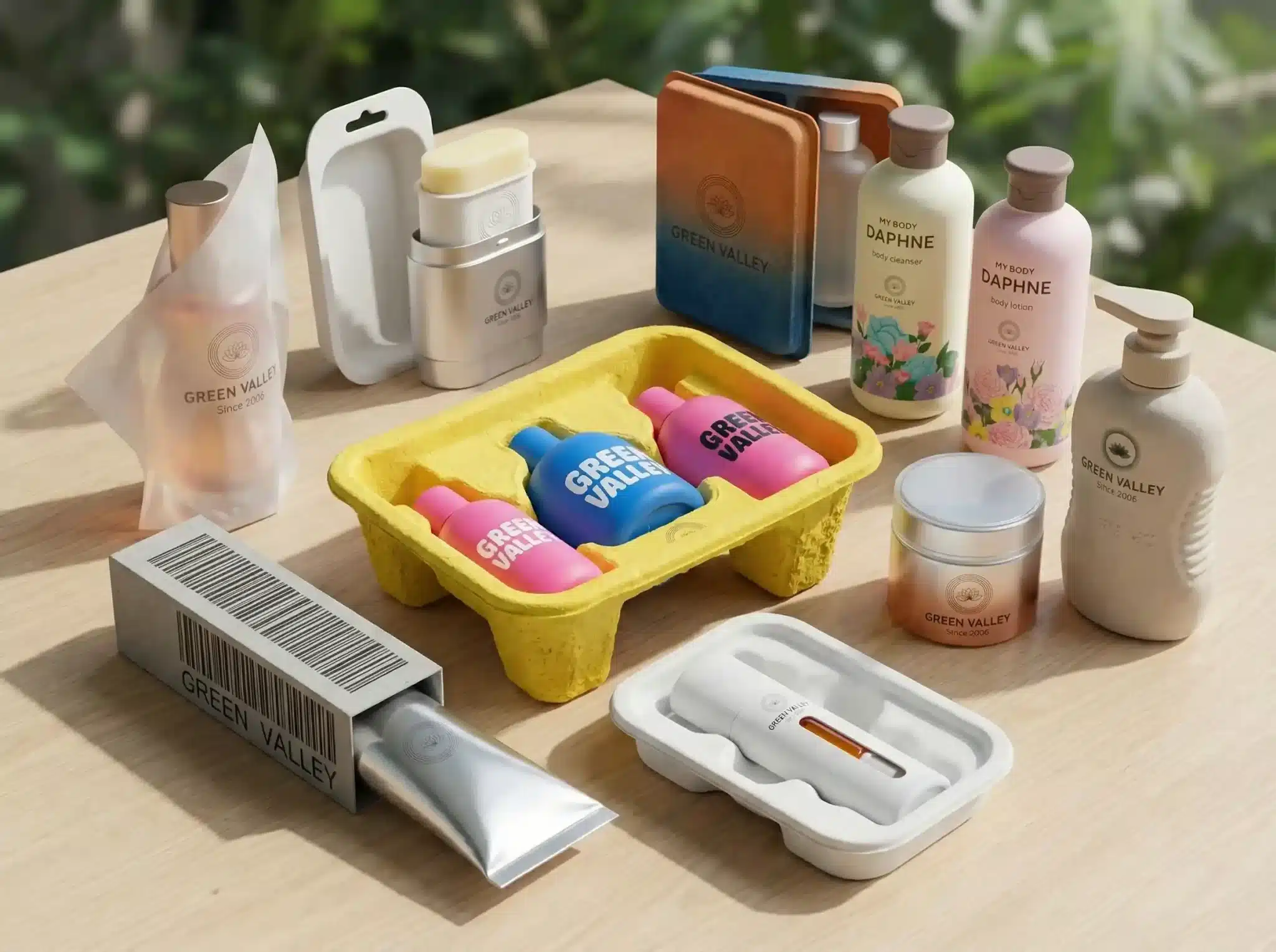
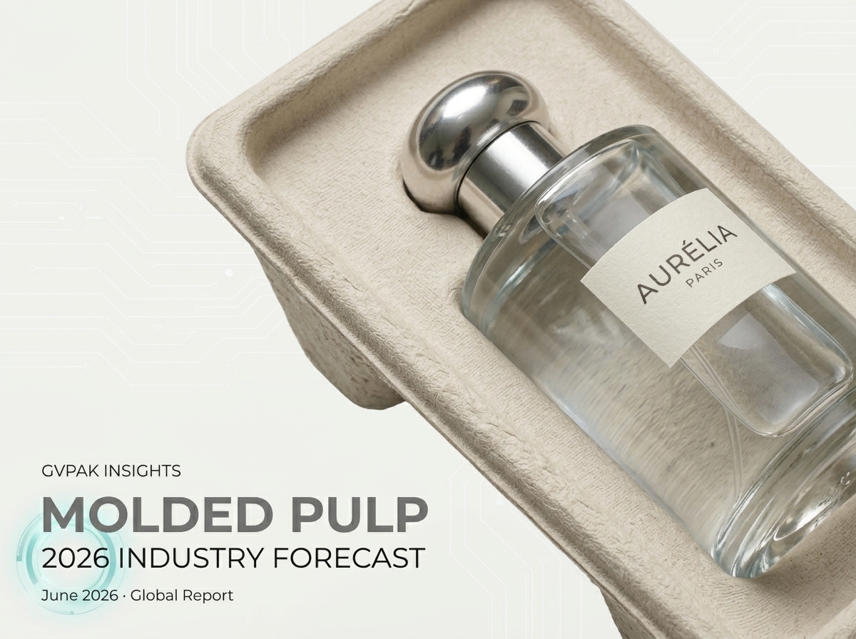
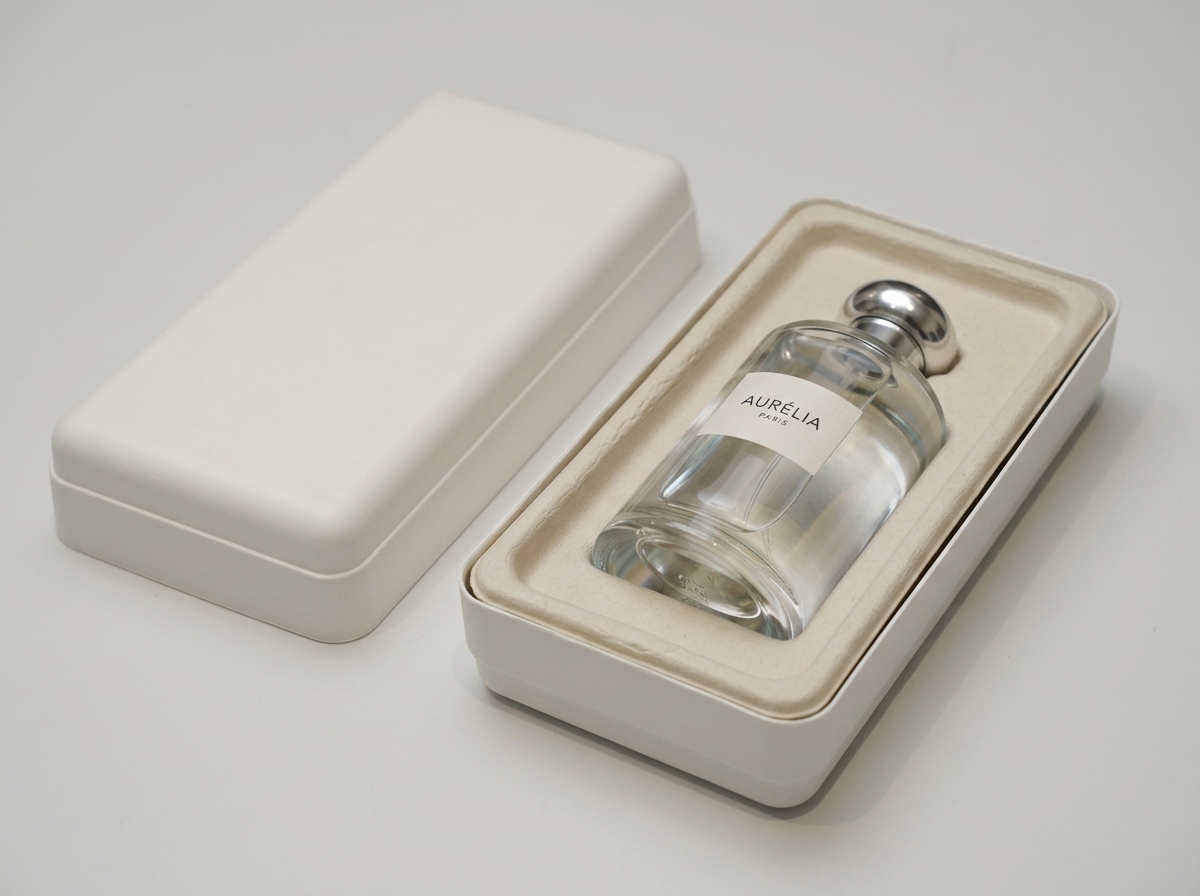
Molded pulp inserts used to look utilitarian. The newer generation doesn’t. Wet-pressed molded fiber can hold tight tolerances—tight enough to cradle a glass perfume bottle without any secondary cushioning. The smooth inner surface creates a visual contrast with the outer shell that reads as intentional design, not budget constraint.
What makes it premium: the product sits in a form that was clearly made for it. No generic cavity. No visible gaps. The snug fit does what foam used to do, but it also communicates care in a way foam never could.
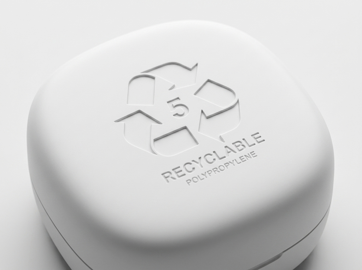
2. Blind Embossing on Uncoated Paperboard
There’s a specific kind of luxury that comes from restraint. A logo or pattern pressed into uncoated paper—no foil, no ink, no coating—creates a tactile detail that only shows itself when you hold the box at the right angle or run your fingers across it.
This works especially well for wellness, jewelry, and fragrance brands that want to signal quality without visual noise. The material does the talking. And because there’s no added ink or lamination layer, the entire box stays easy to recycle as a single stream.
3. The Mono-Material Rigid Box
Rigid boxes have always been the go-to for luxury. The problem was, most of them were multi-material: paperboard wrapped in coated art paper, glued with adhesives that make separation difficult, sometimes with a plastic or magnetic closure thrown in.
The mono-material version strips this back. Paper-based wrap over paperboard structure, water-based adhesive, paper pull-ribbon instead of satin. It still has the weight and presence of a rigid box. But it doesn’t need a recycling diagram to explain how to dispose of it—because there’s nothing to separate.
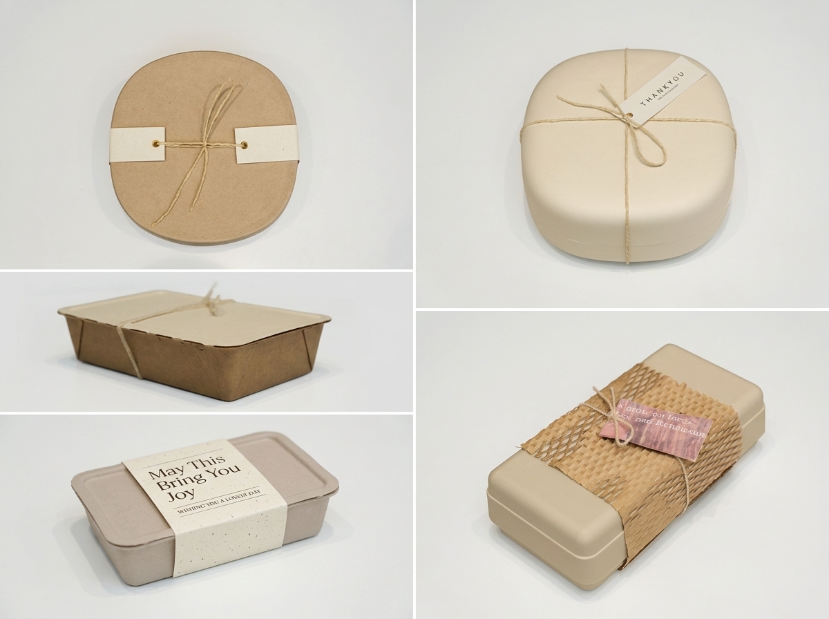
4. Layered Paper Reveal for Multi-Product Sets
When a box contains multiple items—think a skincare set or a sample collection—the temptation is to lay everything out flat behind a window. The layered paper approach does something more interesting. Each product sits on its own paper tier or behind a fold. Opening the box becomes a small sequence of discoveries rather than a single glance.
This works because it borrows from the logic of gift-giving. Each layer peeled back is a micro-moment. And each tier is just paper—foldable, recyclable, lightweight.
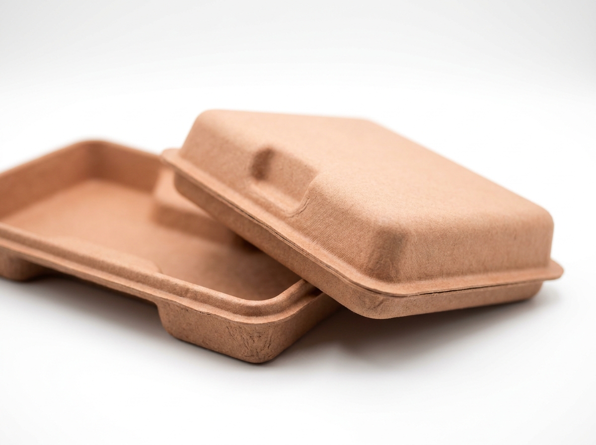
5. Wet-Pressed Pulp as a Full Outer Shell
Most people think of molded pulp as an internal component. But some brands are now using wet-pressed pulp as the outer packaging itself—not hidden inside a printed box, but visible, textured, and proudly structural.
The smooth finish achievable through hot-pressing makes this viable for premium contexts. It reads as “designed object” rather than “packaging.” For electronics accessories, candles, or small wellness devices, a shaped pulp shell with a clean lid can replace both the box and the insert in one piece.
6. Structural Origami Folds That Eliminate Glue
There’s a growing subset of paper packaging that uses folding geometry instead of adhesive to hold its shape. The box locks together through tabs, tucks, and structural tension. No glue needed.
Why this feels premium: it signals engineering. When a customer opens a box that clearly holds itself together through design alone, it registers as clever. It also means every component is a single material—paper—which simplifies end-of-life entirely. For brands shipping internationally, this also reduces the risk of recycling confusion across different municipal systems.
7. Tinted Pulp With No Surface Printing
Instead of printing color onto the surface of paper, some packaging now integrates pigment into the pulp itself during manufacturing. The result is a through-colored material—consistent from surface to core. No ink layer. No coating needed to protect a print.
This is particularly effective for muted, earthy tones that align with natural or wellness branding. The color feels embedded rather than applied. And because there’s no printed surface to scratch or wear, the packaging ages more gracefully during transit.
8. Paper-Based Magnetic-Free Closure
Magnetic closures have been a signature of premium packaging for years. But magnets complicate recyclability. The alternative: paper-tension closures, friction-fit lids, or tuck-lock mechanisms that provide the same satisfying “click” or resistance without any hidden metal or plastic.
Done well, a friction-fit lid actually feels more premium than a magnet—because the resistance is even and silent rather than sudden. It’s the difference between a car door that clicks shut and one that thuds softly into place. Both signal quality. The paper version just happens to be easier to recycle.
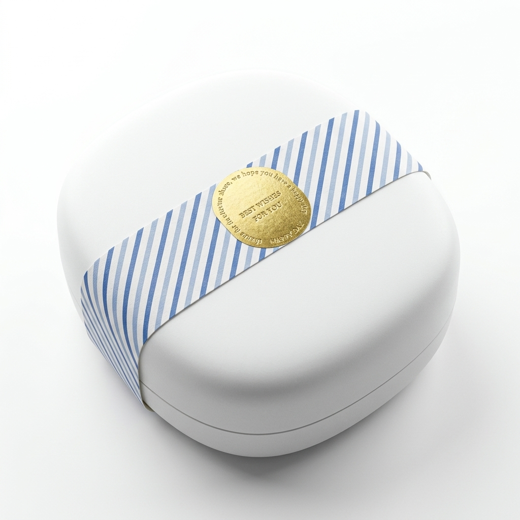
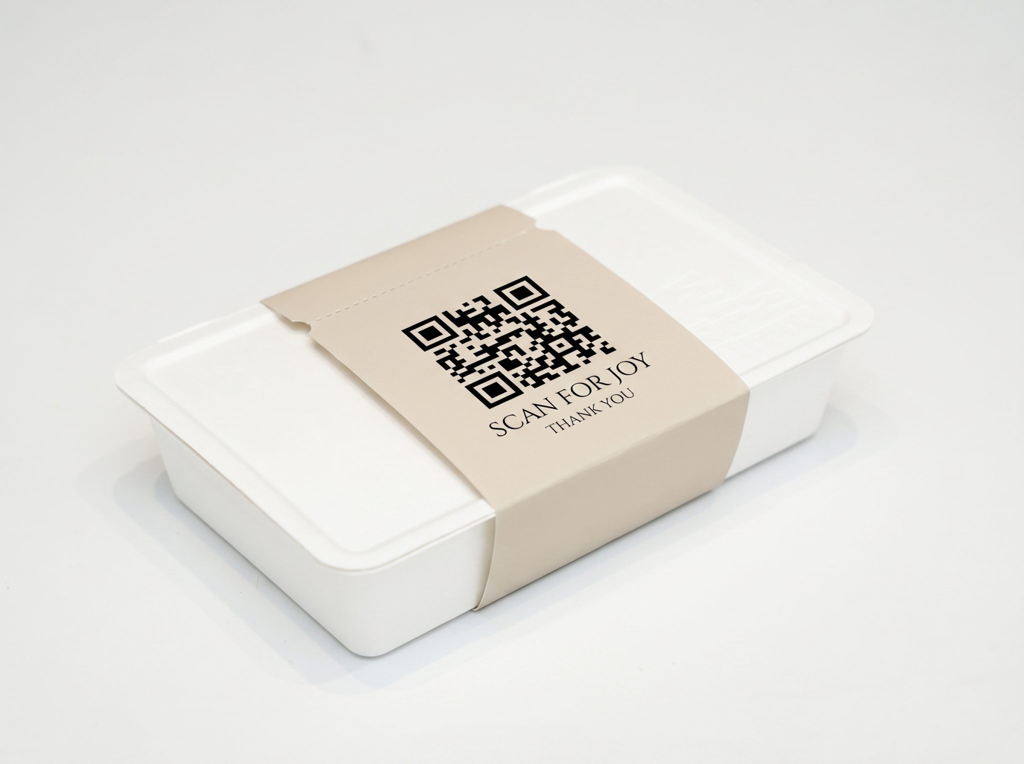
9. QR-Integrated Paper Band Instead of Plastic Wrap
Shrink wrap and cellophane serve two purposes: tamper evidence and surface protection. A paper belly band with a tear-strip achieves the same tamper evidence, while a QR code printed on the band can link to disposal instructions, ingredient stories, or brand content.
This turns a functional element into a communication touchpoint. The customer tears the band, scans if they want to, and everything that remains is paper. No peeling off plastic film and wondering which bin it goes in. It’s a small change that sends a clear signal: this brand thought about the entire experience, including what happens after.
10. Right-Sized Fiber Mailer That Doubles as the Unboxing
The most wasteful thing about many premium shipments isn’t the product box—it’s the oversized corrugated shipper around it. A right-sized fiber mailer eliminates that layer entirely. The shipping container is the experience.
This requires tighter engineering: the mailer has to protect during transit and still look intentional when opened. But when it works, the customer goes from mailbox to unboxing in one step. No peeling away a generic brown box to find the “real” packaging inside. Less material overall, and a faster path to the moment that matters.
When to Choose Molded Pulp vs. Paperboard
They’re both fiber. They’re both recyclable in most markets. But they solve different problems and create different impressions. Here’s a practical way to think about it:
| Factor |
Molded Pulp |
Paperboard |
| Primary strength |
3D form, cushioning, product-specific fit |
Flat surfaces, print quality, folding precision |
| Best unboxing role |
Insert, cradle, or full outer shell |
Outer box, sleeve, band, or lid |
| Surface finish |
Smooth (hot-pressed) to textured (thermoformed) |
Coated, uncoated, textured specialty papers |
| Tooling consideration |
Custom mold required; higher upfront, lower per-unit at scale |
Die-cutting; flexible for short runs |
| Premium signal |
“This was engineered for this product” |
“This was designed with visual intention” |
| Ideal combination |
Molded pulp insert inside a paperboard outer — combines protection engineering with surface design control |
Many of the strongest premium unboxing experiences use both. The outer box provides the brand surface—color, embossing, typography. The inner pulp insert provides the product reveal—precision, protection, that satisfying moment when the product lifts out of something clearly made for it.
Three Design Mistakes That Make Paper Packaging Feel Cheap
Mistake one: generic cavity sizing. When a molded pulp insert has too much clearance around the product, it looks like the product was dropped into a tray rather than placed into one. Tight tolerances matter. If the product shifts when you tilt the box, the premium illusion breaks.
Mistake two: ignoring the lid-off moment. Many brands focus on what the closed box looks like but forget the split-second when the lid comes off. That first visual—the ratio of product to surrounding material, the color contrast between insert and product, the angle at which the product presents itself—determines whether the unboxing feels considered or accidental.
Mistake three: adding unnecessary layers “for perceived value.” Extra tissue paper, filler cards, thank-you inserts, sticker seals—each one adds a disposal decision for the customer. In 2026, more layers don’t signal more value. They signal less thought. The brands getting this right are removing layers while making the remaining ones more intentional.
What This Means for Your Next Packaging Project
The shift toward fiber-based packaging isn’t slowing down. Regulations are pushing it. Consumer expectations are pulling it. And the design tools—both in structure engineering and surface finishing—have caught up to the point where “sustainable” and “premium” no longer require a trade-off conversation.
But the execution still matters enormously. A molded pulp insert with the wrong surface finish feels like an egg carton. A paper box with the wrong weight feels flimsy. The difference between a premium fiber package and a mediocre one usually comes down to three things: how precisely the structure fits the product, how intentional the tactile experience is, and how cleanly the opening sequence unfolds.
If you’re evaluating molded pulp packaging for a product launch or a packaging refresh, the most productive starting point is usually your product dimensions and your unboxing priorities—not a material spec sheet.
Key Takeaways
Paper and molded pulp are no longer fallback options—they’re legitimate premium materials when designed with precision.
Premium unboxing in 2026 depends more on fit, sequence, and tactile intention than on material cost or layer count.
Mono-material and fiber-first approaches simplify recyclability while maintaining brand presence.
The strongest results often combine molded pulp (for protection and product fit) with paperboard (for brand surface and visual control).