





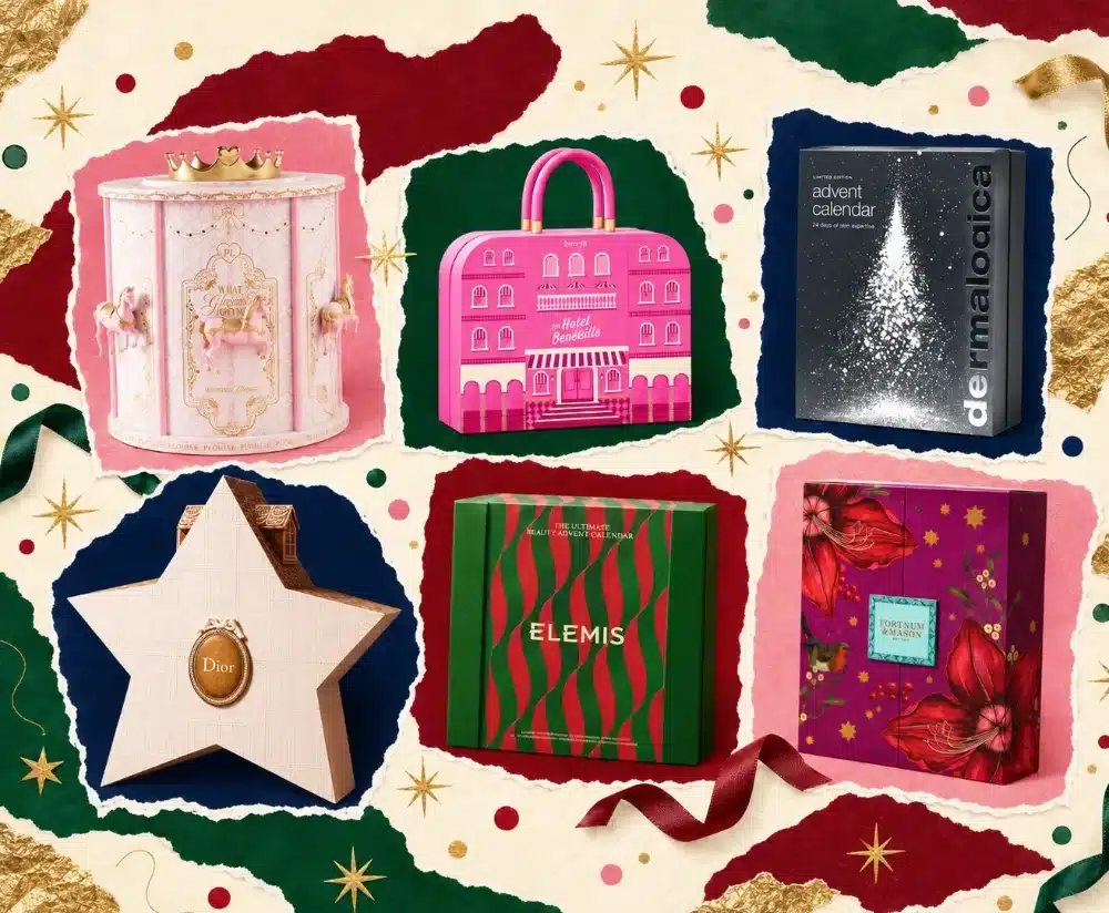


The Advent Calendar Has Become Part of the Gift
The Christmas countdown has never looked quite so extraordinary. From miniature architecture and vintage luggage to richly illustrated beauty chests, these are the 2026 Advent calendars turning festive packaging into an art form.
Long before December arrives, beauty houses, department stores and lifestyle brands have begun unveiling their festive collections. What is changing is not simply the number of surprises inside, but the care devoted to the container itself. The most interesting advent calendar boxes now open like miniature buildings, travel trunks, jewellery chests and tiny theatres.
We have gathered 27 standout designs for Christmas 2026, looking beyond the products to the silhouettes, printed details, compartments and opening rituals that make each package worth a closer look.
I. Miniature Worlds: When Advent Calendars Become Architecture
The most theatrical calendars have moved beyond the rectangle. Rather than merely decorating a box with seasonal imagery, these brands create entire little worlds around the daily reveal.
1. Dior — Le 30 Montaigne Beauty Advent Calendar
Architectural storytelling
Layered doors
Couture details
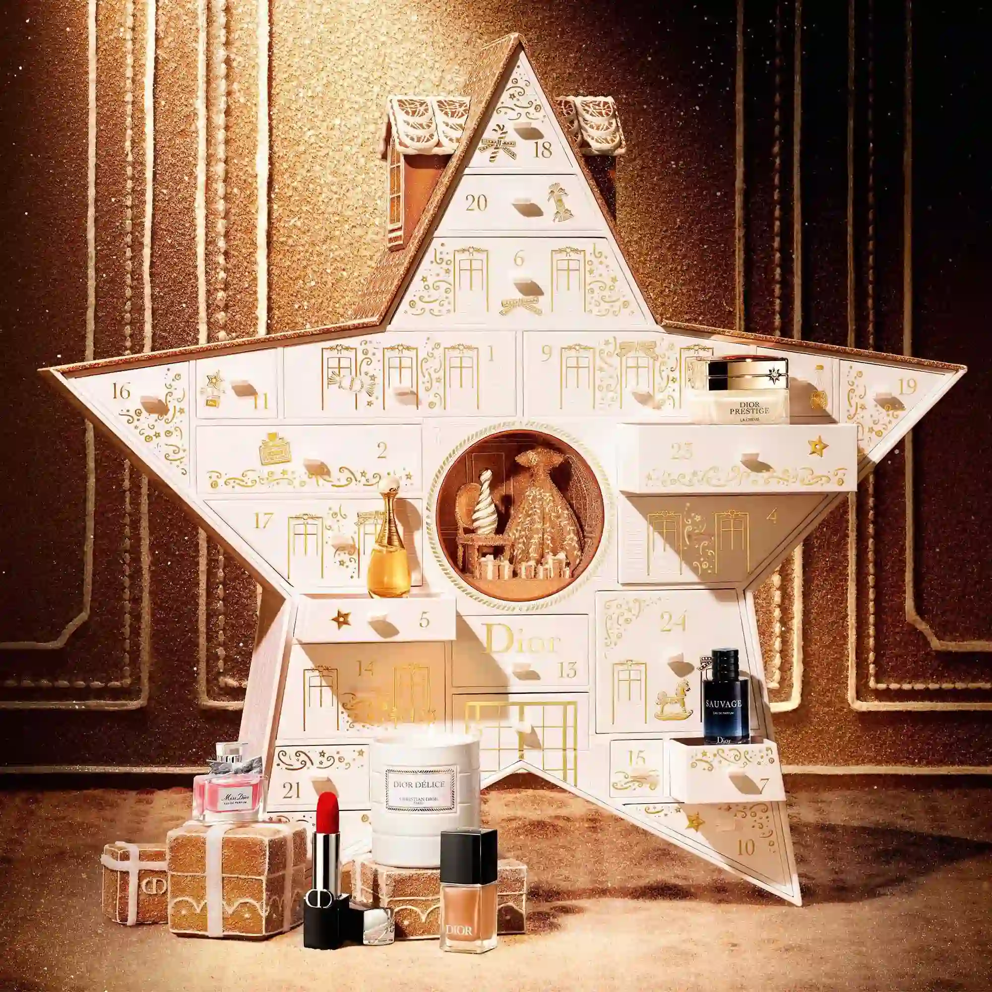
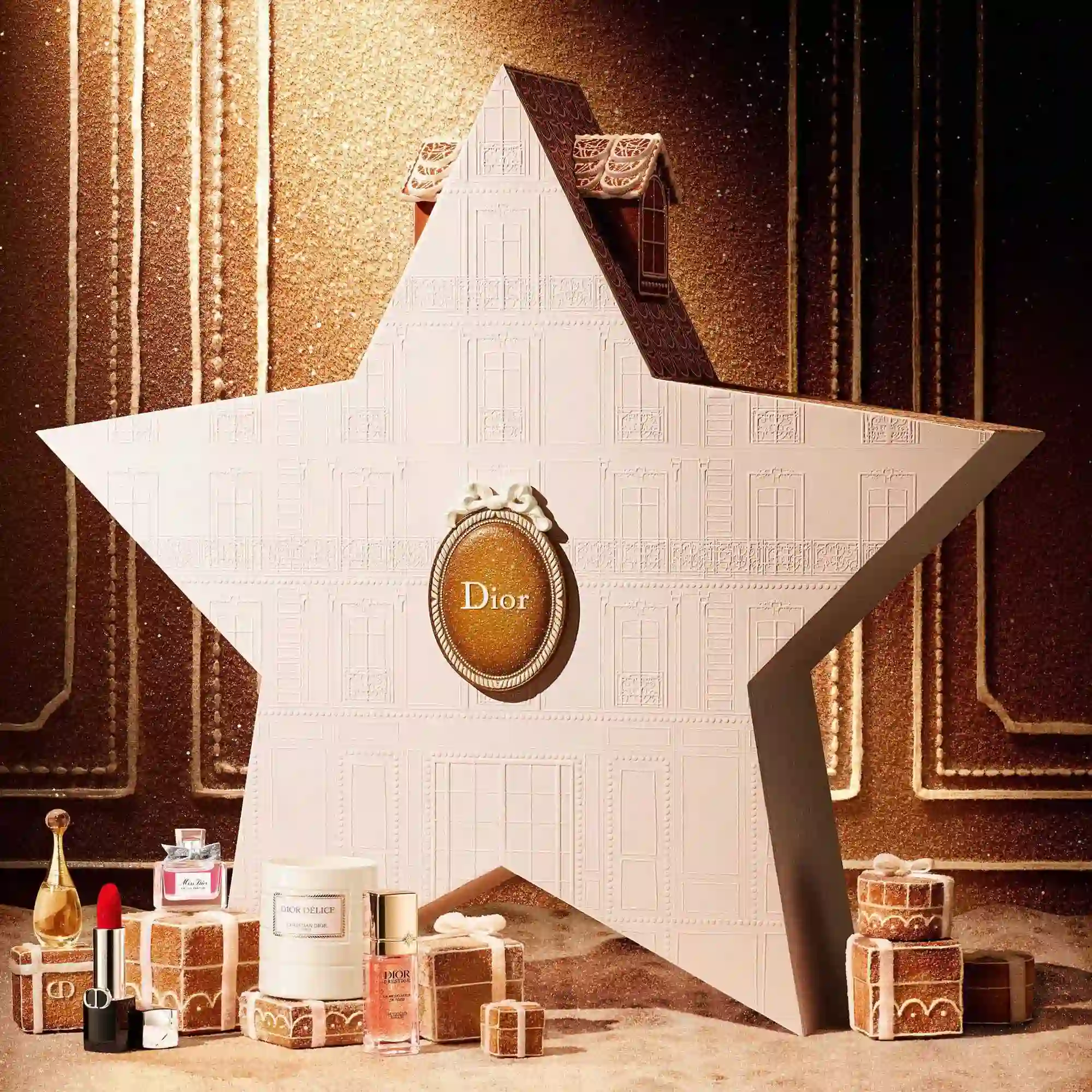
Dior brings the mythology of its Parisian home into the Christmas countdown. The 2026 calendar takes the form of a spectacular star, its pale architectural surfaces opening to reveal numbered compartments and a miniature festive scene inspired by 30 Avenue Montaigne.
The structure does more than carry the house's identity: it turns Dior's architectural heritage into the gift itself. There is also La Malle des Rêves, an exceptional collector's trunk that takes the idea of a lasting luxury object even further. The star edition, however, is the clearest example of a memorable silhouette becoming a complete packaging story.
2. P.Louise — What Glows Around Beauty Advent Calendar
Integrated lights
Sculptural horses
Pink-and-gold finish
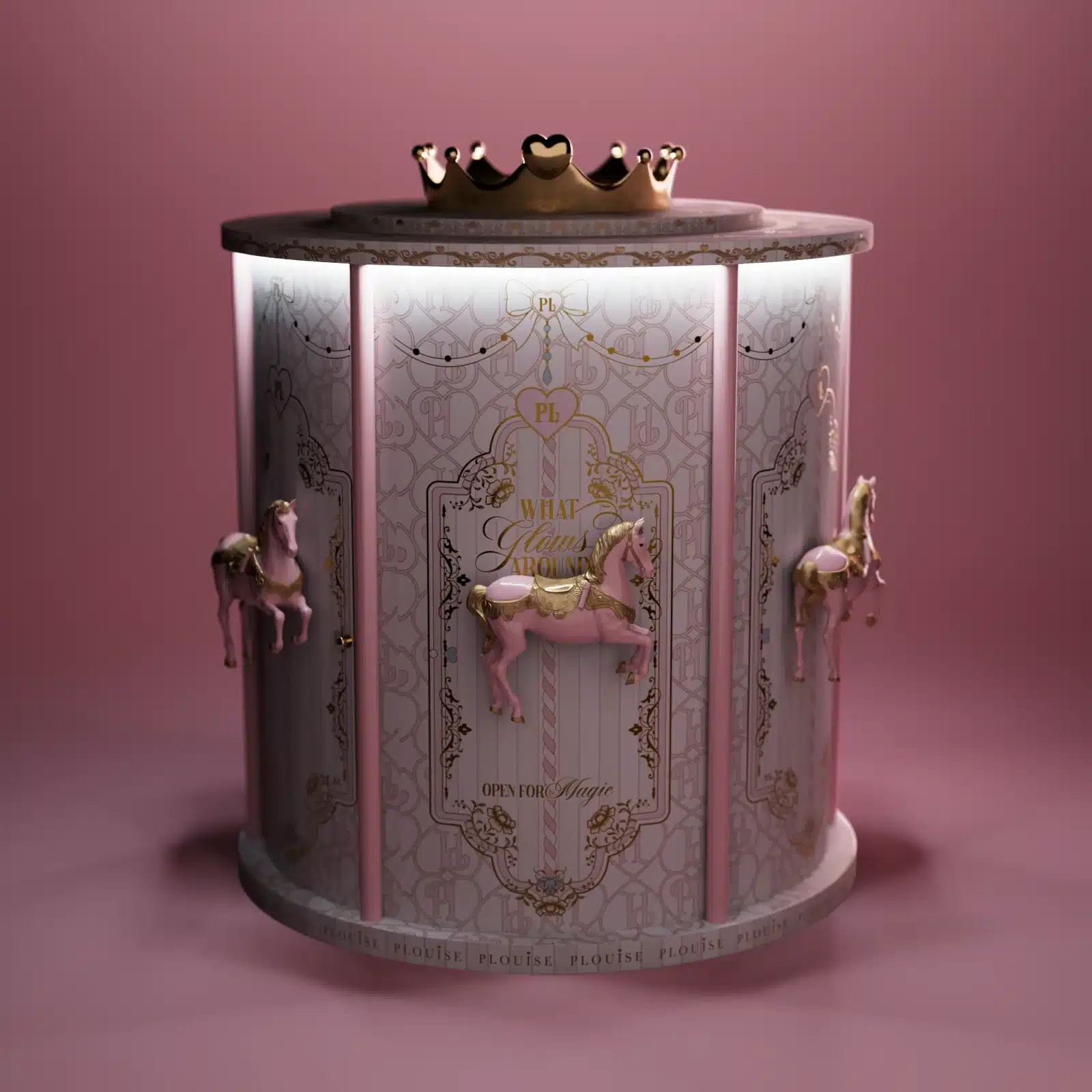
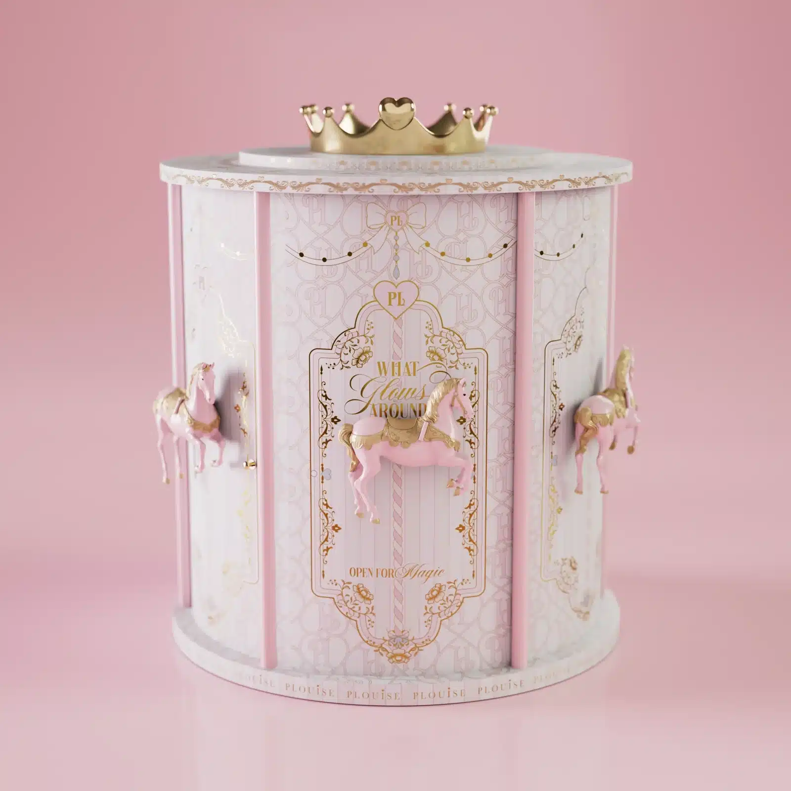
Restraint is hardly the point of P.Louise's What Glows Around calendar. Its towering fairground-carousel presentation, complete with ornamental horses and illuminated details, feels closer to a miniature Christmas attraction than a conventional beauty gift box.
With 25 surprises concealed within the structure, the countdown becomes a performance. Rotation, height and decorative excess invite the owner to interact with the calendar long before opening the next compartment. It is an especially vivid example of packaging conceived for the pleasure of display, unboxing and sharing.
3. Rituals — The Ritual of Advent Premium Calendar
Detachable carriages
24 compartments
Nostalgic display
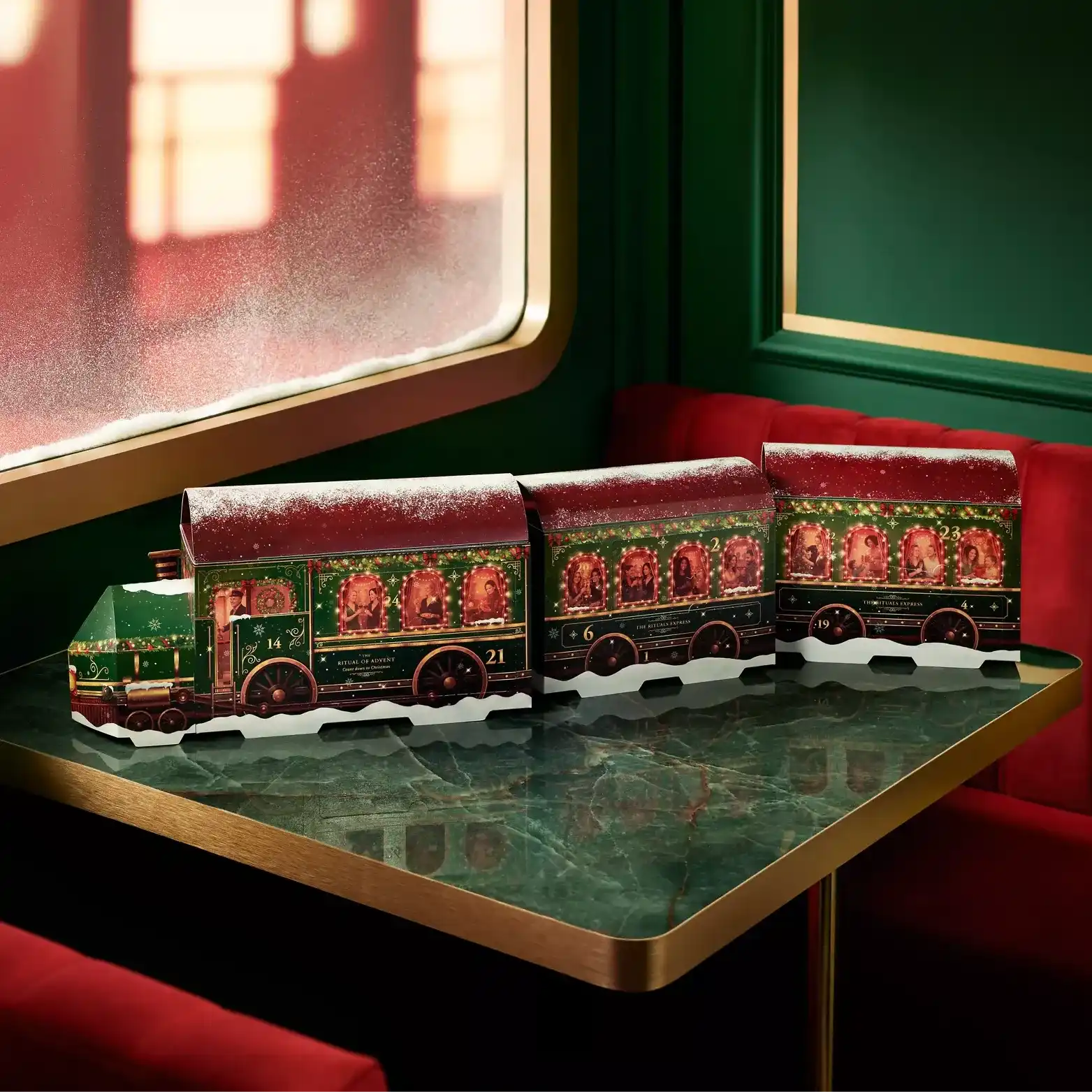
All aboard the Rituals Express. The brand's Premium Advent Calendar has been imagined as a festive train, with a locomotive and three detachable carriages concealing 24 bath, body and home discoveries.
The appeal lies in how naturally the design borrows from Christmas nostalgia. A miniature train is already a familiar part of seasonal decoration, so the package arrives with an emotional association built into its shape. Rather than printing a winter journey onto an ordinary carton, Rituals makes the journey itself the structure.
4. Rituals — The Ritual of Advent Classic Calendar
Illustrated façade
24 doors
No daily assembly
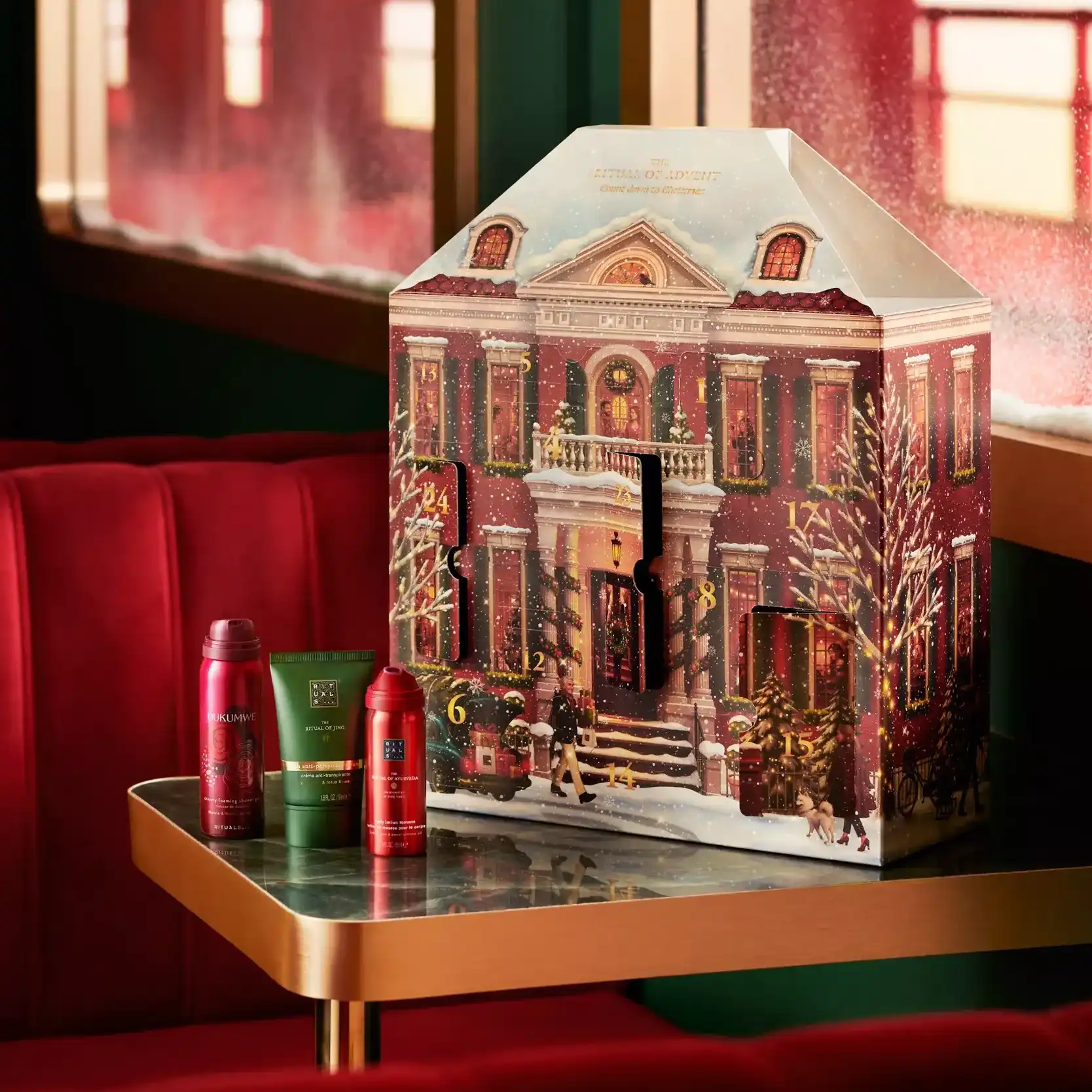
The Classic edition trades the railway for an inviting storybook house. Its pop-up townhouse design features a warmly illustrated architectural façade, with 24 doors concealing a selection of bath, body and home favourites.
Compared with the playful train, the house offers a quieter form of festive theatre. Windows, a snow-dusted roofline and a recognisable building silhouette give every little door a reason to exist. That two calendars from the same brand feel so different is a useful reminder of how much personality packaging structure can create.
5. Lush — 29½ High Street Advent Calendar
Opening house
Blue roof
Recycled board
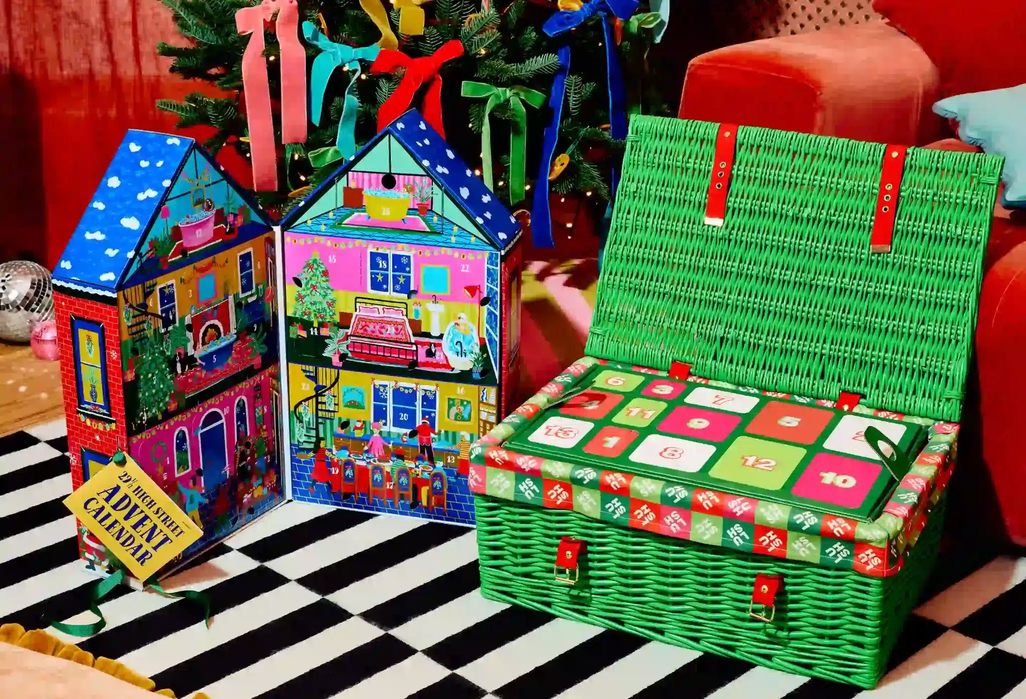
Lush's 29½ High Street calendar turns a fictional shopfront into a riotously colourful Christmas miniature. With its red-brick walls, snow-dusted blue roof and playful decorative details, the box opens like a little building to reveal a world of bath treats.
Its cheerful illustration works hand in hand with its folding structure; the exterior sets the scene, and the interior continues it. Made with recycled board, the design makes especially good use of paper-based construction. In the photograph, the house appears alongside Lush's contrasting wicker-hamper calendar, which takes an altogether different material route.
6. Lush — Advent Calendar in a Wicker Hamper
Green-and-red palette
Red straps
Reusable storage
The second Lush design, pictured beside the High Street house above, exchanges printed paperboard for bright green wicker, red straps and a lined hamper interior. The 25-day assortment sits within an object that feels more like a traditional gift basket than a standard numbered box.
It is a striking contrast between two approaches to seasonal packaging: the house creates a story through print and paper engineering, while the hamper relies on physical texture and a familiar storage form. Both feel unmistakably Lush, despite having almost nothing in common structurally.
7. Penhaligon's — The Advent Calendar
Stacked-trunk form
Travel narrative
Heritage styling
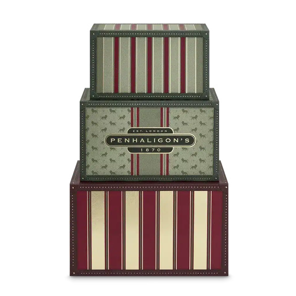
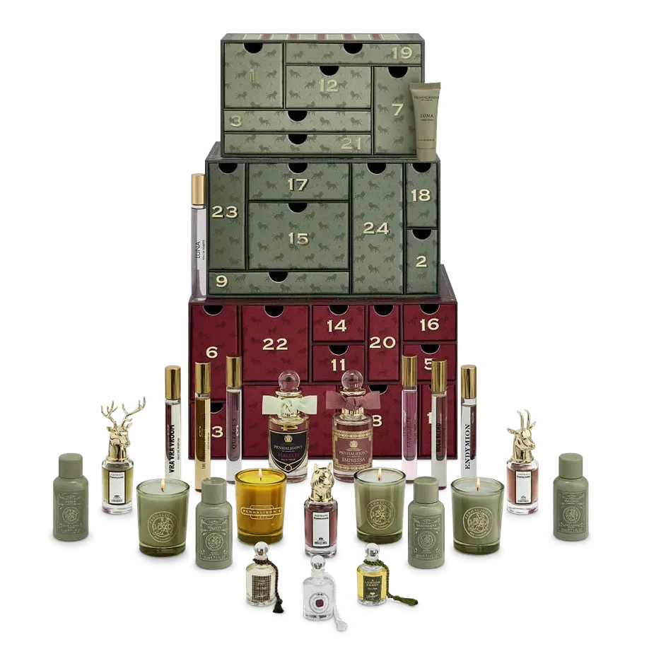
Penhaligon's makes a case for nostalgia with a calendar inspired by vintage luggage and the golden age of railway travel. Its stacked-trunk appearance invites comparisons with glamorous train journeys, grand hotels and the romance of going somewhere unexpected.
The 24 fragrance and body-care discoveries sit within a structure that already suggests stories and destinations. It is a particularly fitting design for a fragrance house with a taste for eccentric narratives. Here, the box feels like an object with a history, even before its first compartment has been opened.
8. Benefit Cosmetics — Hotel Beneville Advent Calendar
Retro graphics
Hotel concept
Playful branding
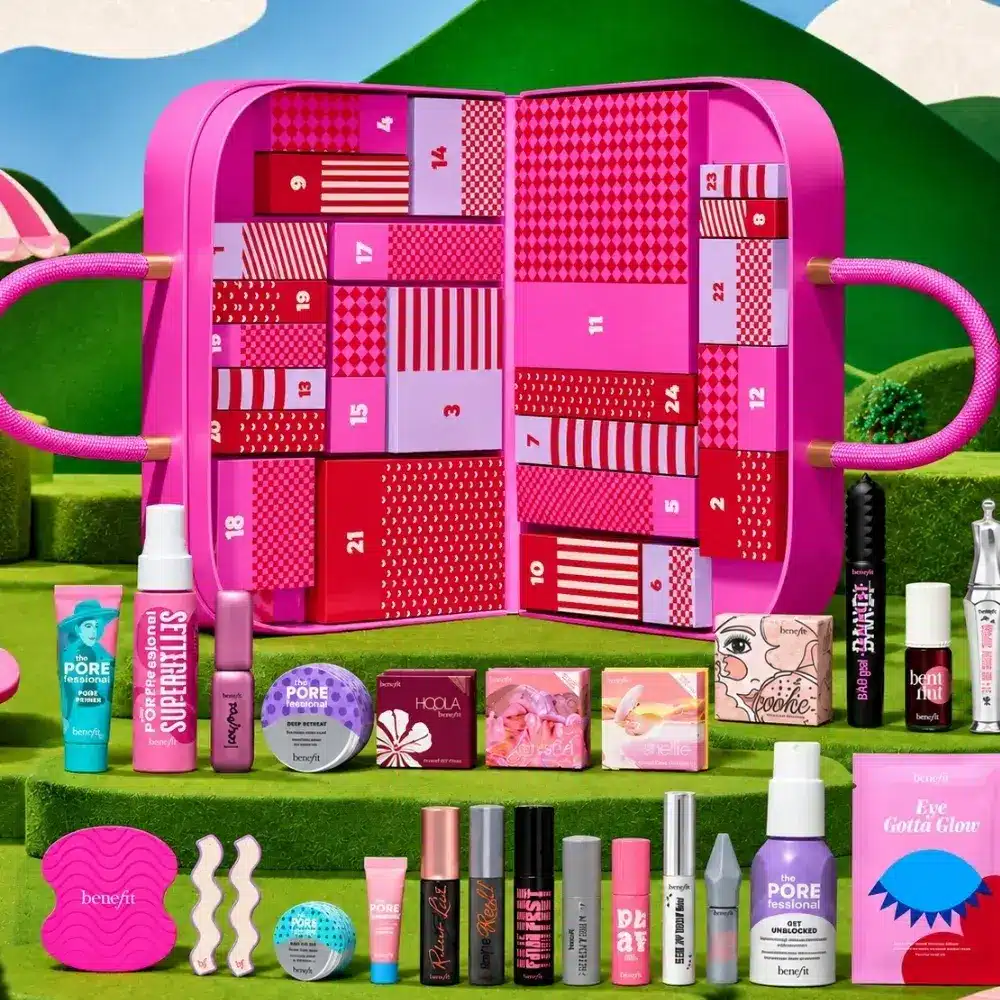
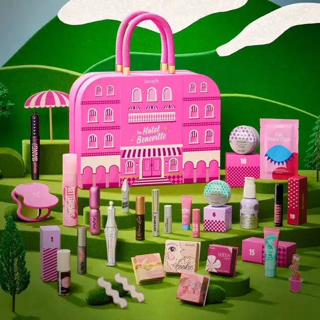
Benefit checks into Christmas with Hotel Beneville, a fictional destination wrapped in the brand's irreverent sense of glamour. The briefcase-inspired calendar uses retro hotel imagery to make its 24 makeup and beauty surprises feel like souvenirs from an imaginary holiday.
Like Penhaligon's, Benefit draws on travel, but the mood is entirely different: less heritage luggage, more colourful kitsch. That contrast shows the flexibility of a familiar structural reference. A suitcase or briefcase can become elegant, eccentric or theatrical depending on the graphics and materials surrounding it.
II. Art on the Outside: Illustration as a Packaging Language
An unusual silhouette is only one way to make a statement. The calendars below rely on illustration, pattern and colour to turn familiar structures into objects with distinct identities.
9. Liberty London — Beauty Advent Calendar
Decorative outer case
25 drawers
Coordinated print
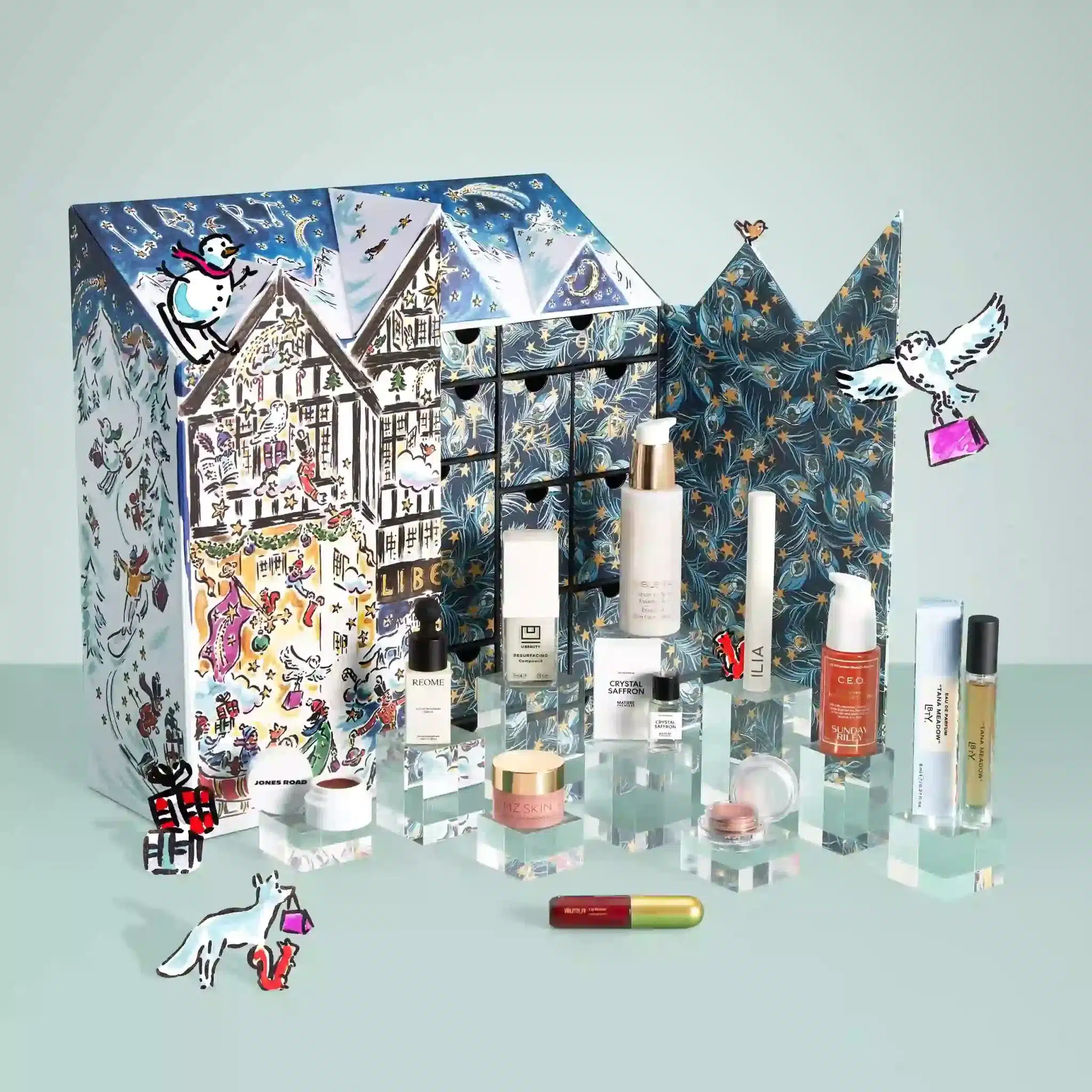
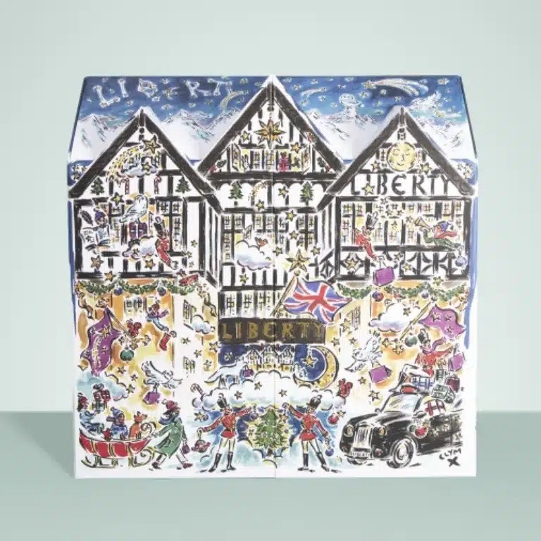
Liberty's calendar has become as recognisable for its artwork as for the treasures it holds. The 2026 edition features an illustrated exterior by Clym Evernden, whose decorative approach feels perfectly at home alongside Liberty's celebrated prints.
Inside, 25 drawers create a pleasingly orderly contrast with the expressive artwork, while a coordinated print accessory extends the aesthetic beyond the box. This is the power of confident art direction: a relatively traditional drawer structure becomes a collectible seasonal object through illustration alone.
10. Diptyque — Advent Calendar: 25 Scented Treasures
Woodland illustration
Gold accents
Removable drawers
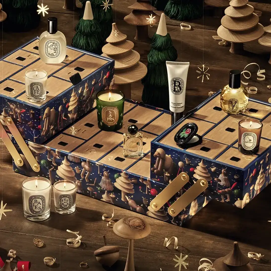
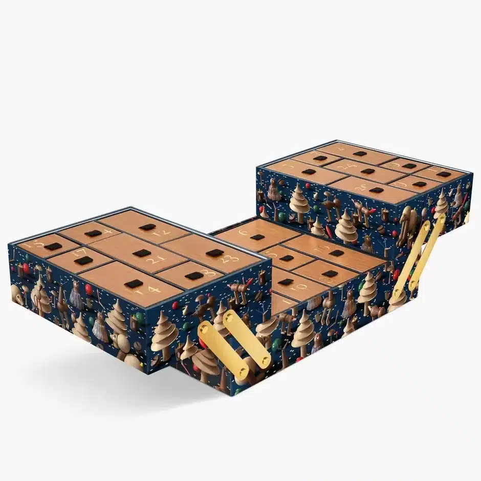
Diptyque's 2026 calendar imagines a craftsman's toolbox belonging to an enchanted forest. Developed with artist Jean-Simon Roch, its illustrated characters and delicate gold-toned detailing bring a sense of storybook magic to the fragrance house's distinctive visual world.
Removable drawers house candles, perfumes and other scented discoveries, while the case is designed for use beyond December. The toolbox reference is particularly intelligent: it suggests collecting, making and looking after beautiful objects, three ideas that seem entirely natural for Diptyque.
11. L'Occitane — Classic Advent Calendar
Deep green palette
Festive still life
Paperboard format
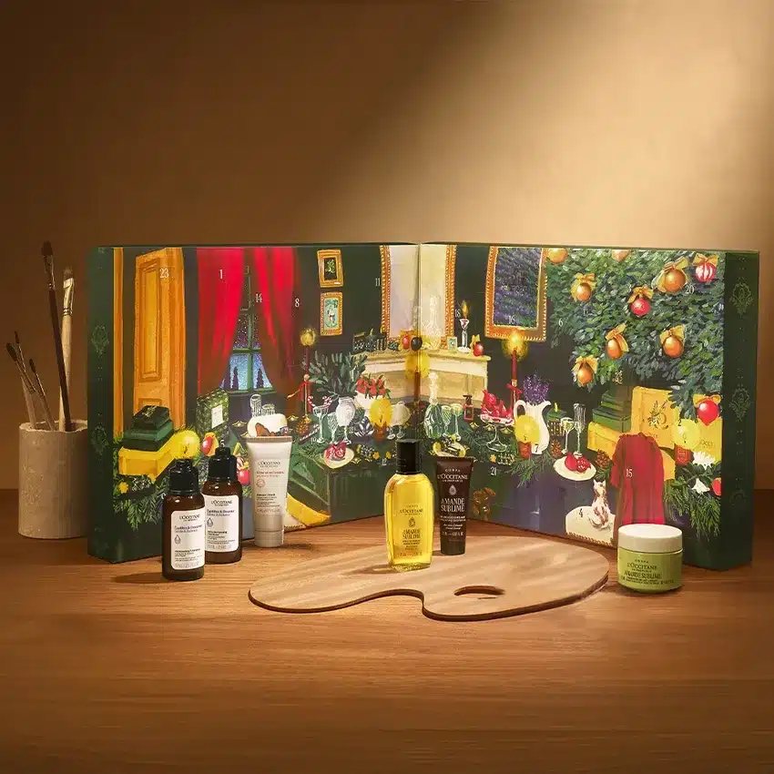
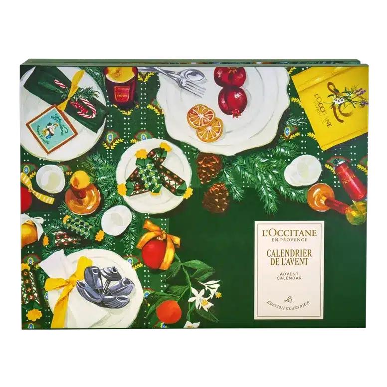
L'Occitane finds its festive character in the warmth of Provence. Rich green tones frame illustrated citrus, evergreens, tableware and other details that recall a lovingly prepared Christmas gathering.
The classic compartmented format may be familiar, but the visual atmosphere is inviting and distinctive. Rather than competing through unusual mechanics, L'Occitane trusts a carefully composed festive illustration to make the box feel like an extension of its botanical and sensorial identity.
12. Tatcha — 12 Ways to Love Your Skin Advent Calendar
Artist collaboration
Compact 12-day format
Playful graphics
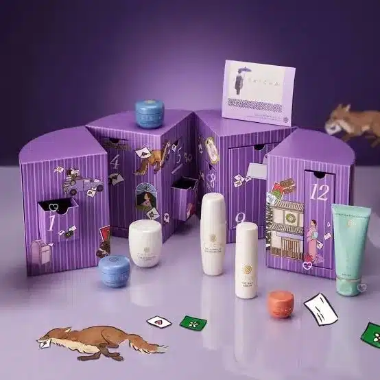
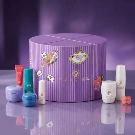
Tatcha offers a welcome departure from predictable Christmas colours. Its 12 Ways to Love Your Skin calendar comes in vivid lilac, with expressive illustrations by Japanese artist foxco giving the packaging a contemporary, intimate personality.
The 12-day format also feels intentionally edited, making the structure more compact than a traditional 24-door calendar. By avoiding snowflakes and reindeer, Tatcha proves that festive packaging can feel special without abandoning a brand's own visual language.
13. John Lewis — Beauty Advent Calendar
Navy-and-gold tones
Opening cabinet
25 drawers
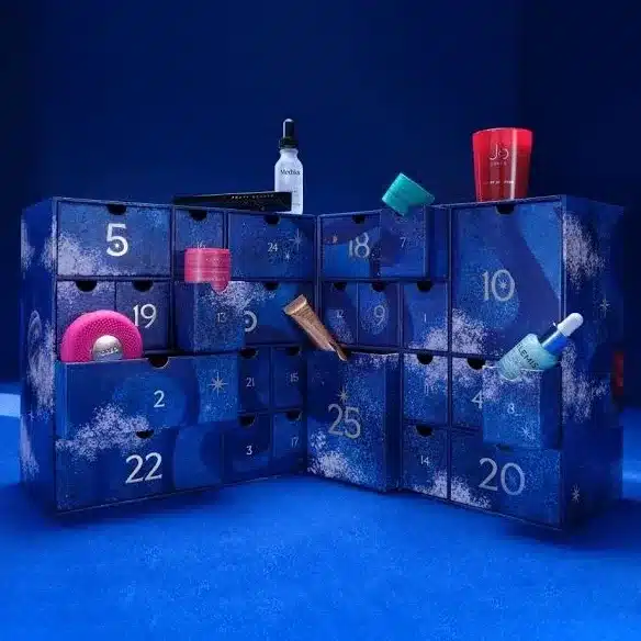
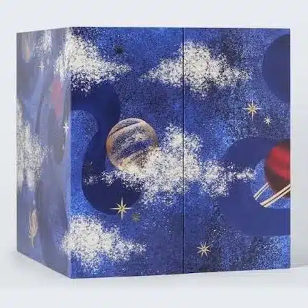
John Lewis approaches the season with an illustrated cabinet that feels like a small Christmas theatre. Its deep navy palette, hand-painted festive artwork and gold-toned details frame 25 drawers of beauty discoveries.
The result balances old-fashioned storytelling with an orderly, modern interior. John Lewis also presents the box as recyclable, with individual compartments suitable for reuse. There is something satisfying about its combination of an expressive outer world and a practical, compartmented structure.
14. Glossybox — Beauty Wrapped Advent Calendar
Soft pink palette
Illustrated bows
Numbered compartments
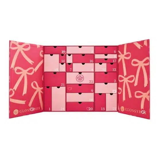
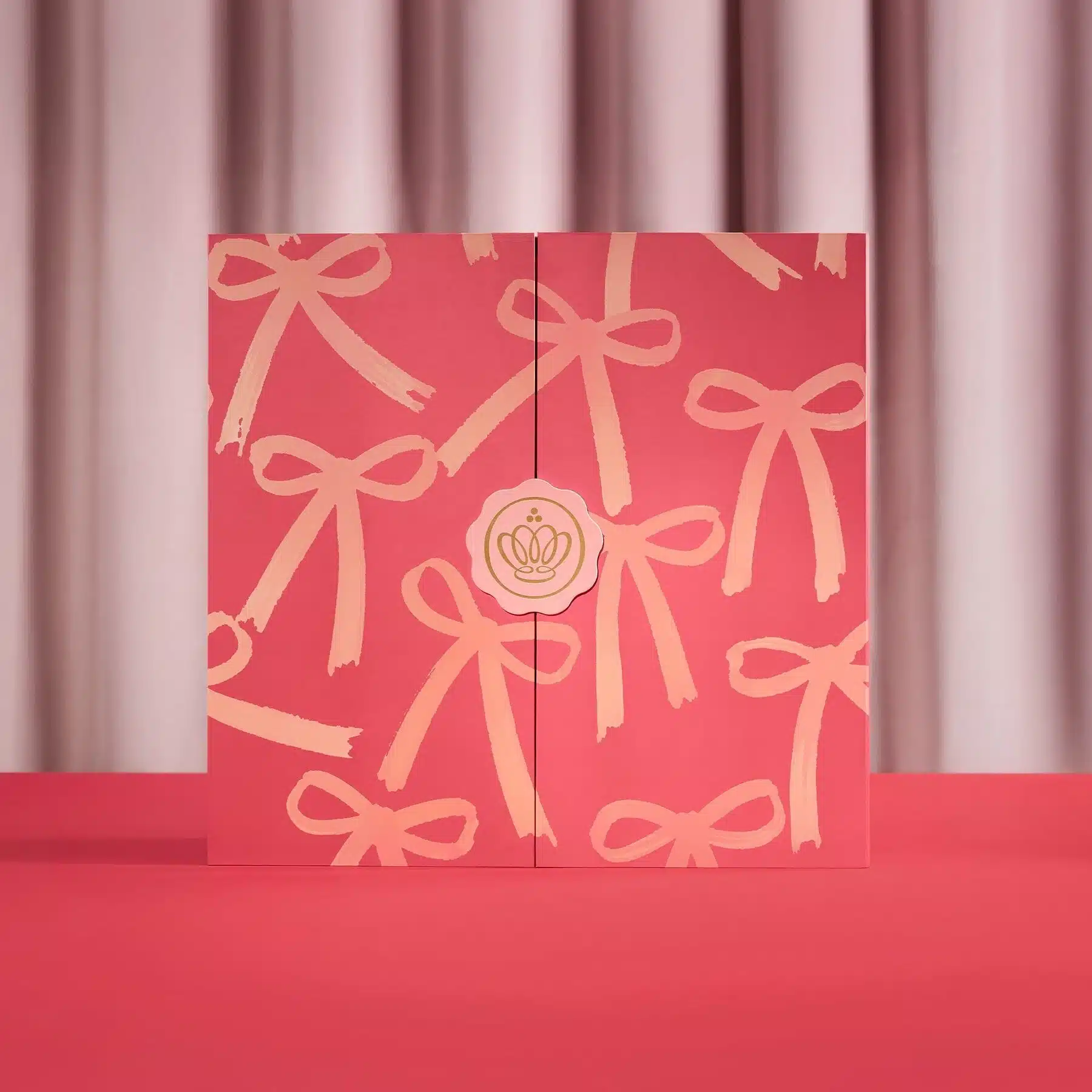
Glossybox has built its 2026 calendar around a familiar pleasure: receiving a beautifully wrapped present. The Beauty Wrapped design uses a soft pink colour story and decorative bow imagery across its numbered compartments.
Instead of treating ribbons as an accessory applied at the very end, the brand turns the idea of gift wrapping into the package's visual identity. The result is playful and immediately legible, showing that even the most familiar festive motif can feel fresh when carried consistently across a design.
15. The Fragrance Shop — Women's Advent Calendar
Purple palette
25-door format
Festive motifs
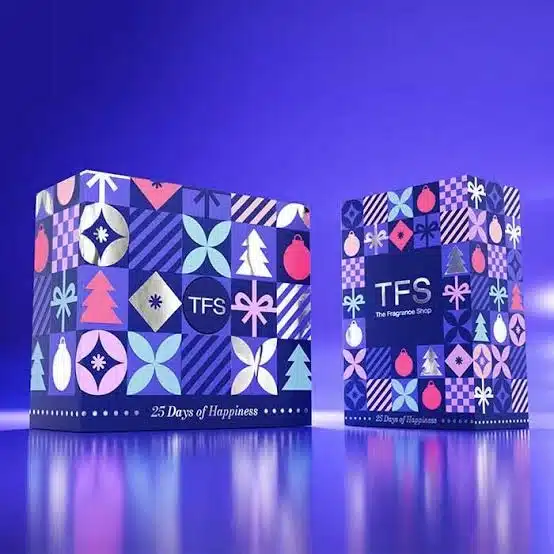
The Fragrance Shop's 25 Days of Happiness calendar swaps traditional Christmas scenes for a lively patchwork of geometric motifs. Purple, violet and pink tones frame stylised ornaments, trees, ribbons and abstract shapes.
Its graphic system almost recalls a contemporary textile print: individual symbols repeat, but the full composition remains energetic. For a multi-brand fragrance calendar, that is an effective choice. The packaging creates its own festive identity without borrowing too heavily from any one product inside.
III. The Luxury Treatment: Structure, Surface and the Opening Moment
At the season’s midpoint, the design conversation moves from playful illustration to touch, proportion and mechanics. For anyone developing custom christmas boxes, these examples show how a simple change of shape, finish or opening gesture can redefine the whole gift.
16. Harrods — Beauty Advent Calendar
Book-style opening
25 compartments
Formal luxury
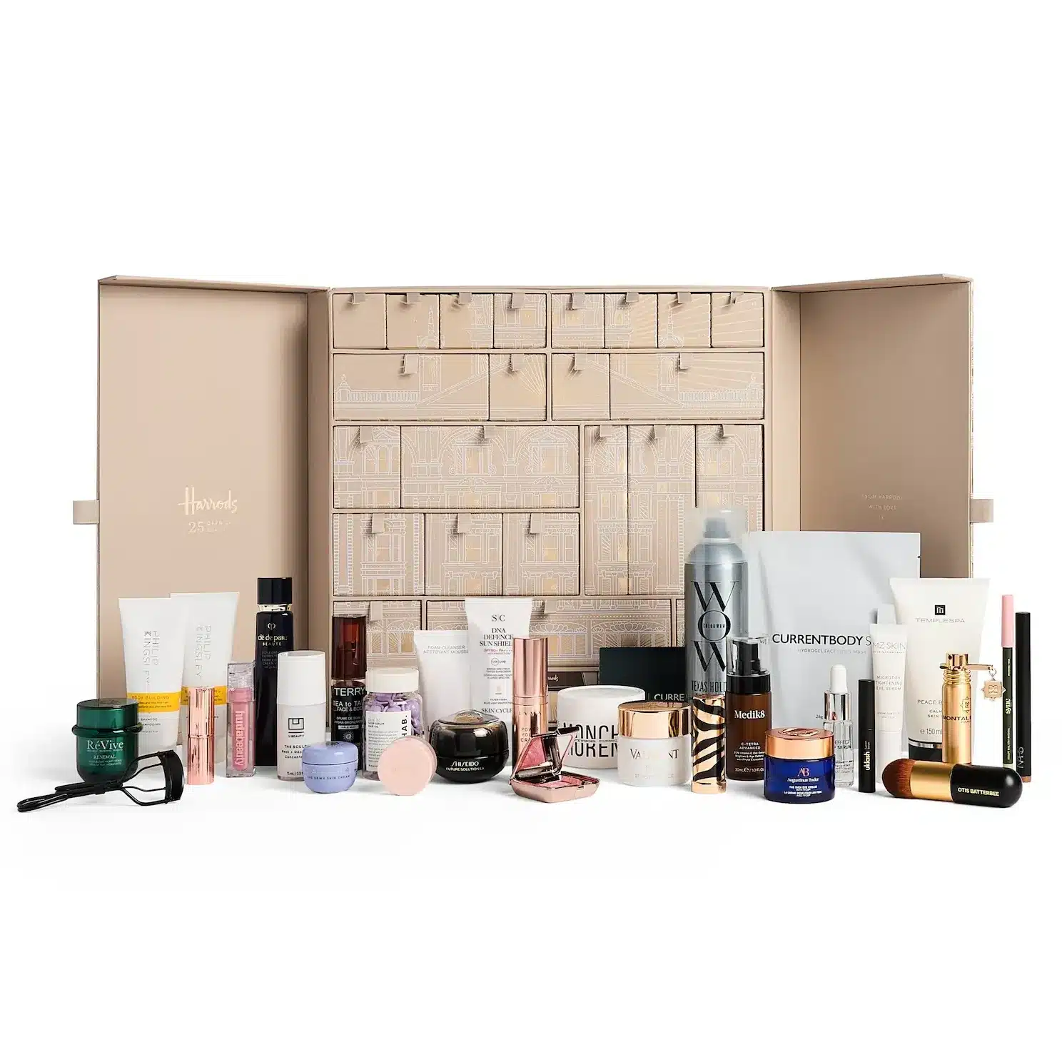
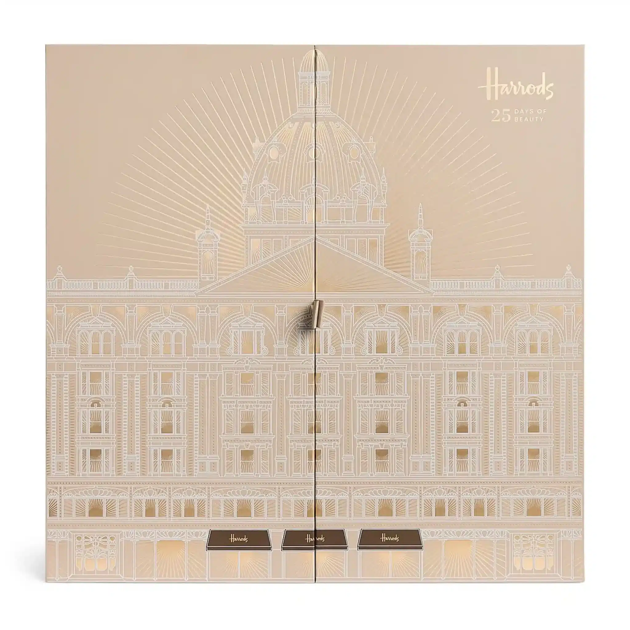
Harrods delivers the ceremony of luxury gifting in an opulent gold case that opens like a decorative book. Within its structured interior, 25 compartments hold an assortment of prestige beauty discoveries.
The book-inspired opening is a classic device, but it remains persuasive: parting the covers feels like entering a curated collection. The design relies on a disciplined silhouette and a confident metallic finish rather than an extravagant architectural construction.
17. MAC Cosmetics — 24 Days of M·A·C Icons Advent Calendar
Reflective silver panel
Tiered drawers
Numbered boxes
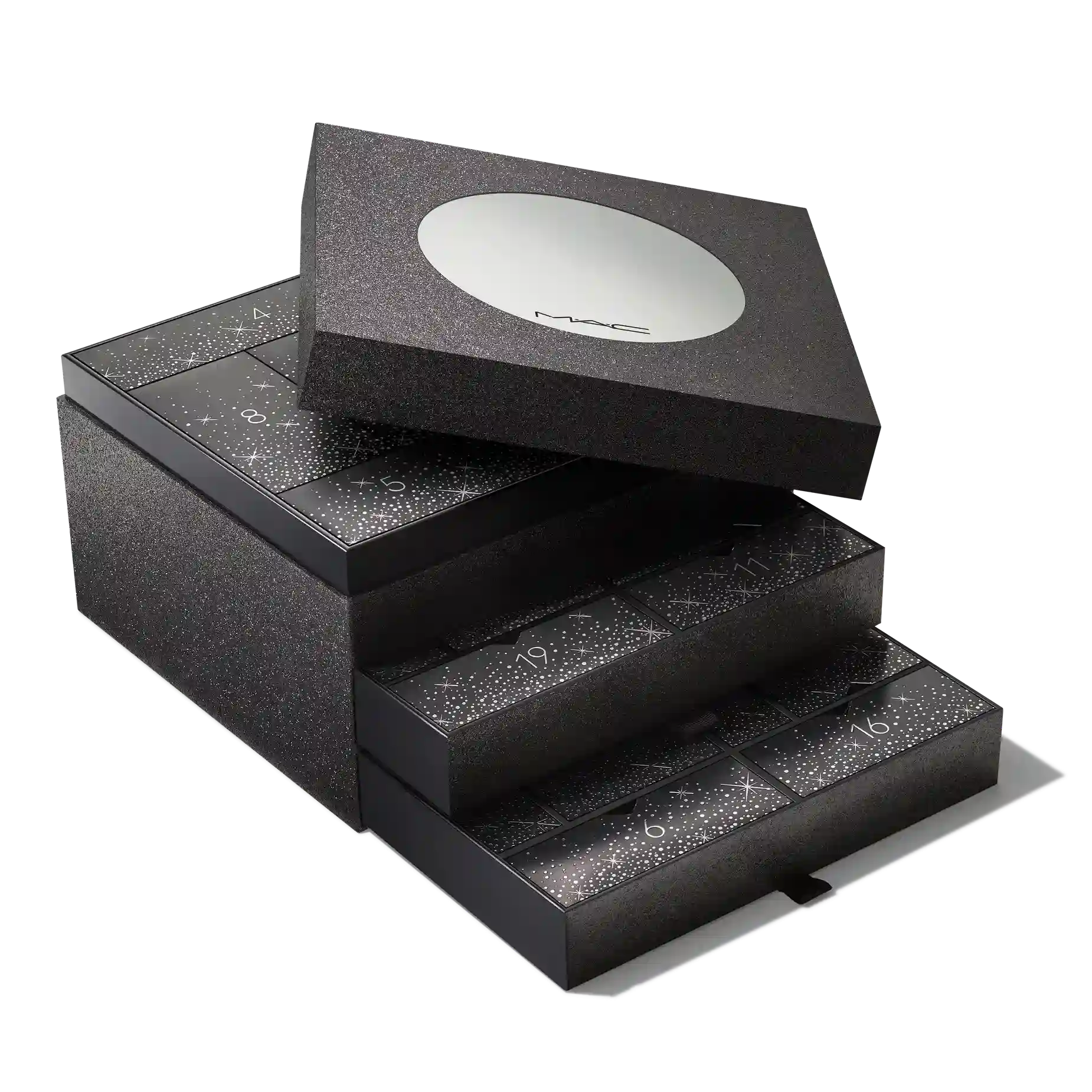
MAC's 2026 calendar stays close to the brand's most recognisable design codes: deep black, understated glamour and a touch of silver shimmer. The case includes a removable lid with a reflective detail, while tiered pull-out drawers reveal the numbered gifts inside.
It is a sleek alternative to the decorative maximalism seen elsewhere this season. The packaging creates drama through surface, proportion and the choreography of its stacked compartments rather than through brightly coloured Christmas imagery.
18. Molton Brown — Advent Calendar
Marble-brown finish
Copper accents
Radiating drawers
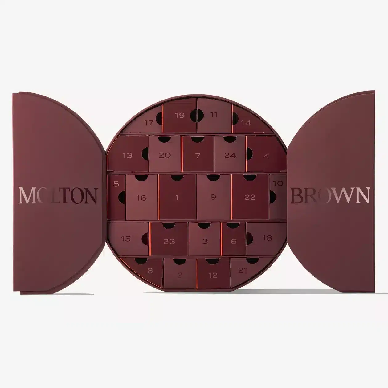
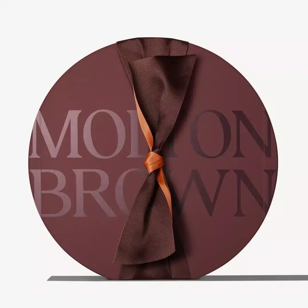
Molton Brown changes the geometry of the Christmas countdown with a circular, marble-brown case. Its two curved doors open around an arrangement of numbered drawers, giving the structure the presence of a sophisticated decorative object.
Copper-toned details add warmth to the deeper brown palette. The result feels composed and grown-up: less novelty toy, more carefully designed fragrance case. It is an excellent reminder that shape alone can distinguish a calendar from the crowded field of rectangles.
19. Jo Malone London — Christmas Kist Advent Calendar
Individual festive parcels
Layered unwrapping
Elegant detailing
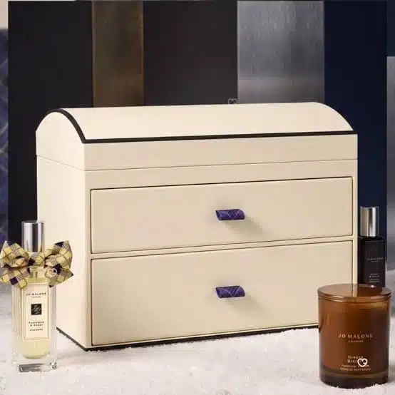
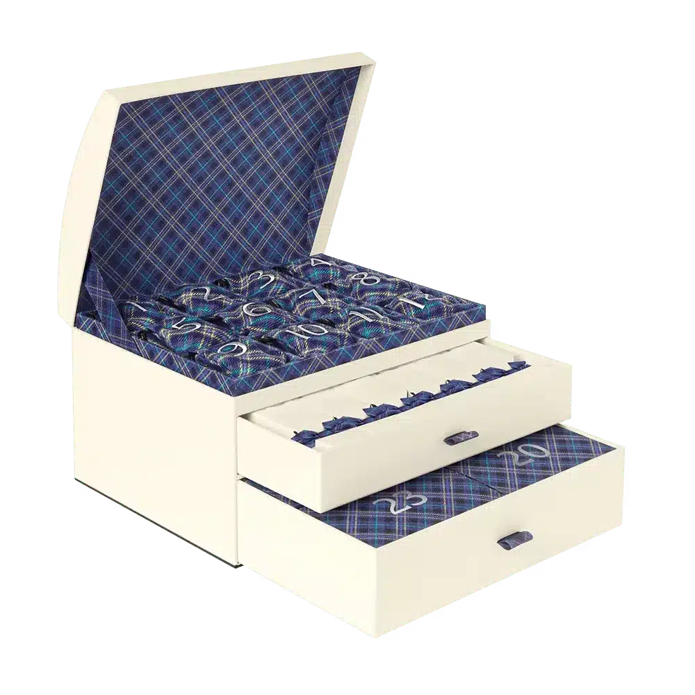
Jo Malone London turns its gift-wrapping ritual into a month-long experience. The Christmas Kist calendar takes the form of an elegant trunk, within which individually presented scented surprises draw on the imagery of crackers, ornaments and stockings.
The most interesting feature is the packaging inside the packaging. Instead of presenting 25 identical openings, the smaller parcels add variation and personality. Every day becomes another carefully wrapped gift, reinforcing the fragrance house's longstanding association with ceremonial gifting.
20. LOOKFANTASTIC — Beauty Advent Calendar
Rotating logo opening
Bold typography
25 drawers
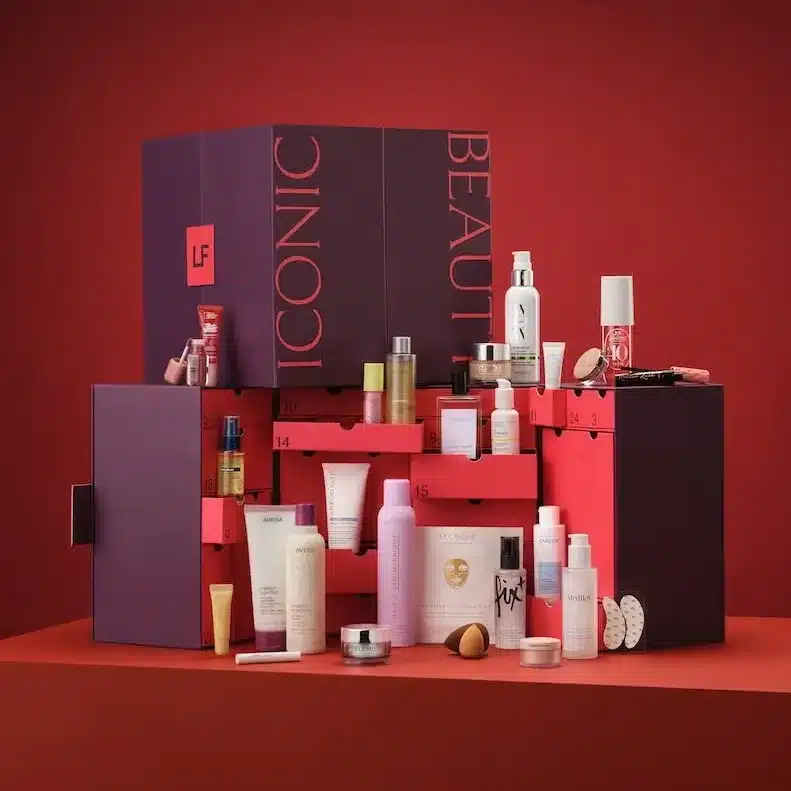

LOOKFANTASTIC's 2026 calendar makes a statement through bold typography, rich plum and red tones, and a large LF emblem. The logo plays a functional role, twisting to release the case before its numbered drawers are revealed.
That small mechanical detail is an effective piece of branding: a symbol becomes an action. The result feels contemporary and graphic, demonstrating how a simple geometric structure can gain personality from one carefully considered opening gesture.
21. ELEMIS — The Ultimate Beauty Advent Calendar
Decorative cabinet
25 drawers
Keepsake structure

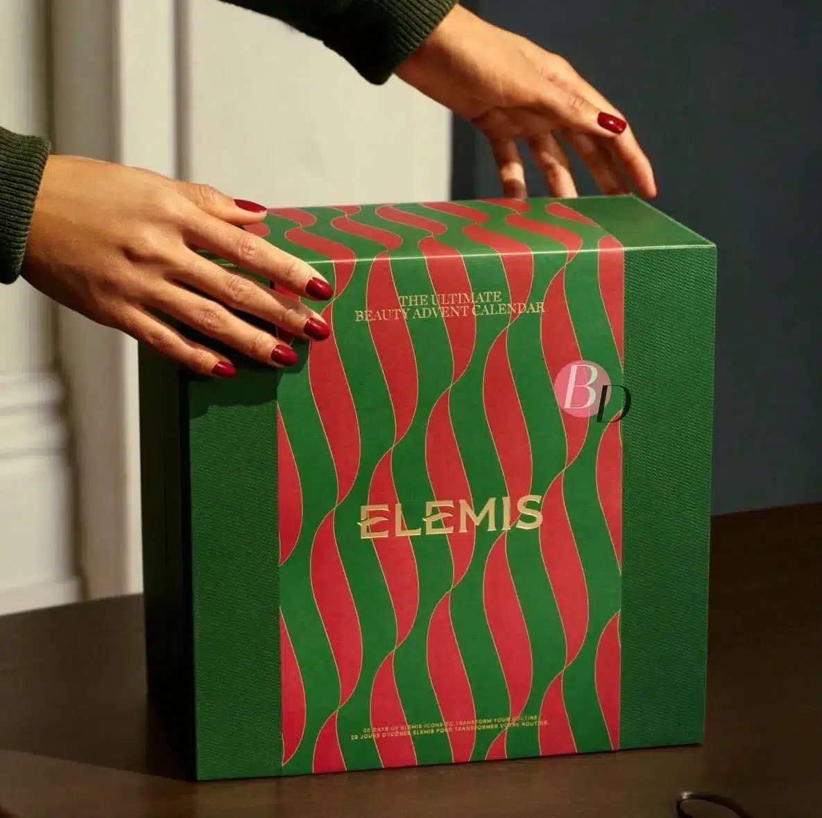
ELEMIS embraces a recognisably festive red-and-green palette while keeping the graphics modern and expressive. Flowing decorative patterns give the case movement, and a series of 25 drawers creates a satisfying rhythm across the interior.
The contrast between the deep green surfaces and red details makes the calendar instantly seasonal without resorting to an overload of holiday symbols. It is a useful illustration of how familiar colours can still look fresh when the pattern and compartment proportions are carefully controlled.
22. The Body Shop — Ultimate Beauty Advent Calendar
Pink drawers
Illustrated interior
Colour contrast
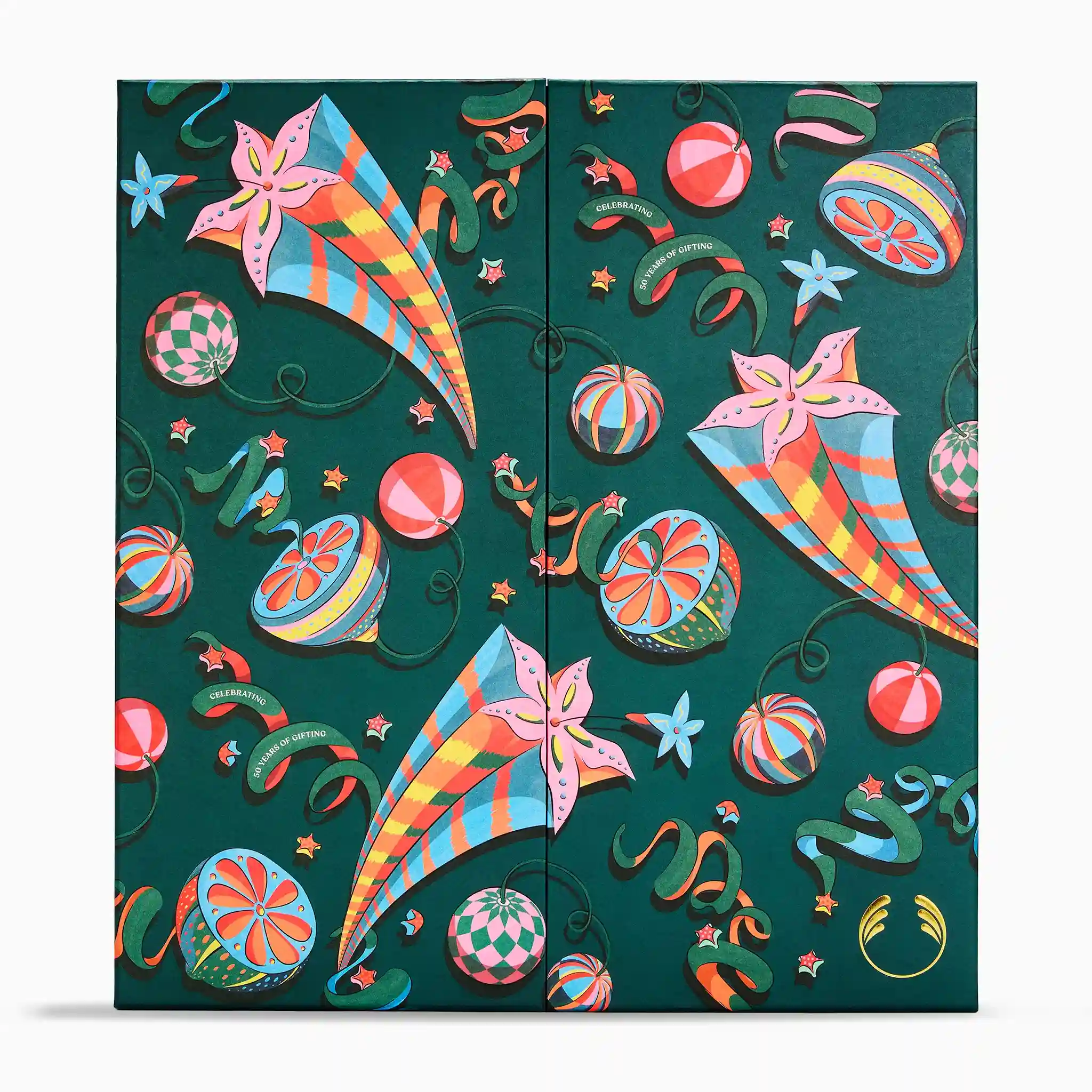
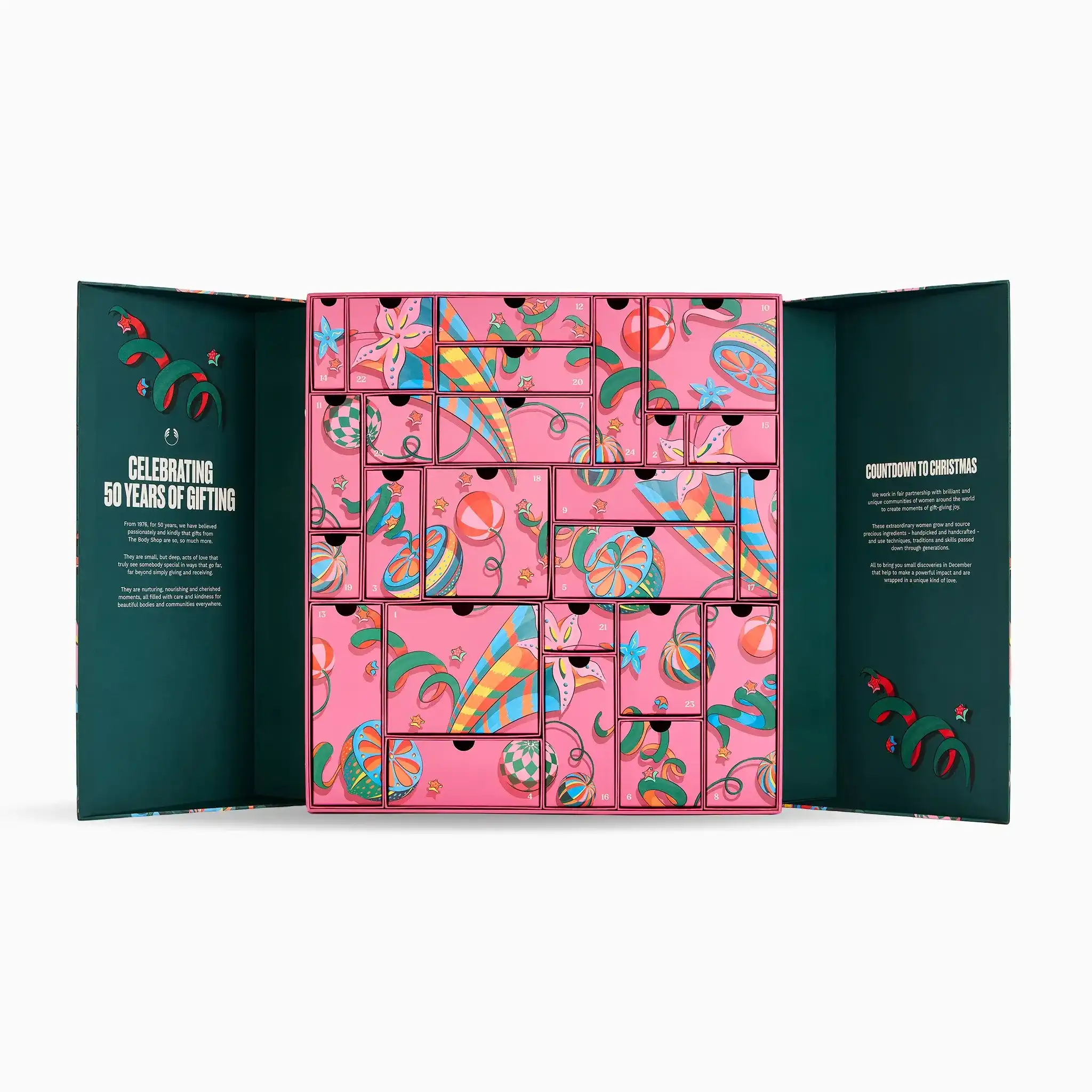
The Body Shop makes an especially cheerful use of contrast. A deep green outer cabinet opens to reveal vivid pink compartments covered in playful illustrations, allowing the calendar's personality to change as it is opened.
The combination feels exuberant without requiring an elaborate silhouette. Its classic cabinet structure remains practical, while the graphic interior supplies the visual surprise. It is a lesson in making the inside of a package every bit as important as its exterior.
IV. The Keepsake Generation: Packaging with a Second Life
Beautiful packaging has always made a strong first impression. This final group asks what happens when the last compartment is empty, from refillable drawer systems to practical paper-based storage.
23. Charlotte Tilbury — Hollywood Beauty Wonderland Advent Calendar
Gold detailing
Jewel handles
Reusable drawers
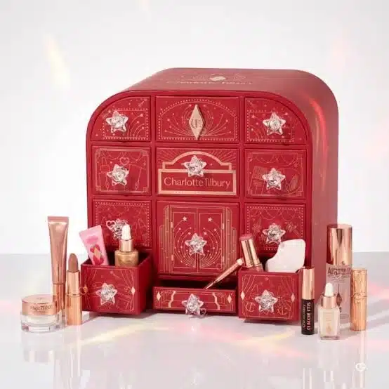
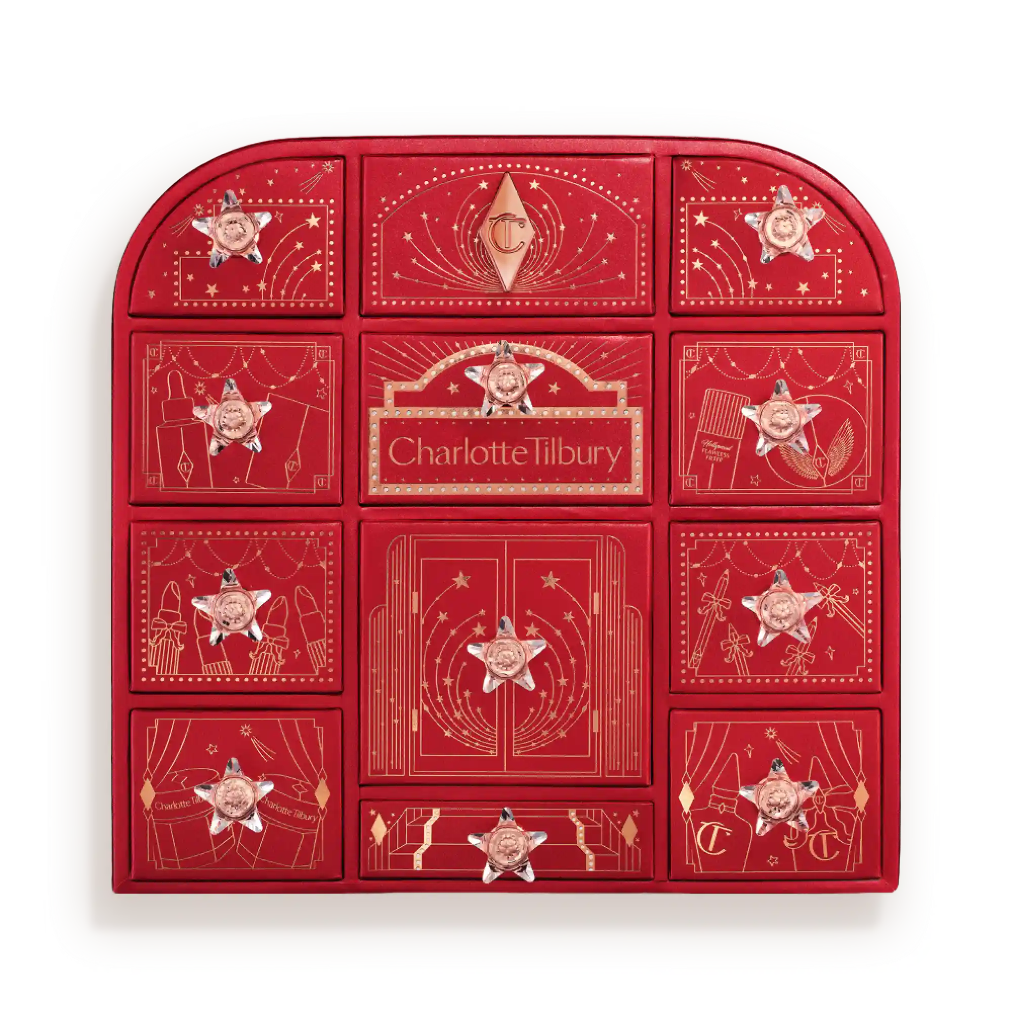
Charlotte Tilbury's Hollywood Beauty Wonderland translates old-school glamour into a ruby-red and gold miniature chest. Twelve jewel-handled drawers hold beauty surprises, while the symmetrical arrangement evokes the storage of a traditional vanity table.
The form is particularly persuasive because its second life is so easy to imagine. Once the countdown ends, the chest can become home to jewellery, makeup or other small treasures. The packaging already looks as though it belongs on a dressing table.
24. Fortnum & Mason — Beauty Advent Calendar
Ornate graphics
Keepsake case
Recyclable presentation
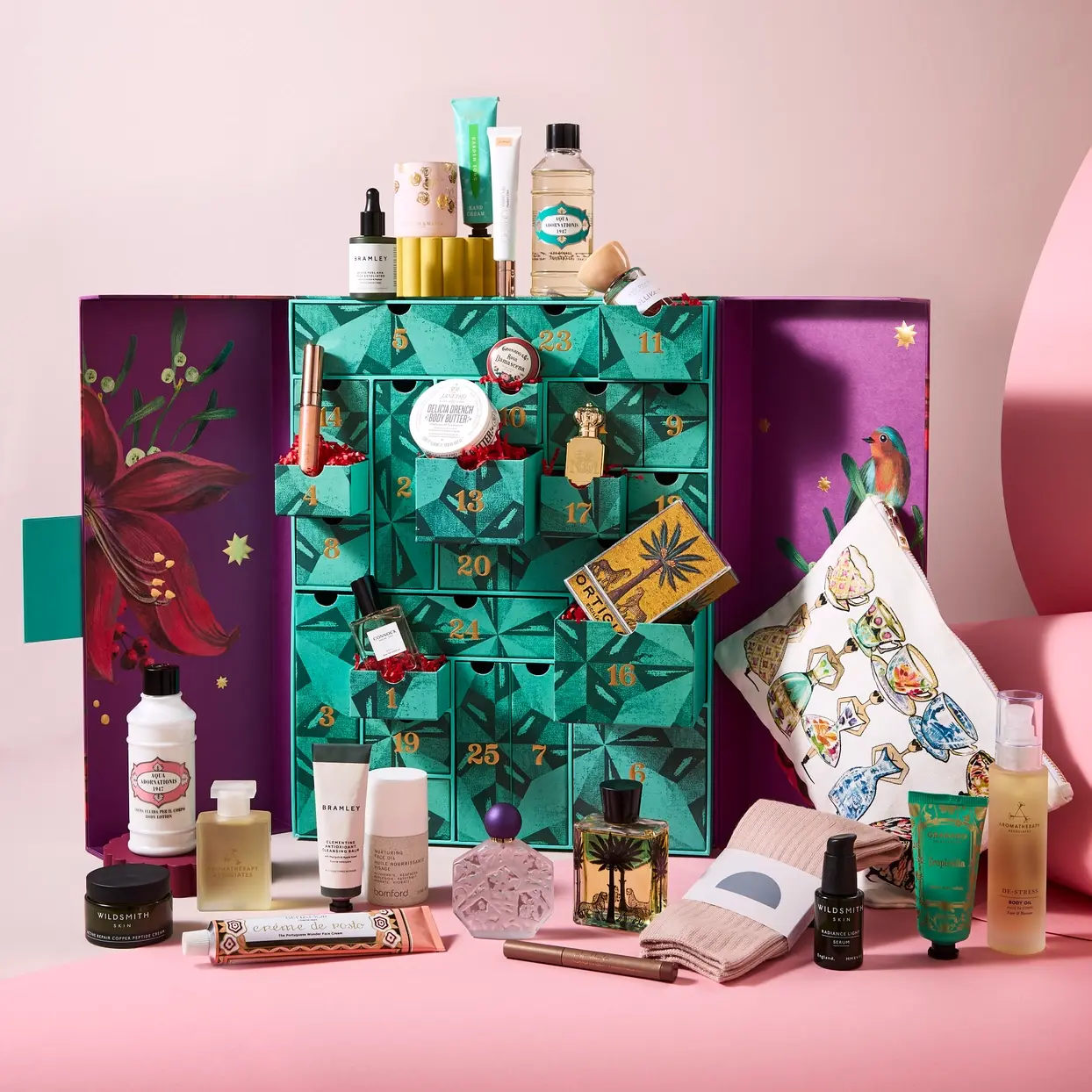
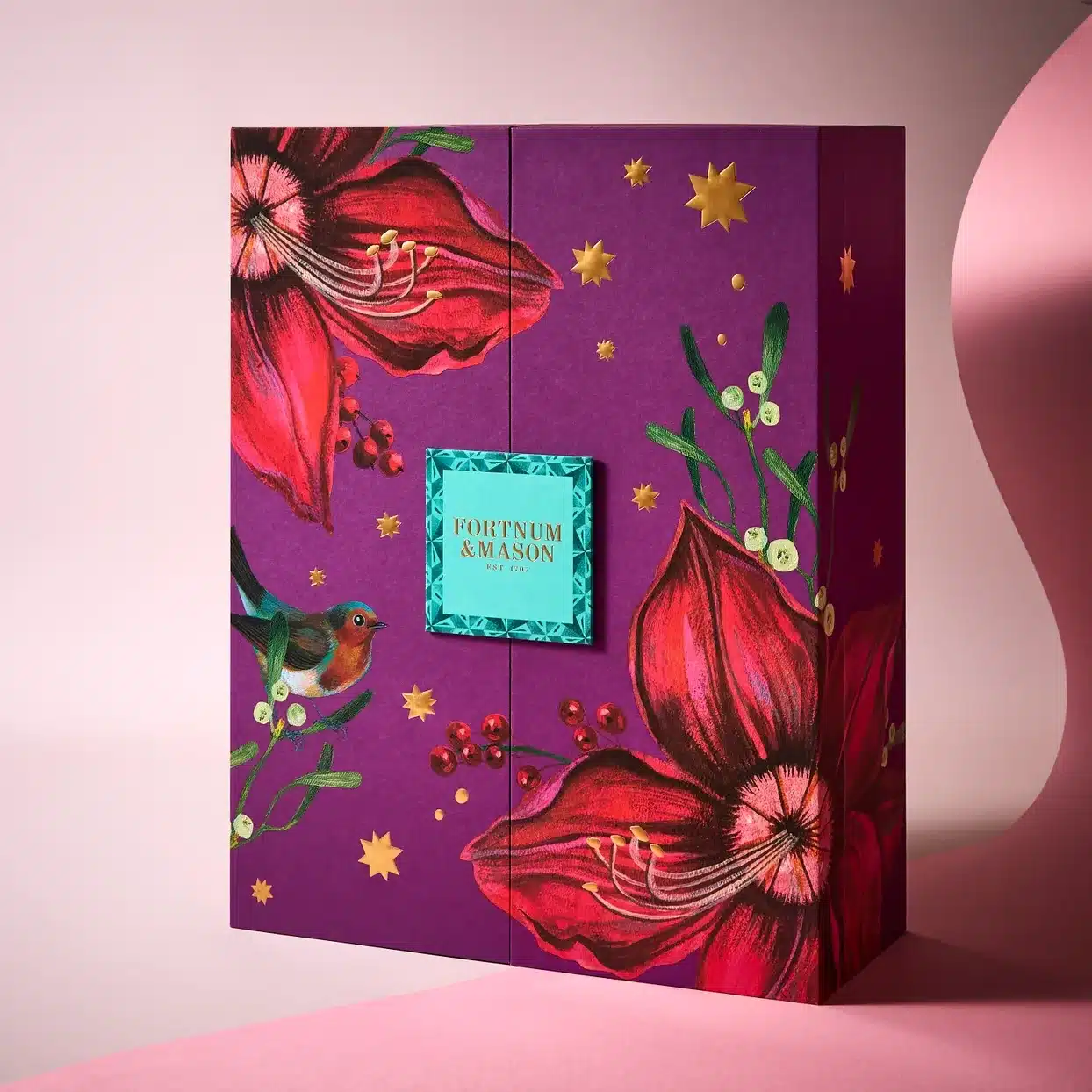
Fortnum & Mason places festive indulgence within a decorative drawer-style case designed to be refilled and reused. Its 25 gifts are presented with the sense of ceremony expected from the retailer's long gifting heritage.
The practical drawer layout makes the idea of reuse convincing. Individual compartments can later hold accessories, small keepsakes or another collection of festive surprises. This is a case where visual charm and a potential second function support each other naturally.
25. Space NK — Beauty Advent Calendar
FSC-certified materials
Vegetable-based inks
Recyclable design
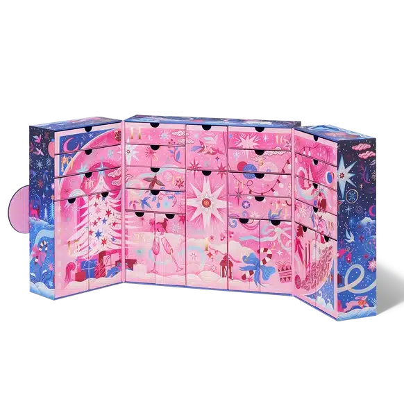
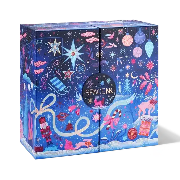
Space NK finds visual richness in a decorated paper-based structure rather than an extravagant mechanism. Its illustrated exterior and compartmented presentation give the beauty discoveries their own sense of occasion.
The material story is also part of the design: the brand highlights recyclable FSC-certified paper packaging and vegetable-based printing inks. Thoughtfully chosen paper materials do not automatically solve every environmental challenge, but they show how structural and graphic decisions can be considered together.
26. Dermalogica — Advent Calendar 2026
Numbered compartments
Mixed-size fit
Functional layout
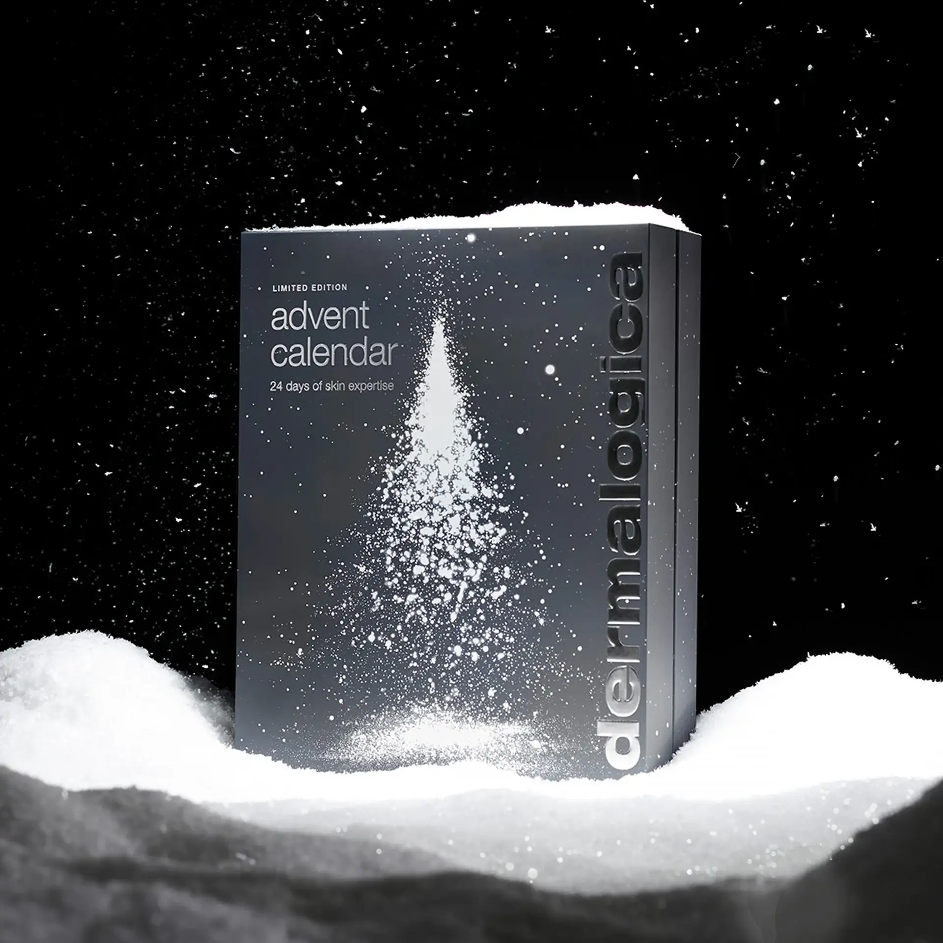
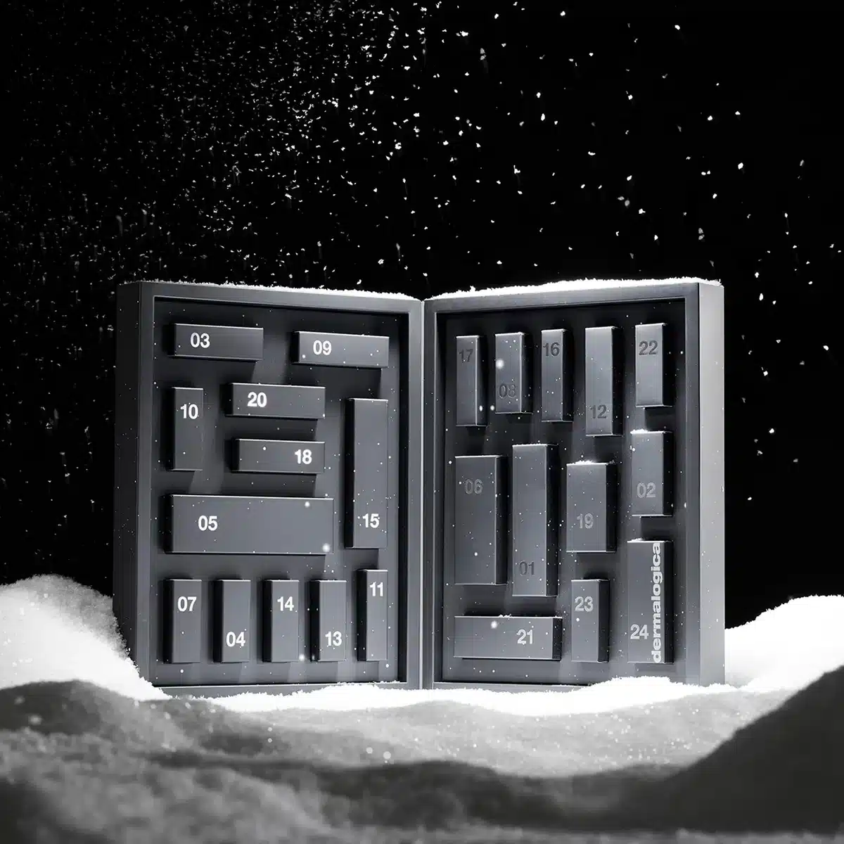
Dermalogica takes a more practical approach to the daily reveal. Its calendar arranges skincare discoveries and accessories in individual numbered compartments, with a clear interior structure that accommodates products of different dimensions.
It is a useful counterpoint to the more theatrical designs. For a skincare collection, internal fit matters: bottles, tubes and accessories need protection and easy access. Good Advent packaging is not simply attractive when closed; it must continue to work effortlessly throughout the countdown.
27. Papier — 24-Day Stationery Advent Calendar
Printed mini boxes
Graphic variety
Reusable drawers
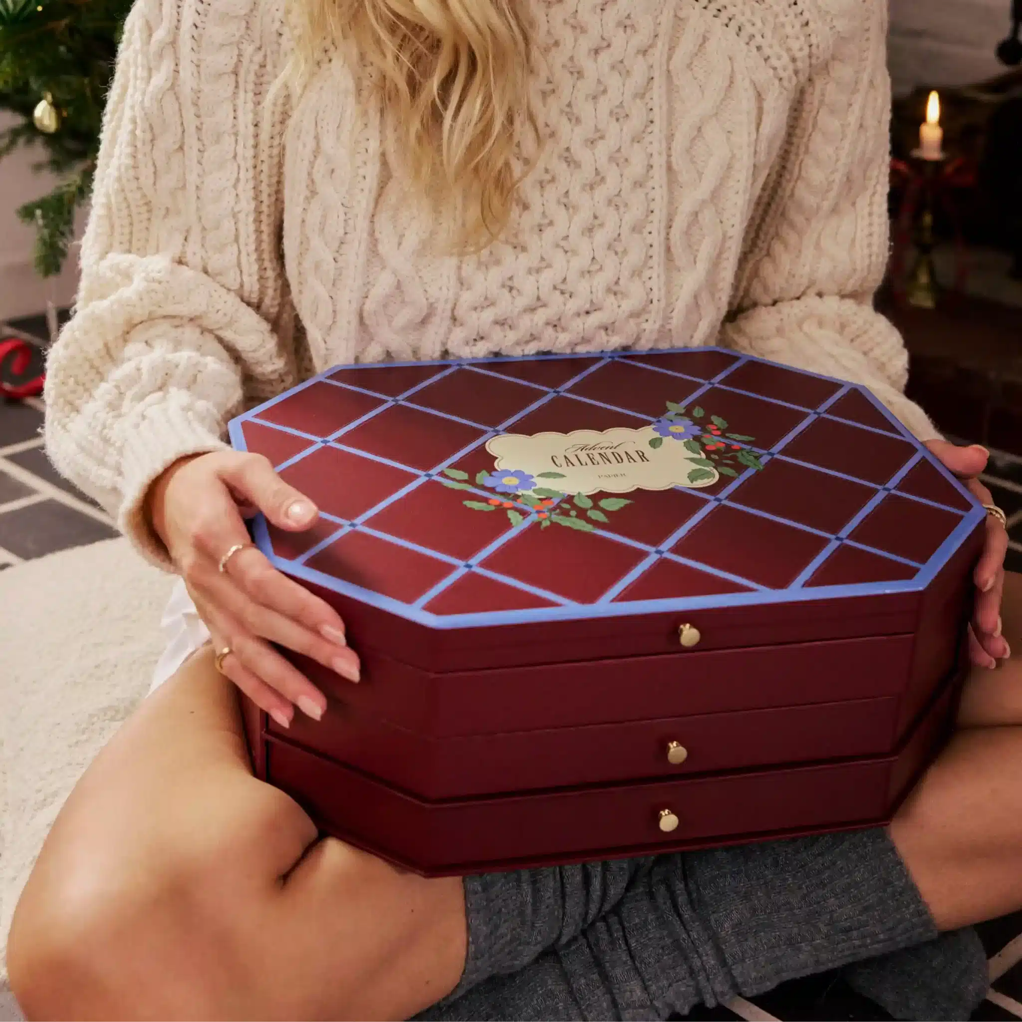
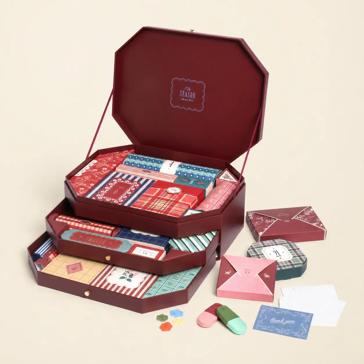
Papier carries its love of graphic design into a decorative stationery treasure chest. Twenty-four individual paper gift boxes are arranged within reusable drawers, with patterns inspired by the playful visual language of Italian food packaging.
For a stationery brand, this makes perfect sense. Paper is both the product and the medium of presentation, allowing illustration, folding and little daily rituals to feel like parts of the same story. The result is witty, colourful and wonderfully removed from conventional beauty-calendar styling.
Five Christmas Packaging Trends Emerging in 2026
1. Structure has become storytelling
Rituals’ train, Lush’s illustrated shop and P.Louise’s carousel communicate their concepts through shape before a single gift is unwrapped. For packaging designers, the point is not to imitate a building or a vehicle, but to consider whether the construction itself can carry the brand narrative.
2. Illustration is a signature, not a finishing touch
Liberty, Diptyque, L’Occitane and Papier each use a visual language that belongs unmistakably to the brand. Their calendars show how an ordinary paperboard box can feel collectible when the artwork is developed as part of a coherent design rather than applied as an afterthought.
3. Unboxing has become a daily ritual
An Advent calendar is opened repeatedly, not once. Drawers, hinged panels, individual parcels and rotating closures all shape that experience. The best mechanisms remain satisfying on day twenty-four, not just in the first unboxing video.
4. Seasonal colour has escaped the rulebook
Ruby red and forest green still have their place, but lilac, glittering black, plum, soft pink and copper-brown are equally at home in Christmas 2026. A distinctive brand palette can communicate the occasion without relying on predictable motifs.
5. Keepsake value is increasingly intentional
Charlotte Tilbury’s vanity-like chest, Fortnum & Mason’s refillable drawers and Papier’s stationery cabinet all suggest an afterlife for seasonal packaging. Yet reusability and sustainability are not interchangeable: durability, material selection, transport and actual consumer reuse all influence environmental impact.
What These Designs Mean for Custom Christmas Packaging
The lesson is not that every Christmas gift should become an oversized sculpture. It is that the packaging structure, product arrangement and visual story should feel like parts of the same idea. A fragrance collection may need a rigid cabinet with protective inserts; a beauty assortment might work best as varied pull-out drawers; stationery or smaller gifts may suit a family of printed folding cartons.
Smaller seven- or twelve-compartment formats can borrow the anticipation of Advent without requiring a full 24-day construction. Even a thoughtfully designed secret santa box can include coordinated miniature packages, an unusual lid or several moments of discovery. The principle is the same: making the act of receiving a present feel deliberate.
Materials deserve equal attention. Rigid paperboard can create a refined outer structure; paperboard cartons offer room for inventive graphics; molded pulp inserts can help secure products of different shapes. Foil stamping, embossing and specialty finishes can reinforce the concept, but they work best when they support a clear design rather than compete for attention.
Ultimately, a memorable calendar needs more than an arresting photograph. Its components must protect the contents, open comfortably and continue to make sense across the entire countdown.
The Final Word: The Box Is Part of the Gift
Dior turns its Parisian heritage into miniature architecture. Rituals gives nostalgia the shape of a train and a welcoming home. Lush makes both an illustrated paperboard shop and a tactile wicker hamper feel unmistakably its own. Meanwhile, MAC, Liberty and Diptyque show how finishes and artwork can make familiar structures surprisingly personal.
Some of these ideas are extravagant; others are remarkably simple. What connects them is an understanding that anticipation deserves a beautiful setting. The traditional Advent calendar may have begun as a way to count down the days, but in 2026 the most compelling examples make the packaging itself part of the celebration.

