Skincare Packaging Trends 2026 – Top 10 Personal Care Packaging Ideas & Graphic Design Trends
January 13, 2026 · Marcus
In 2026, skincare packaging has evolved far beyond mere containment—it’s become a silent wellness coach, a tactile meditation, and a statement of personal values. Picture twisting open a refillable serum bottle made from sugarcane pulp, scanning its surface to unlock your personalized morning routine, or dispensing exactly three drops of vitamin C through a precision smart dropper. Today’s leading personal care brands are weaving together clean formulations, circular design, and sensory-rich experiences to transform daily skincare into a conscious ritual. As airless systems protect preservative-free actives, monomaterial pumps simplify recycling, and biophilic graphics evoke natural calm, your packaging choices signal not just what’s inside the bottle, but what your brand stands for in an age of transparency and intention. Today, GVPAK’s skincare packaging specialists will guide you through the most impactful packaging innovations and graphic trends shaping personal care in 2026, helping you align your brand with the wellness-first future.
The Evolution of Skincare & Personal Care Packaging in 2026
By 2026, the skincare and personal care industry has undergone a profound transformation, moving decisively from the “Clean Beauty” movement toward comprehensive “Wellness Rituals.” Packaging is no longer simply functional—it’s an integral part of the therapeutic experience, designed to support mental health, environmental responsibility, and personalized self-care journeys. Consumers now expect packaging that protects ultra-sensitive, preservative-free formulations while minimizing environmental impact through truly circular systems. The rise of waterless concentrates, probiotic actives, and biotech-derived ingredients has demanded innovation in barrier protection, precision dispensing, and material science. Simultaneously, an aging global population is driving demand for ergonomic, accessible designs that serve users across all abilities. In this landscape, skincare packaging must balance scientific precision with emotional resonance, regulatory compliance with creative expression, and premium aesthetics with sustainable responsibility.
Top 10 Skincare & Personal Care Packaging Design Trends for 2026
The personal care packaging landscape in 2026 is defined by innovation that serves both product integrity and planetary health. From breakthrough material science to intelligent dispensing systems, these ten trends represent the convergence of consumer demand, regulatory evolution, and technological possibility. Each trend addresses specific challenges in modern skincare—whether protecting delicate active ingredients, enabling true circularity, or creating inclusive user experiences that serve diverse populations with dignity and delight.
1. Circularity First: Refillable High-End Serum Systems
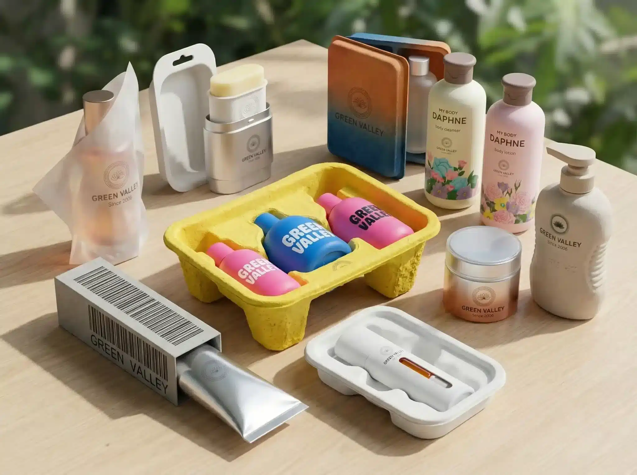
The refillable revolution has moved beyond niche luxury into mainstream personal care, with serum and treatment lines leading the charge. Premium skincare brands are investing in durable, beautifully engineered outer vessels—often in glass, anodized aluminum, or high-quality recycled plastics—paired with lightweight, easily replaceable inner cartridges. This approach dramatically reduces material consumption while maintaining the tactile luxury consumers expect from high-performance skincare. Some systems incorporate magnetic locking mechanisms for secure cartridge placement, while others feature twist-and-click designs that make refilling satisfying and foolproof. The key innovation lies in designing refill systems that feel premium rather than compromised, transforming what could be perceived as inconvenience into a valued ritual of conscious consumption.
Permanent outer vessels in weighted glass or anodized aluminum that signal investment-piece quality
Lightweight refill cartridges using minimal materials, often shipped in compostable mailers
Digital tracking through NFC chips that remind users when to reorder and reward refill purchases
Subscription models that deliver refills automatically, reducing packaging waste from individual shipments
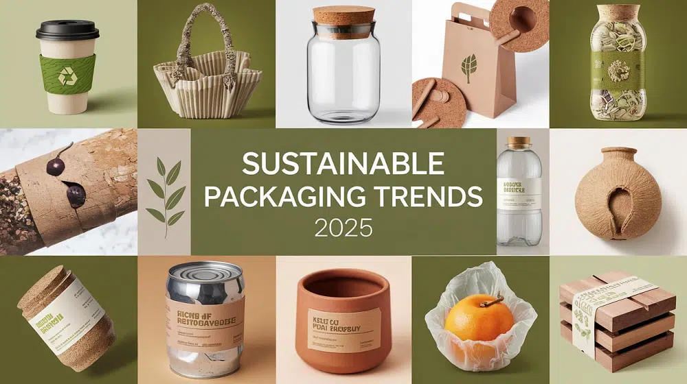
2. From Waste to Wonder: Bagasse & Pulp-Based Shower Bottles
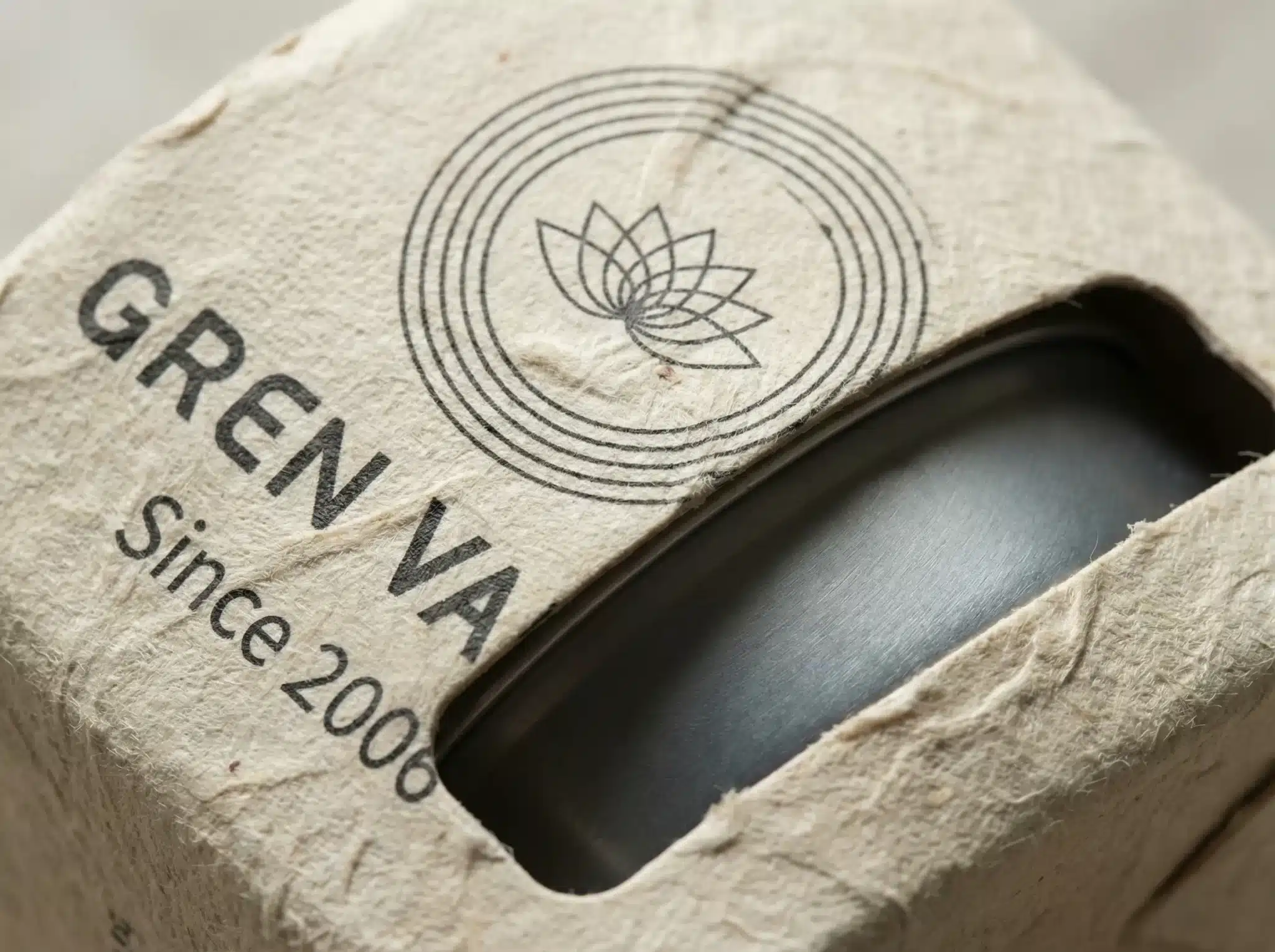
Molded pulp packaging—once reserved for protective shipping materials—has evolved into sophisticated primary packaging for shampoos, body washes, and shower products. Manufacturers are using bagasse (sugarcane fiber), bamboo pulp, and reclaimed paper to create water-resistant, biodegradable bottles and tubes that perform in humid bathroom environments. Advanced molding techniques now achieve smooth surfaces and precise threading for pump and cap fitment, while natural barrier coatings derived from algae or plant waxes provide moisture protection without compromising compostability. These containers break down completely in home compost or industrial facilities, offering a genuine end-of-life solution that plastic alternatives cannot match. The aesthetic is intentionally raw and textural, communicating authenticity and environmental commitment through visible fiber patterns and earth-toned colorways.
Bagasse and bamboo fiber bottles for shampoo, conditioner, and body wash that withstand shower humidity
Plant-based barrier coatings replacing plastic liners, enabling full biodegradability
Textured, organic aesthetics that celebrate visible fibers and natural color variation
Precision-molded threads compatible with standard pumps and closures
Clear composting instructions and certification symbols to guide proper disposal
3. The Airless Revolution: Preserving Preservative-Free Formulas
As clean beauty formulators eliminate synthetic preservatives in favor of naturally-derived actives, packaging technology must compensate by preventing oxidation and microbial contamination. Airless pump systems—once premium luxury items—are becoming essential for vitamin C serums, retinol treatments, and probiotic skincare. These systems use vacuum pressure to dispense product without introducing air, dramatically extending shelf life while maintaining ingredient potency. Modern airless designs incorporate transparent viewing windows so users can monitor remaining product, and some feature dose-control mechanisms that dispense precise amounts with each pump. The engineering challenge lies in creating systems that are both effective and affordable for mid-market brands, driving innovation in simplified mechanisms and cost-effective materials.
Vacuum-pressure dispensing that prevents air exposure and oxidation of sensitive actives
Transparent viewing strips or windows for monitoring product levels without opening
Dose-controlled pumps delivering measured amounts (e.g., one pump = 0.5ml) for consistent application
Extended shelf life enabling cleaner ingredient decks without synthetic preservatives
Cost-optimized designs bringing airless technology to accessible price points
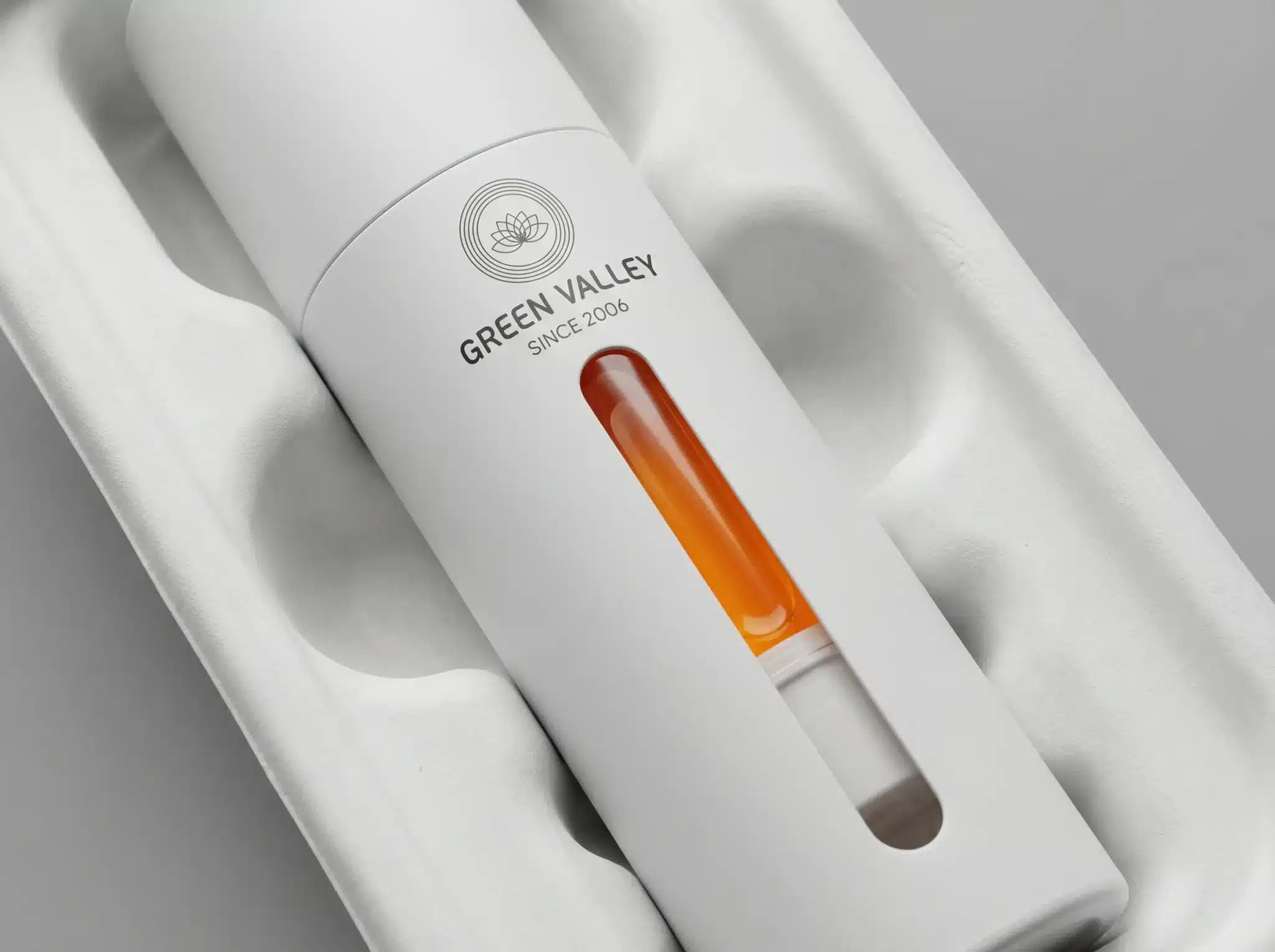
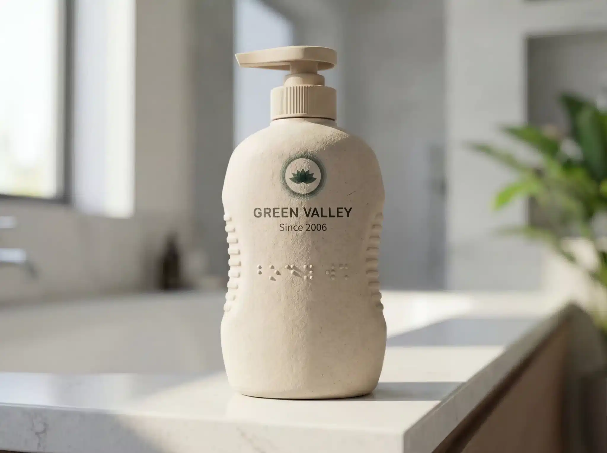
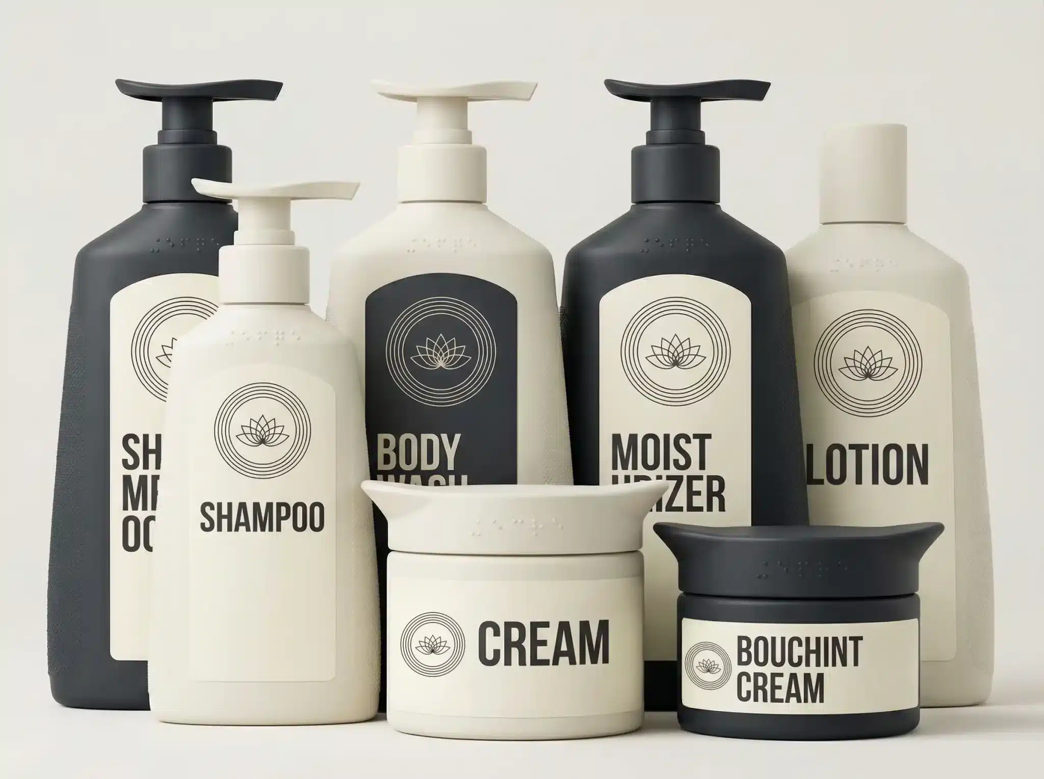
4. Universal Design: Inclusive Ergonomics for Aging Populations
With global demographics shifting toward older populations, skincare brands are embracing universal design principles that serve users across all abilities. This means packaging with larger, easy-grip surfaces, high-contrast labeling, tactile indicators for those with limited vision, and one-handed operation for users with reduced dexterity. Pump mechanisms require minimal pressure, jar openings feature non-slip textures, and tube caps incorporate leverage-friendly wings. Beyond physical accessibility, brands are integrating audio QR codes that provide spoken instructions when scanned, and large-format text that remains legible without reading glasses. These inclusive features benefit everyone—not just those with specific needs—creating packaging that’s genuinely easier and more pleasant to use regardless of age or ability.
Large-diameter openings and non-slip textures for users with arthritis or reduced grip strength
Low-pressure pumps requiring minimal force to dispense product
High-contrast color schemes and large-format text for aging vision
Tactile indicators (raised dots, textured panels) to differentiate products without reading labels
Audio-enabled QR codes providing spoken instructions and ingredient information
One-handed operation designs for users with limited mobility or temporary injuries
The holy grail of sustainable packaging—components made entirely from a single material—is finally becoming reality in personal care. Traditionally, pumps and closures combined multiple plastics and metal springs, making them impossible to recycle. Now, innovative suppliers are creating all-PE (polyethylene) or all-PP (polypropylene) systems where every component, including springs and valves, uses the same base material. This breakthrough enables true circular recycling, as the entire package can be processed together without sorting. Brands are also adopting mono-PET bottles with PET pumps, creating perfectly matched systems. The design challenge involves engineering components that maintain functionality while adhering to single-material constraints, often requiring creative mechanical solutions and precision manufacturing.
All-PE or all-PP pump systems with plastic springs replacing traditional metal components
Mono-PET bottles paired with PET pumps for perfect recyclability matching
Elimination of composite materials that contaminate recycling streams
Enhanced recyclability labeling showing material composition and recycling pathway
Partnerships with recycling facilities to ensure systems are actually processed, not just theoretically recyclable
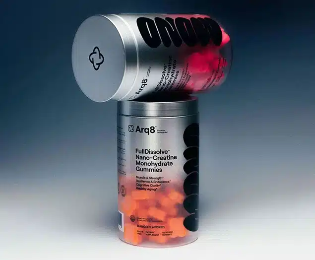
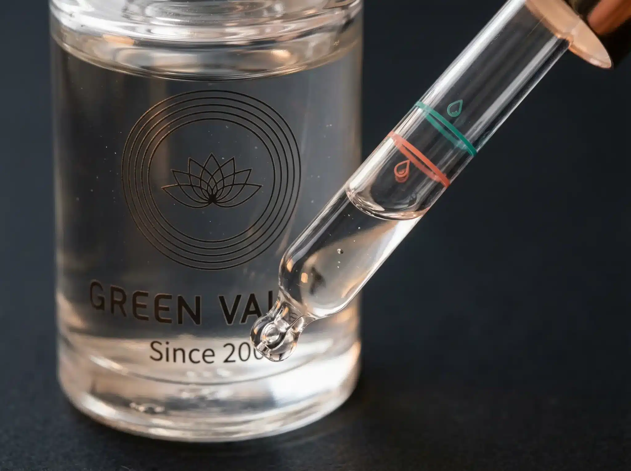
6. Smart Droppers: Precision Dosing for Active Ingredients
As skincare becomes increasingly sophisticated with potent actives like retinoids, peptides, and acids, precision dosing has become both a safety requirement and a user expectation. Smart dropper systems now incorporate calibrated markings, controlled-release mechanisms, and even digital sensors that communicate with smartphone apps. Some designs feature measured chambers that fill to exact volumes, preventing over-application of expensive or potentially irritating ingredients. Others use color-coded rings or tactile clicks to indicate dose sizes (one drop, three drops, half-dropper). The most advanced systems connect via Bluetooth to track usage patterns, send refill reminders, and provide personalized application coaching based on skin response data collected through connected devices.
Calibrated droppers with measurement markings for consistent application of potent actives
Measured-chamber systems that fill to predetermined volumes, preventing waste or over-application
Color-coded or tactile dose indicators for intuitive use without constant label checking
App-connected smart droppers tracking usage and providing personalized routines
Controlled-release mechanisms ensuring slow, steady dispensing for precision
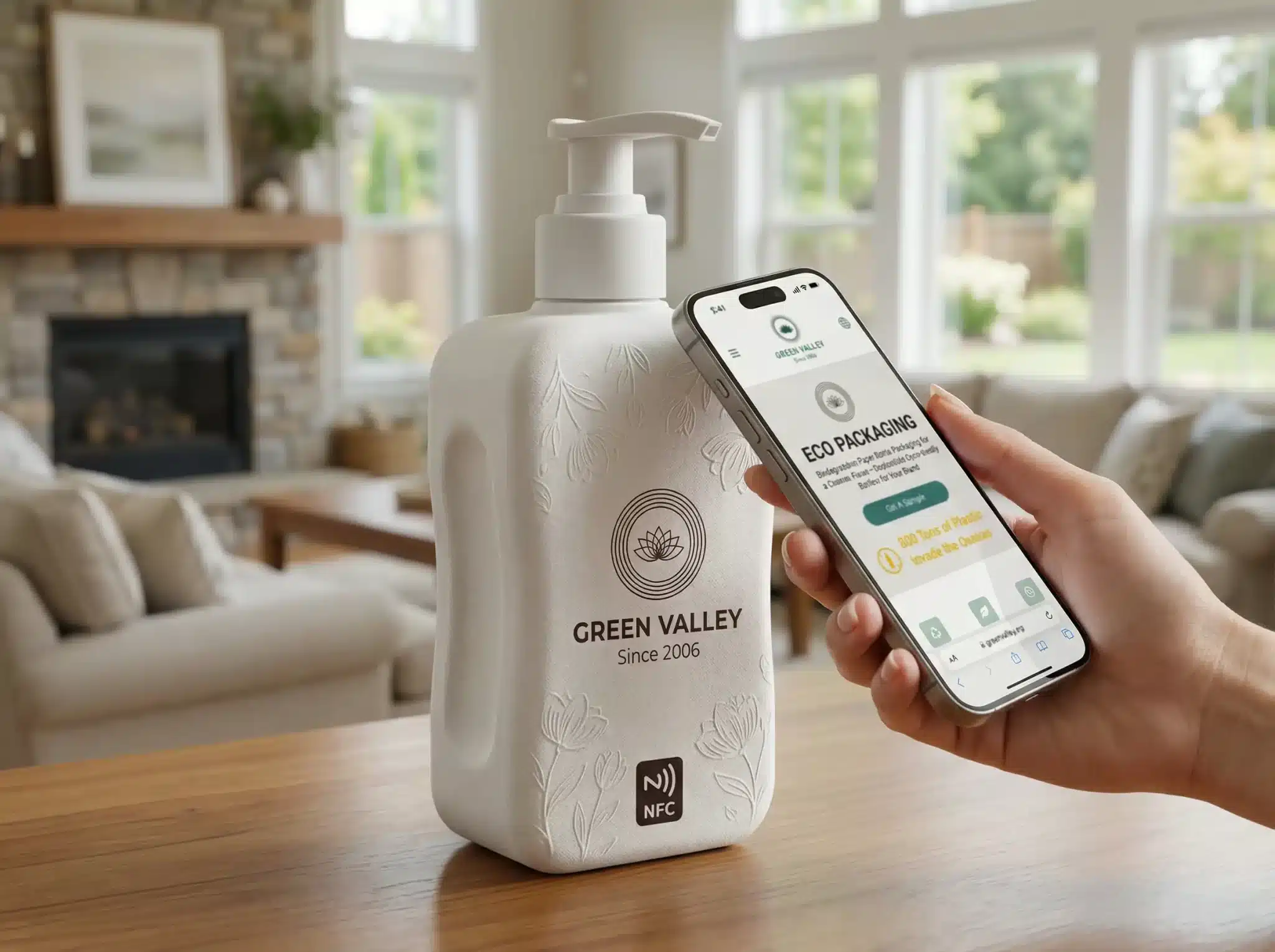
7. Connected Care: NFC Tags for Personalized Skin Coaching
Near-field communication (NFC) chips embedded in skincare packaging are transforming products into interactive wellness platforms. A simple smartphone tap unlocks personalized content—tutorial videos demonstrating application techniques, ingredient transparency down to sourcing details, authentication certificates to combat counterfeiting, and even skin analysis tools that recommend complementary products. Some brands use NFC to deliver sequential content, revealing new tips and information as users progress through a product, creating an evolving relationship between consumer and brand. The technology also enables closed-loop systems where scanning an empty container triggers refill orders or recycling instructions, making sustainable behaviors frictionless. For brands, NFC provides invaluable data on actual product usage patterns, informing future formulation and packaging decisions.
Personalized skincare coaching based on user data and product usage patterns
Sequential content delivery revealing new information as users progress through products
Automated refill ordering and recycling guidance triggered by scanning empty containers
Loyalty program integration rewarding sustainable behaviors and consistent routines
Product authentication combating counterfeit personal care products
8. Anti-Microbial Packaging: Self-Sanitizing Personal Care Surfaces
Post-pandemic hygiene awareness persists, driving demand for packaging that actively inhibits bacterial and fungal growth. Manufacturers are incorporating silver ion technology, copper-infused plastics, and antimicrobial glass coatings that reduce microbial contamination on package surfaces. This is particularly valuable for jar-format skincare where fingers repeatedly contact product, and for shared household items like body lotions or hand creams. Some innovations include photocatalytic coatings that activate under bathroom lighting to break down bacteria, or time-release antimicrobial agents that remain effective throughout the product’s shelf life. These technologies complement—not replace—good hygiene practices, but they provide an additional layer of protection that conscious consumers increasingly expect, especially for products applied to sensitive facial skin.
Silver ion and copper-infused materials reducing surface bacterial colonization
Antimicrobial glass coatings for luxury jar packaging in spa and treatment lines
Photocatalytic surfaces activated by bathroom lighting to continuously sanitize
Time-release antimicrobial agents maintaining effectiveness throughout shelf life
Particularly valuable for jar formats, shared household products, and spa/professional settings
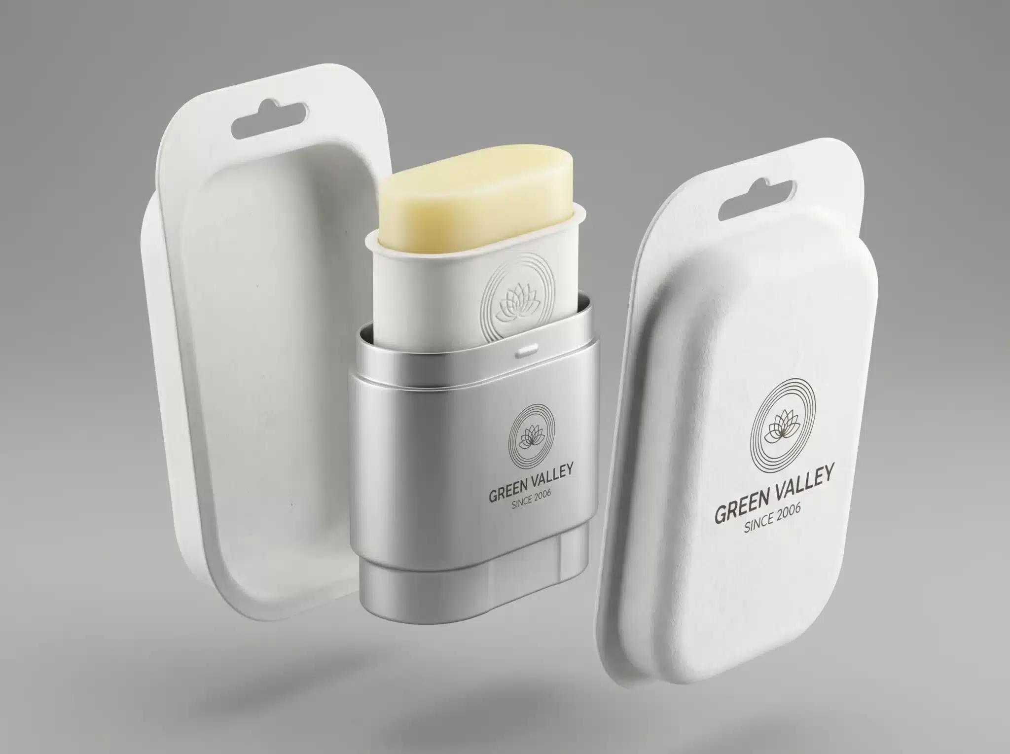
9. Zero-Waste Solids: Concentrated Skincare in Compostable Wraps
Waterless skincare concentrates—cleansing balms, solid serums, powder exfoliants—are eliminating the need for liquid-containing bottles entirely. These concentrated formulas activate with water during use, reducing shipping weight and packaging requirements dramatically. Products are wrapped in paper, beeswax-coated cloth, or plant-based films that compost completely, or packaged in reusable tins and containers designed for infinite refills. Some brands offer naked products with no packaging at all beyond a recyclable shipping carton. This category particularly appeals to minimalists, travelers, and zero-waste advocates, but the format is expanding beyond niche into mainstream as formulators master textures and performance that rival traditional liquid products. The challenge lies in protecting highly concentrated actives from humidity and light while maintaining compostable materials.
Compostable wraps using beeswax-coated cloth, plant-based films, or simple paper bands
Reusable metal tins designed for multiple refill cycles with minimal material
“Naked” products shipped in recyclable cartons with no individual packaging
Concentrated formulas reducing shipping weight and carbon footprint by up to 80%
Moisture and light protection through intelligent material selection without compromising compostability
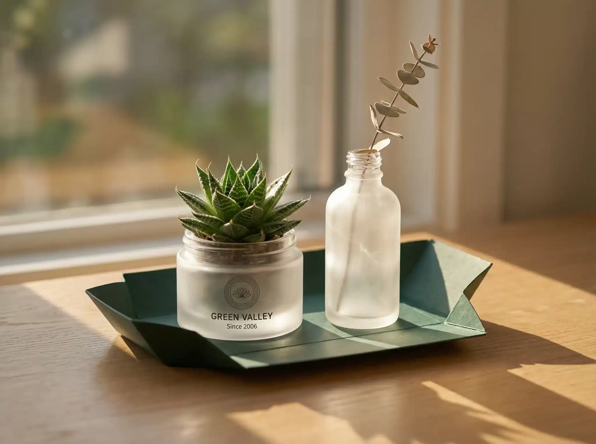
10. Secondary Life: Packaging that Transforms into Home Decor
Rather than designing packaging to be discarded, innovative brands are creating containers with intentional second lives as functional objects. Skincare jars become planters with drainage holes molded into their bases, serum bottles transform into bud vases through removable droppers, and gift boxes convert into desk organizers or jewelry storage through thoughtful structural design. This approach extends product value perception while reducing waste, as consumers emotionally attach to beautiful objects they continue using. Some brands include transformation instructions on inside labels or through QR code tutorials, while others design the secondary function to be immediately obvious. The strategy works best for premium and gift-oriented products where the additional manufacturing investment is justified by enhanced brand perception and customer loyalty.
Jars with integrated drainage becoming planters for succulents or herbs
Serum bottles designed as bud vases when droppers are removed
Gift boxes that unfold into desk organizers, jewelry trays, or display shelves
Inside-label or QR-linked tutorials demonstrating transformation processes
Premium materials justifying the additional manufacturing investment through extended brand presence
Emotional attachment reducing disposal rates and increasing word-of-mouth marketing
Top 10 Graphic Design Trends for Skincare & Personal Care (2026)
While sustainable materials and smart features define the functional evolution of skincare packaging, graphic design creates the emotional connection that drives purchase decisions and brand loyalty. In 2026, personal care graphics navigate the tension between clinical credibility and sensory delight, scientific transparency and artistic expression. These ten visual trends reflect deeper cultural shifts—toward authenticity over perfection, nature over artifice, and meaning over mere aesthetics. Each approach offers skincare brands distinct opportunities to communicate values, connect with specific demographics, and differentiate in an increasingly crowded wellness marketplace.
Look: Technical drawings, molecular diagrams, schematic layouts, precision line work, monochromatic color schemes.
Why it works: Communicates scientific rigor and clinical effectiveness; appeals to ingredient-conscious consumers seeking evidence-based skincare.
Skincare Use: Active ingredient serums with molecular structure graphics, clinical treatment lines with technical specifications, dermatologist-developed products emphasizing research credentials.
The laboratory blueprint aesthetic brings the visual language of scientific documentation to skincare packaging, using technical drawings, cross-sections, and schematic diagrams to communicate formula sophistication. Ingredient molecules are rendered as precise structural diagrams, packaging layouts echo patent drawings, and typographic choices favor technical sans-serifs reminiscent of laboratory labeling. This approach particularly resonates with consumers who prioritize clinical validation and transparent ingredient disclosure, positioning products as serious tools rather than indulgent luxuries. Monochromatic palettes—blacks, whites, grays—or scientific color coding (blue for hydration, yellow for vitamin C) reinforce the medical authority. The design strategy works brilliantly for active ingredient-focused brands, dermatologist collaborations, and treatment-oriented products where efficacy claims demand visual credibility.
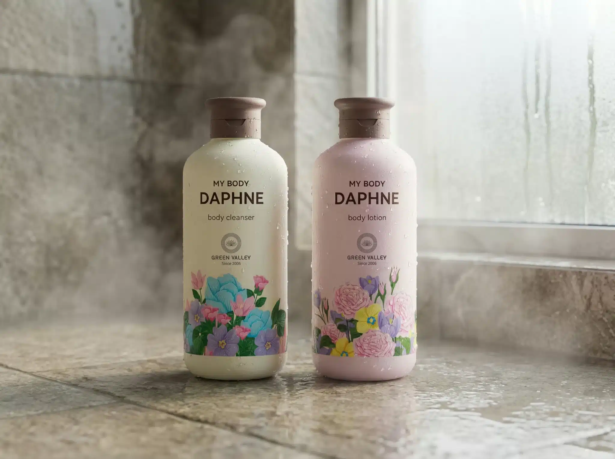
2. Biophilic Gradients: Nature-Inspired Color Transitions
Why it works: Creates calm, organic feeling; taps into biophilic design principles connecting humans to nature.
Skincare Use: Botanical face oils with forest-to-sky gradients, mineral sunscreens echoing stone and sand, ocean-inspired cleansers with aquatic color flows.
Biophilic gradient design draws color inspiration directly from natural environments, creating smooth transitions that echo sunrise progressions, ocean depth variations, or the way light filters through forest leaves. Unlike arbitrary color blends, these gradients reference specific natural phenomena, grounding their aesthetic in recognizable environmental experiences. A hydrating serum might feature the blue-to-azure progression of shallow tropical waters, while a nighttime retinol uses the deep purple-to-black transition of twilight. The effect is simultaneously calming and sophisticated, avoiding the overly literal botanical illustrations of previous clean beauty trends while maintaining connection to nature. This approach works particularly well for products emphasizing natural or naturally-derived ingredients, eco-conscious formulation, or wellness-focused routines where the packaging itself contributes to the therapeutic experience.
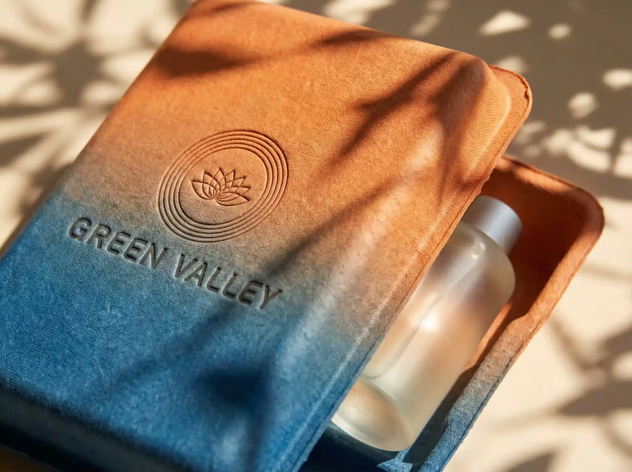
3. Transparency & Raw Textures: The “No-Filter” Branding
Why it works: Counters airbrushed perfection culture; builds trust through visual honesty and material authenticity.
Skincare Use: Products celebrating real skin textures, recycled material packaging showing visible fiber, unretouched user testimonials.
The transparency and raw texture movement rejects the heavily processed, perfection-focused visuals that dominated beauty marketing for decades. Packaging celebrates visible paper fibers in recycled cardboard, deliberately shows the natural color variation in plant-based plastics, and uses photography that depicts real skin with texture, pores, and natural variation. Typography might be slightly irregular, printed with visible halftone dots or screen texture. Product photography is shot in natural light with minimal retouching, showing how formulas actually look in use. This no-filter approach resonates powerfully with consumers fatigued by impossible beauty standards and skeptical of overly polished brand messaging. It’s particularly effective for brands positioned around skin acceptance, inclusive beauty, and authentic self-care rather than transformation promises.
4. Digital Wellness: Soothing, High-Contrast Neon Accents
Look: Calming base palettes (soft blues, greens, neutrals) punctuated with electric neon highlights; digital-native color systems.
Why it works: Bridges physical wellness products with digital lifestyle; creates visual energy while maintaining sophisticated restraint.
Digital wellness graphics acknowledge that modern self-care exists at the intersection of physical ritual and digital technology. Packaging uses predominantly soothing, muted backgrounds—soft sage greens, powder blues, warm beiges—but punctuates them with unexpected bursts of electric neon in electric pink, acid yellow, or cyber blue. The effect suggests calm competence with moments of energetic optimism, mirroring how wellness apps use interface design. This approach works brilliantly for products with digital components (NFC-enabled packaging, app-connected devices, skin analysis tools) and brands targeting digitally native consumers who expect their physical products to speak the same visual language as their screens. The high contrast ensures shelf impact while the restrained color ratios maintain sophistication.
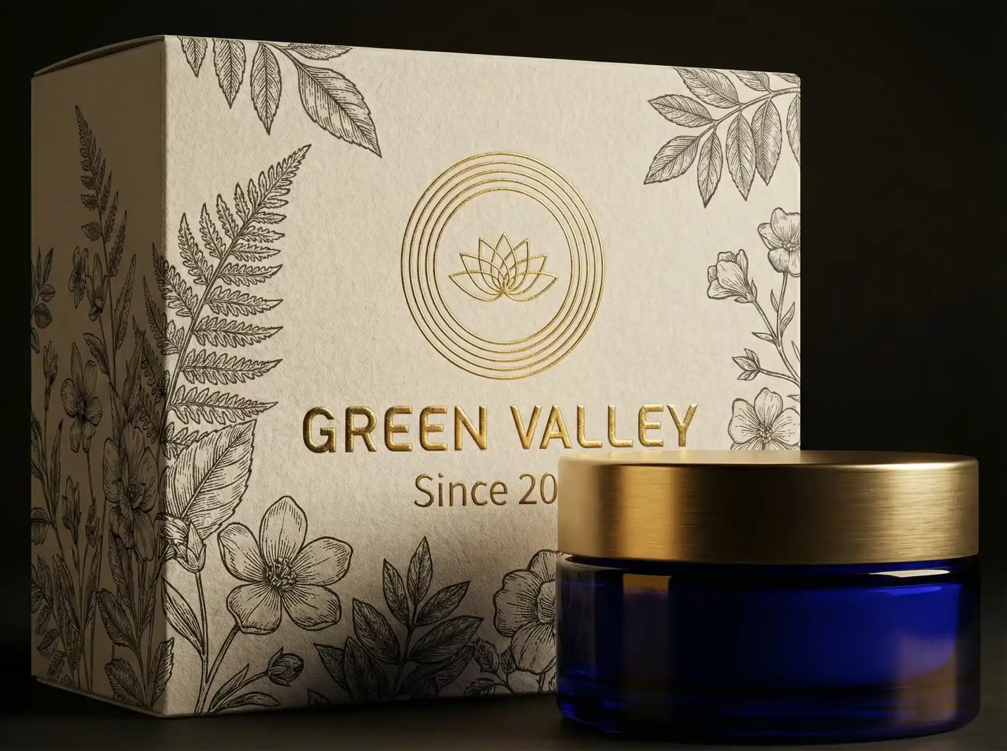
5. Heritage Etch: Modern Apothecary & Retro Apothecary Vibes
Look: Engraving-style line work, vintage pharmaceutical typography, apothecary jar references, sepia or monochrome palettes.
Why it works: Evokes craftsmanship, heritage formulation, and timeless effectiveness; suggests ingredients have historical validation.
Heritage etch design resurrects the visual language of 19th-century apothecaries and early pharmaceutical packaging, using detailed engraving-style illustrations, serif typography reminiscent of old prescription labels, and layout structures borrowed from vintage botanical reference books. Ingredients are depicted through precise botanical drawings rather than photographic images, and Latin nomenclature appears alongside common names. The palette tends toward sepia, cream, forest green, and deep burgundy—colors associated with traditional medicine and natural ingredients. This aesthetic works powerfully for brands emphasizing time-tested botanical ingredients, traditional extraction methods, or heritage formulation knowledge passed through generations. It provides sophisticated gravitas that counters the sometimes frivolous perception of beauty products, repositioning skincare as serious medicine.
Tactile typography elevates minimalist packaging through dimensional text treatments that invite touch. Rather than relying on color or complex graphics, these designs use blind embossing (raised text with no ink), debossing (recessed text), or selective varnishes that create subtle textural variation. The typography itself becomes sculpture, often executed in refined sans-serifs or elegant serifs with generous letterspacing. The approach requires restraint—too much dimensional treatment becomes cluttered—so successful examples feature just the brand name or a single key word rendered tactilely. This strategy works beautifully for premium products where the packaging experience contributes to perceived value, and for brands positioning around mindfulness and sensory awareness where touch is integral to the ritual.
7. Surreal Skin: Abstract Human Forms & Fluid Shapes
Look: Abstracted body silhouettes, flowing organic shapes suggesting skin or water, dreamlike figure compositions.
Why it works: Represents skincare’s transformative potential without literal before/after imagery; feels artistic and inclusive.
Skincare Use: Body care collections, transformative treatment lines, products celebrating diverse beauty.
Surreal skin graphics use abstracted human forms—silhouettes that might be bodies, might be landscapes, might be flowing water—to suggest transformation and beauty without relying on specific facial features or body types. These fluid, organic shapes avoid the pitfalls of traditional beauty advertising (which often excludes or idealizes) while maintaining clear connection to the human body and skincare’s purpose. Color palettes tend toward skin tone ranges expanded into unexpected territories (lavender skin, mint skin, golden skin) or monochromatic treatments that eliminate literal skin representation entirely. This approach allows brands to celebrate the body and beauty while remaining inclusive, artistic, and conceptually sophisticated rather than literal and potentially limiting.
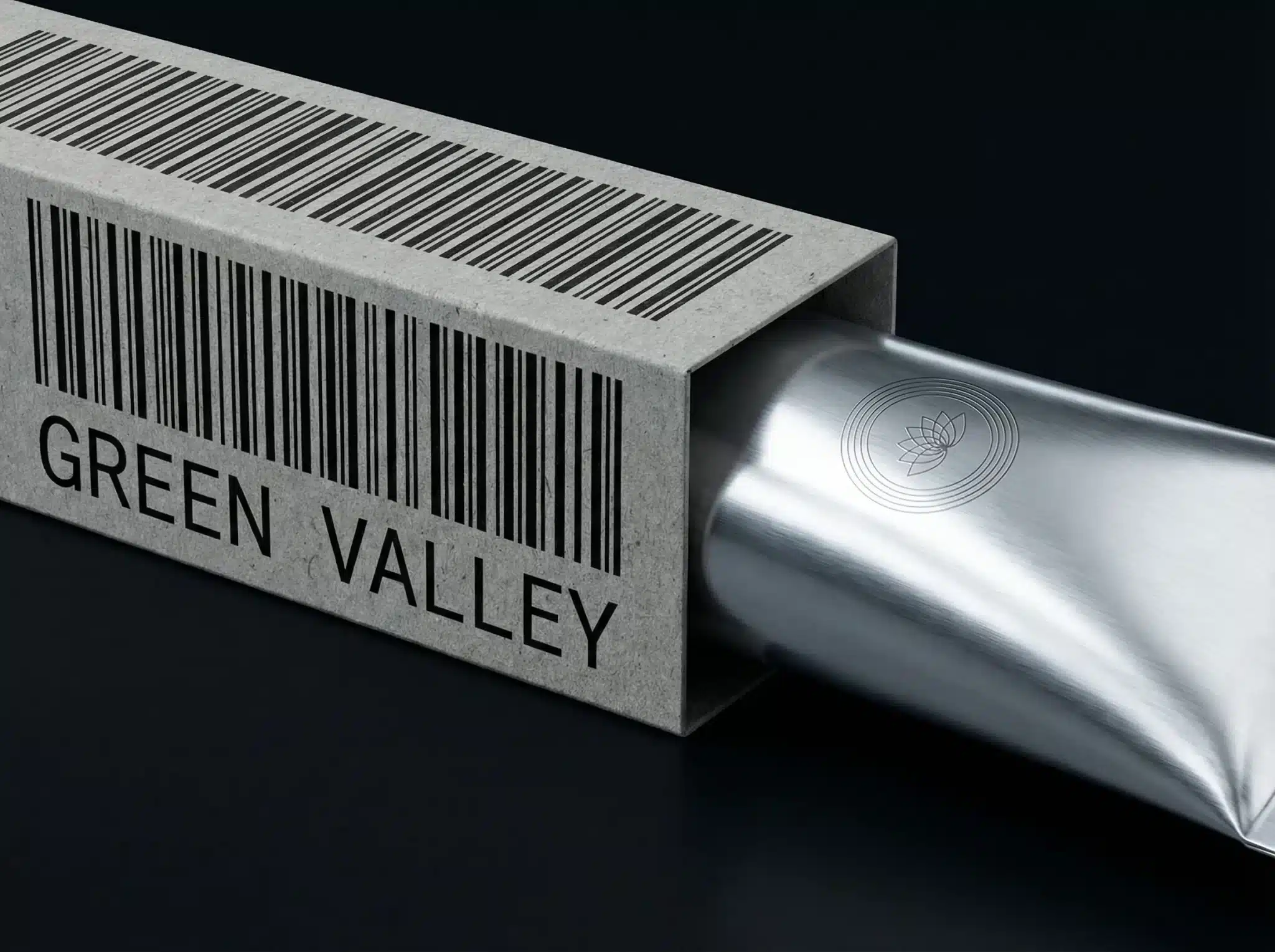
8. Micro-Industrial: Utilitarian Codes and Barcode Art
Micro-industrial design borrows visual cues from manufacturing, shipping, and industrial quality control systems—barcodes, batch numbers, utilitarian label layouts, and monospaced technical typefaces. Rather than hiding these functional elements, the design celebrates them as aesthetic features, suggesting transparency, precision manufacturing, and serious quality control. Some brands incorporate oversized batch numbers as decorative elements or use barcode-style graphics as pattern. The palette is typically stark—black and white, occasionally with safety yellow or industrial orange accents. This aesthetic resonates strongly with consumers who distrust marketing embellishment and appreciate straightforward functionality, particularly in men’s grooming and gender-neutral personal care where traditional beauty packaging codes feel inappropriate.
Grainy soft-focus graphics embrace analog photography aesthetics—visible film grain, soft focus, gentle light leaks, and pastel color washes that feel more painterly than photographic. The effect is simultaneously nostalgic and contemporary, combining the warmth of film photography with digital color manipulation. Products photographed in this style appear to glow from within, surrounded by halos of diffused light and gentle color gradients. This treatment works beautifully for products positioned around nighttime rituals, calming sensitive skin, or meditative self-care moments where the packaging itself should induce relaxation. The dreamy quality suggests transformation happening gently, over time, rather than through aggressive intervention—a positioning increasingly important as consumers reject harsh actives in favor of skin barrier support.
10. Kidcore Revival: Playful & Nostalgic Personal Care Kits
Why it works: Injects joy into self-care; appeals to Gen Z’s nostalgic playfulness and rejection of serious beauty culture.
Skincare Use: Acne treatments repositioned as positive, bath products for adults, mood-boosting morning skincare, gift sets.
Kidcore personal care embraces the visual exuberance of childhood—bright primary colors, cartoon characters, sticker-like graphics, and bubble letters—but applies them to adult products with sophisticated formulation. This isn’t infantilizing; rather, it’s reclaiming playfulness and joy that adult life and serious beauty culture often suppress. The aesthetic works particularly well for products addressing concerns that have traditionally carried shame or stress—acne treatments become cheerful rather than clinical, bath products encourage adult play, morning routines get mood-boosting color injection. For brands targeting Gen Z consumers who’ve grown up rejecting millennial minimalism, kidcore offers permission to be maximalist, expressive, and unabashedly fun. The key is balancing playful aesthetics with genuinely effective formulation, ensuring the packaging promise matches the product performance.
Partner with GVPAK for Innovative Skincare Packaging Solutions in 2026
Ready to transform your skincare brand with packaging that performs as impressively as your formulations? At GVPAK.COM, we specialize in sustainable, intelligent personal care packaging solutions that address the unique challenges of modern skincare—from airless systems protecting preservative-free actives to monomaterial pumps enabling true circularity. Our expertise spans molded pulp shower bottles, precision-dosing droppers, NFC-enabled smart packaging, and inclusive ergonomic designs that serve users across all abilities. Whether you’re launching a clinical treatment line requiring laboratory-inspired graphics, a wellness-focused brand needing biophilic design, or a playful Gen Z product demanding kidcore energy, our team brings both technical capability and design vision to every project. Connect with GVPAK to discuss how we can help you create skincare packaging that protects potent ingredients, delights conscious consumers, and communicates your brand’s commitment to both skin health and planetary wellness in every beautiful, functional detail.
Dedicated to providing customers with one-stop solutions, from creative design to meticulous production and secure delivery, ensuring perfection at every step.