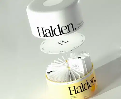
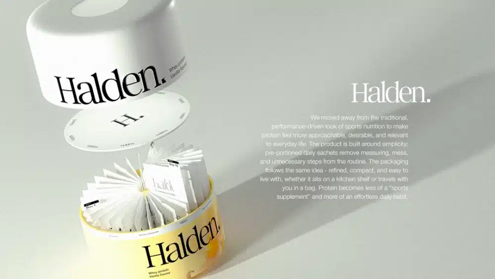
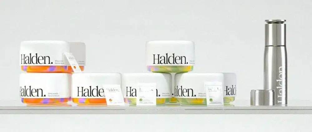
At first glance, most people would mistake this jar for face cream or a scented candle. It has a matte white cylinder, a small circular “H.” logo in the center of the lid, and just one line of serif text with a period: “Halden.” There are no nutrition claims and no big bold text saying “30g Protein Per Serving.”
This is the protein powder packaging designed by Kazakhstan designer Yernaz Ramazanov for a whey protein brand. He did not put any gym-related words on the tub, nor did he use the heavy black fonts common in this industry. His key step was making the protein powder look nothing like protein powder.
Project Info
| Brand |
Halden (Whey Protein) |
| Designer |
Yernaz Ramazanov (Behance: prostoera) |
| Location |
Almaty, Kazakhstan |
| Release Date |
August 2026 |
| Category |
Sports Nutrition / Functional Food · Branding + Packaging Design |
About the Designer: Yernaz Ramazanov
Yernaz Ramazanov is a brand and packaging designer from Almaty, Kazakhstan. His work covers full branding, logo design, and packaging design for global clients. Besides Halden, his notable projects include KANSO, FERRUM 32, LITTLE ADAM Coffee & Bakery, and Yoki Pet Food Packaging, spanning food, beverage, pet care, and coffee industries.
He also creates 3D renders independently. All product renders in this project were built using Cinema 4D and Octane Render, giving the brand cinematic visual effects without needing an external 3D team.
Sports Nutrition Packaging Has Been Stuck in Black and Bold for 20 Years
The visual language of sports nutrition has barely changed in two decades. Black backgrounds, heavy sans-serif fonts, muscle outlines, lightning bolts, and metallic textures repeat everywhere. On any e-commerce shelf, a row of dark tubs looks almost identical.
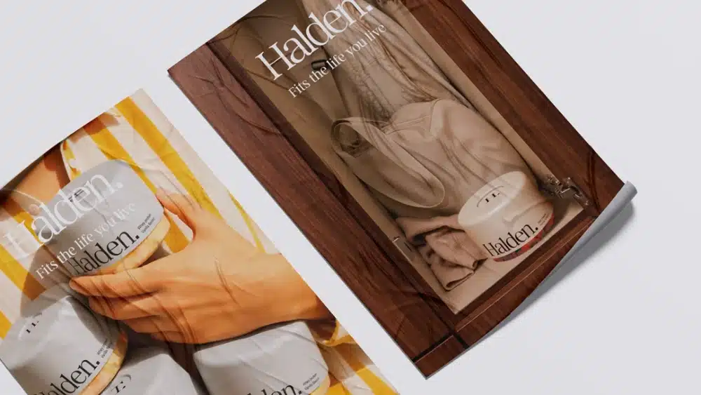
Halden’s designer chose the opposite path. Instead of keeping protein powder tied to lifting weights and heavy gym scenes, he brought it into everyday life. Halden’s photos do not feature gym backgrounds. Instead, you see storage scenes in wooden drawers, single-serve sachets peeking out of jacket pockets, brand books on the beach, and canvas bags resting on the grass.

Designing the Tub Like Face Cream
Halden uses a matte white cylindrical tub. Consumers naturally associate this shape with face creams, body lotions, or high-end candles. The jar features only one line of serif text, “Halden.”, with a clean period at the end. The center of the lid carries a small circular “H.” logo. There are no nutrition claims, no big ingredient lists, and no bold callouts for “30g protein per serving.”
Looking at this shape, you would think it is a daily personal care item rather than a workout supplement.
Color Hidden at the Bottom
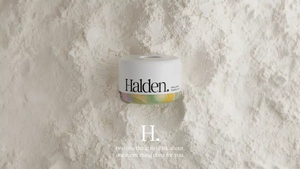
Protein brands usually separate flavors using full-body colors: brown for chocolate, yellow for vanilla, and red for strawberry. This turns the retail shelf into a box of crayons.
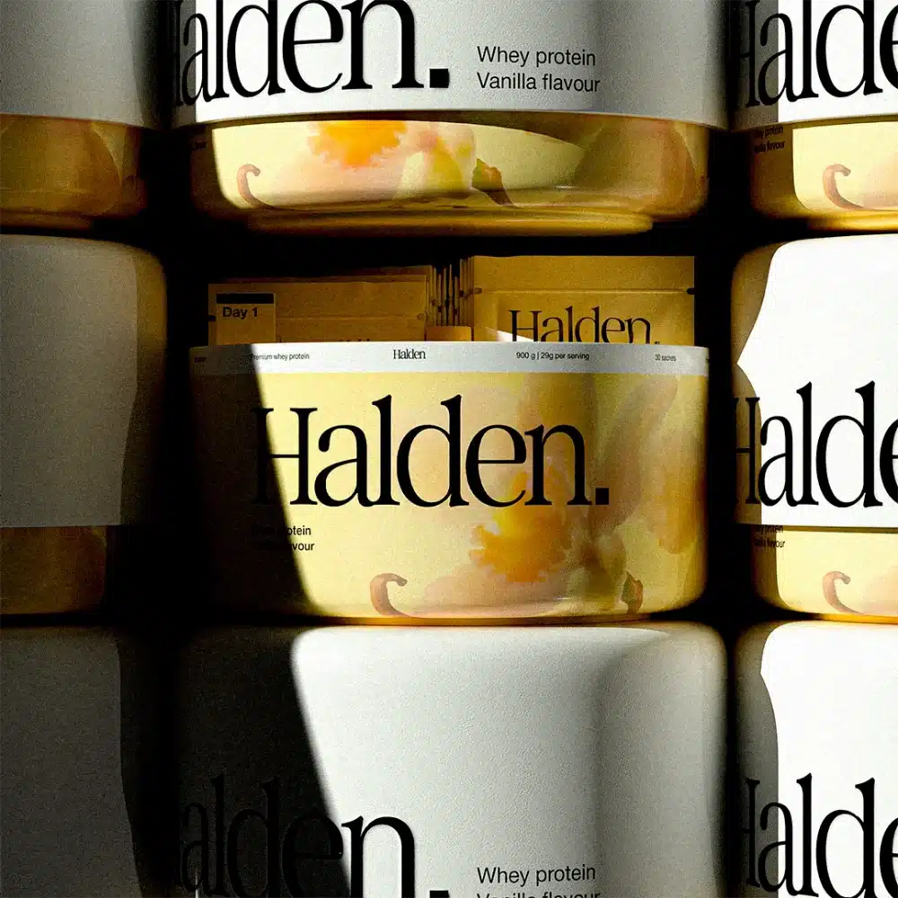
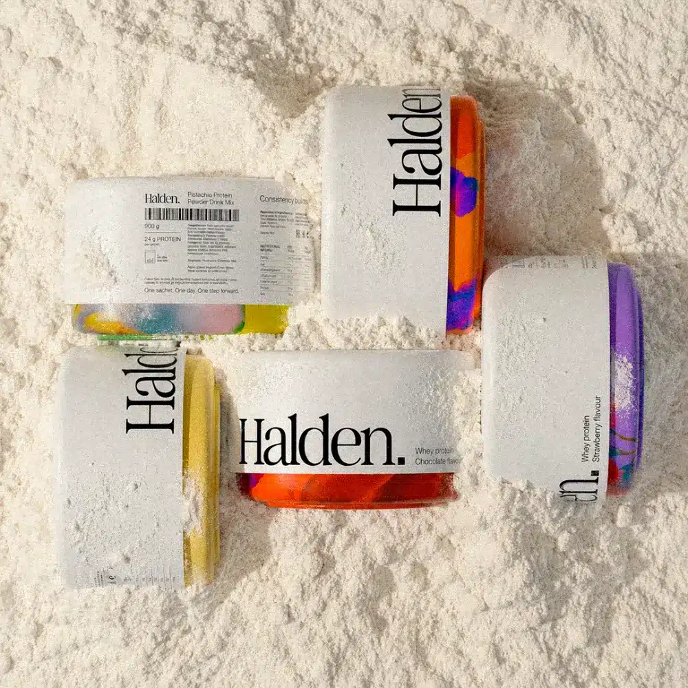
Halden flipped this logic. The tub body remains plain white, while color is hidden at the bottom. Each flavor uses a fluid pattern around the base: warm orange-red for chocolate, golden yellow for vanilla, purple for strawberry, and soft green for pistachio. Rather than flat color blocks, these look like marble patterns or oil paint swirls, sealing a unique mini-landscape under every tub.
On retail shelves, the unified white bodies create a clean, premium look. When customers pick up the product, the bottom color reveals the flavor. From a distance, it looks like a single cohesive brand; up close, flavors become easy to tell apart.
A 30-Day Calendar Inside One Tub
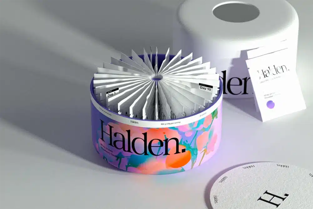
Halden offers more than just bulk protein powder. Its core product line uses single-serve daily sachets. Each sachet contains one exact serving, printed with the flavor name, a color-coded dot, and simple nutrition facts (114 kcal / 1.5g fat / 24.0g protein).
Daily protein users face real friction: scooping, weighing, making messes, and struggling to carry powder on the go. Pre-portioned sachets remove all these pain points at once.
The inside structure of the tub is clever. Opening the lid reveals a fan-shaped layout of sachets numbered from Day 1 to Day 30, resembling a physical calendar. This turns the physical container into a tool for habit building. Tearing open one sachet a day builds a healthy routine over 30 days. It serves as a brilliant example of smart functional packaging.
Why Use a Serif Font?
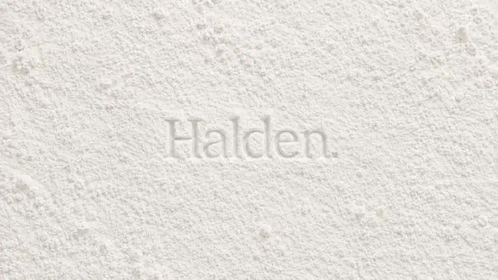
“Halden.” uses a high-contrast serif font ending with a period, similar to Playfair Display or Cormorant. Serif typography often conveys elegance and classic appeal, whereas the fitness industry relies almost exclusively on bold sans-serif fonts. This font choice alone signals that the brand does not want to blend in with traditional gym supplements.
Secondary details use small sans-serif fonts, maintaining clear visual hierarchy without distracting from the main brand name. The overall layout focuses on subtraction, removing unnecessary elements with purpose.
Looking Beyond Aesthetics: The Business Logic
When people see Halden, their first thought is usually “it looks great.” But beyond aesthetics, the underlying business strategy is what truly stands out from a design decision perspective.
The global market for protein powder packaging is highly uniform and crowded. Major brands dominate market share through scale and distribution. If a new brand uses the same visual style, it can only compete on price – and price wars are difficult to win.
Halden took another route by redefining its target audience. Traditional protein powder targets a narrow group: male gym-goers focused on muscle growth. Halden expands this reach to urban professionals who value lifestyle aesthetics, as well as consumers tired of traditional sports styling. A large portion of this audience includes women who view wellness as a daily habit rather than a heavy gym routine.
This audience is willing to pay a premium for thoughtful design. When a protein tub looks like a $60 face cream, its price point is no longer judged purely by “cost per gram of protein.” Instead, it enters the lifestyle brand space.
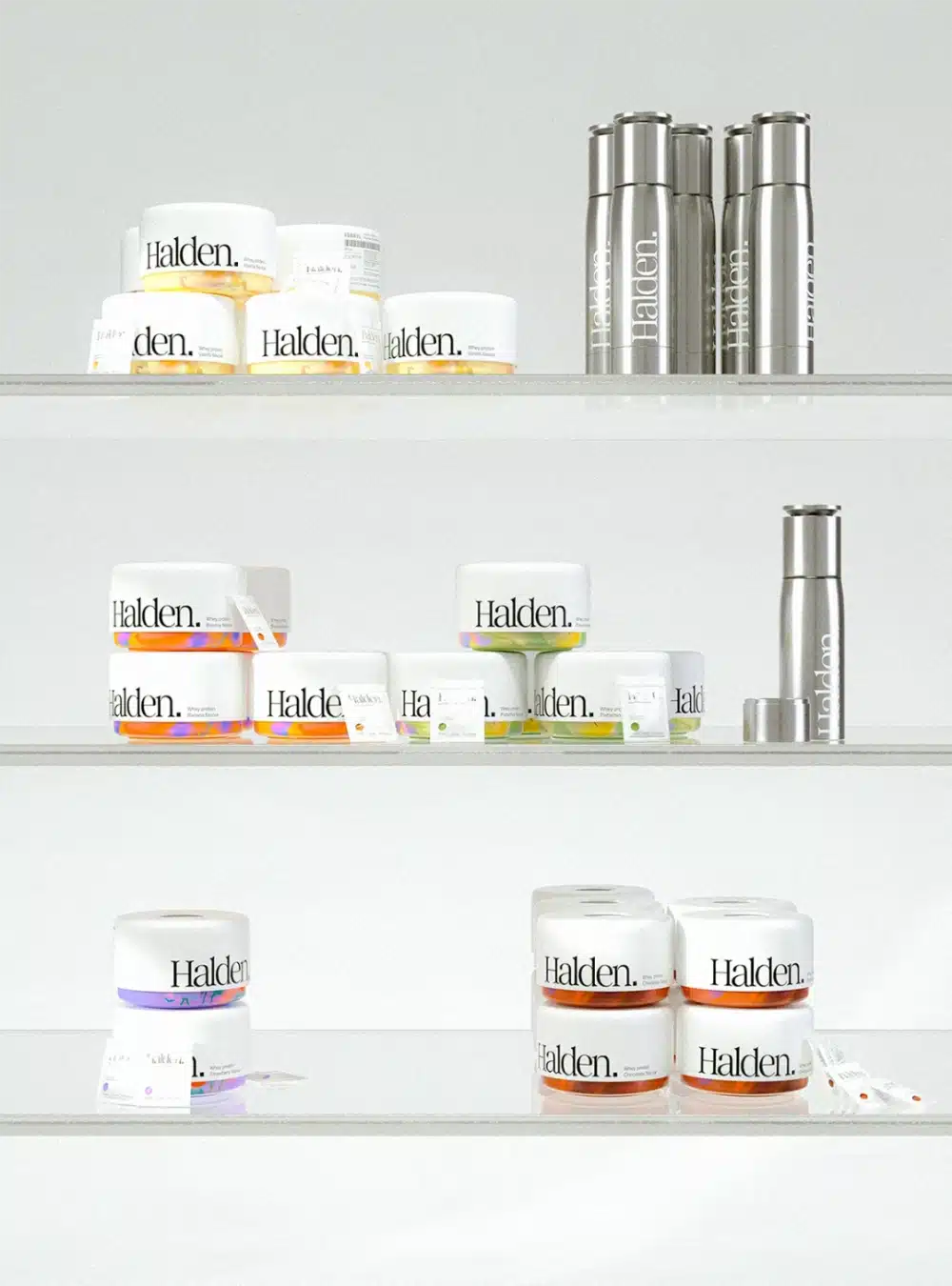
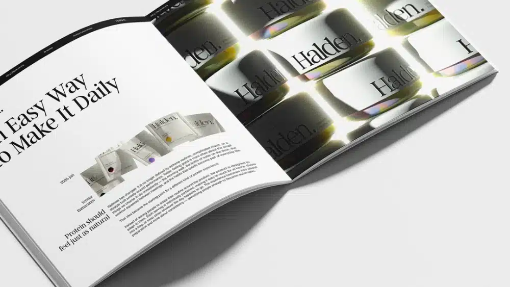
The supporting brand assets follow this vision: metal shakers instead of plastic gym bottles, canvas tote bags, magazine-style brochures, and outdoor billboards. None of these items feel tied to a gym setting. Every detail positions Halden as a lifestyle brand that happens to sell protein powder.

Creative Approach
Halden aims to make protein powder look completely different from standard market options. Designer Yernaz Ramazanov shifted category perception across three main areas: using skincare-style tubs, selecting serif typography with a period, and placing photos in daily lifestyle settings. When a product sits in a crowded market where consumers expect a specific look, breaking those expectations can unlock major brand value.
Key Highlight
The internal Day 1 to Day 30 sachet layout is the smartest structural detail in this project. It turns a basic question – “how to pack sachets” – into an engaging user experience centered on habit formation. The structure itself becomes a key selling point, demonstrating how functional packaging can add real value to a consumer’s daily routine.
Key Takeaways
Executing this strategy comes with specific demands. Custom round tubs and specialized inner trays require higher minimum order quantities (MOQs) than standard square tubs, so the target retail price must support custom tooling costs. The brand must also produce consistent lifestyle content across social channels and influencer partnerships. Sales channels should favor e-commerce and boutique stores over traditional fitness shops.
For new brands entering the functional food space, Halden shows that visual norms can be both a challenge and an opportunity. Those who break standard category rules often end up shaping the next era of packaging design.
If you want to brainstorm and recreate innovative packaging ideas like this, the packaging design team at GVPAK is ready to collaborate with you.