How much design potential can there really be in a box of chocolates?
For everyday packaging, the answer may seem fairly simple: protect the chocolates, present the brand well, and make the product look appetizing.
But Halloween and Christmas change the rules.
During the holiday season, a box of chocolates is no longer just a container. It needs to communicate the occasion almost instantly. Sometimes it also becomes part of the gift, part of the decoration, part of an Advent ritual, or even something customers keep long after the chocolates are gone.
That does not mean seasonal packaging needs to reinvent itself every year.
Looking at 2026 brand launches, packaging projects, and broader seasonal design signals, the more interesting story is how familiar ideas are being reworked. Halloween packaging is becoming freer in color, tone, and structure, while Christmas packaging is increasingly designed to be displayed, reused, refilled, or recycled more thoughtfully.
What is really changing?
Rather than forcing every observation into a “new trend”, it is more useful to look at the changes that genuinely seem worth watching, along with a few classics that still work perfectly well.
Halloween Chocolate Packaging: Familiar Symbols, New Ways to Use Them
What comes to mind first when you think of Halloween?
Pumpkins, ghosts, tombstones, bats, witches, and of course, plenty of orange and black.
For decades, these elements have formed a visual language so familiar that consumers barely need to read the label. A jack-o’-lantern and a few bats are usually enough to say, “Halloween is here.”
But familiar does not have to mean repetitive.
In 2026, some of the most interesting Halloween packaging is not abandoning these classic symbols. It is simply using them in more flexible ways. A pumpkin does not have to stay printed on the lid; it can become the shape of the box itself. A ghost does not have to be frightening; it can be cute, playful, or almost cartoon-like. And a box of chocolates does not have to rely on orange and black to feel unmistakably seasonal.
Halloween is keeping its traditions. It just has more ways to play with them.
1. Halloween Colors Are Breaking Away From Orange and Black
Orange and black are probably never going to disappear from Halloween.
Orange naturally recalls pumpkins, autumn leaves, candlelight, and harvest season, while black brings in night, bats, witches, and gothic imagery. For packaging that needs instant seasonal recognition, the combination still works extremely well.
What is changing is not the relevance of these colors, but the dependence on them.
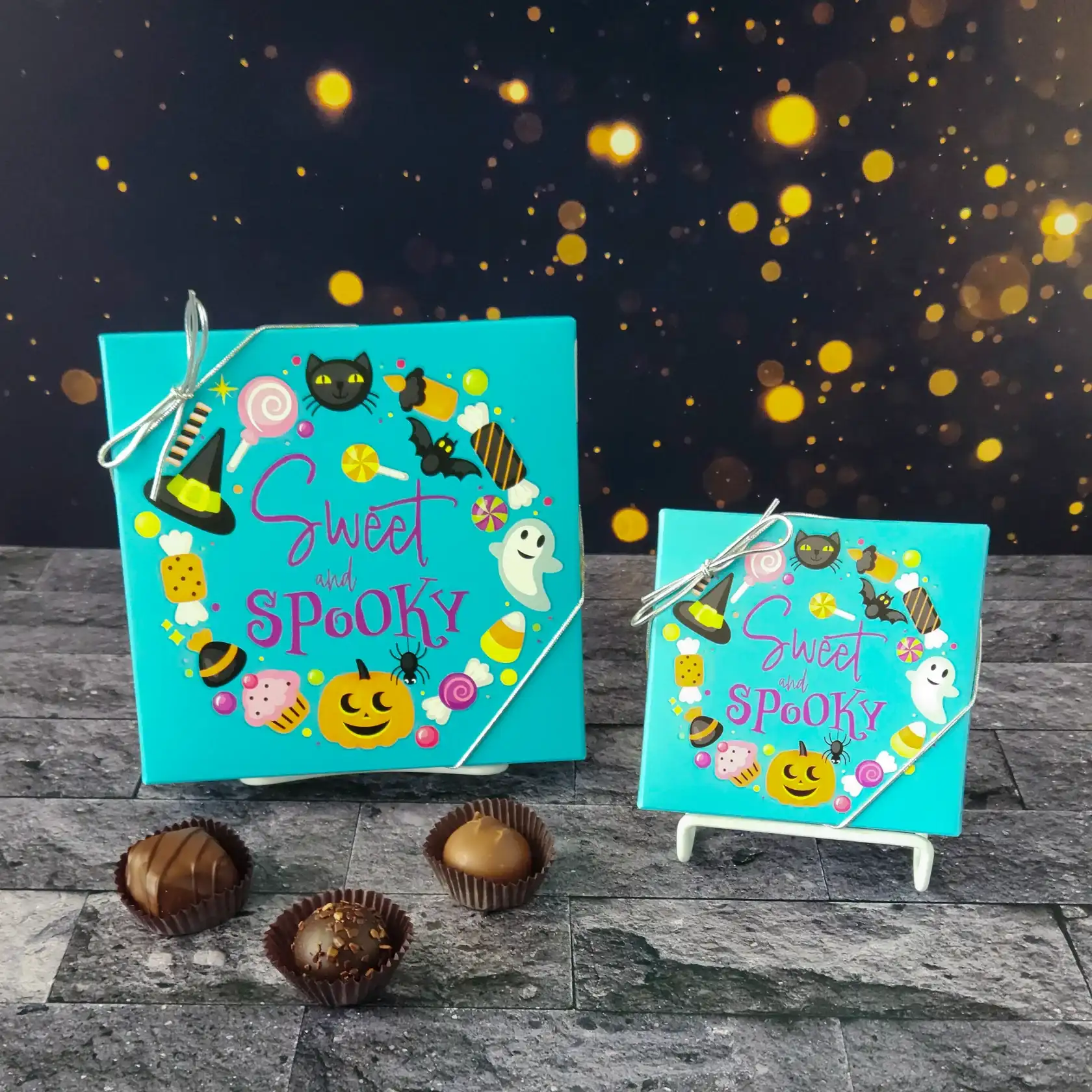
Case: Stage Stop Candy – Sweet and Spooky Chocolate Box
Instead of using the usual orange or deep purple background, the packaging uses a bright turquoise or aqua-green base. On its own, that color would hardly suggest Halloween. But once the box is covered with black cats, ghosts, bats, pumpkins, witch hats, candy, and stars, the holiday identity becomes immediately clear.
The useful lesson here is not that turquoise is suddenly “the Halloween color of 2026”. It is this:
Halloween identity no longer has to come from color alone.
Once illustrations, characters, and seasonal symbols are doing enough of the storytelling, the color palette becomes much more flexible.
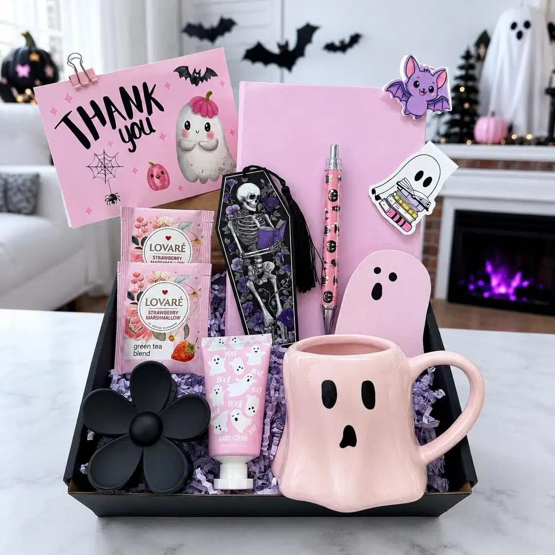
That freedom can be especially useful for packaging aimed at younger consumers, couples, party favors, or premium gifting. Turquoise with a black cat, pink with a cute ghost, lavender with a crescent moon, or cream with a vintage pumpkin can all still feel unmistakably Halloween.
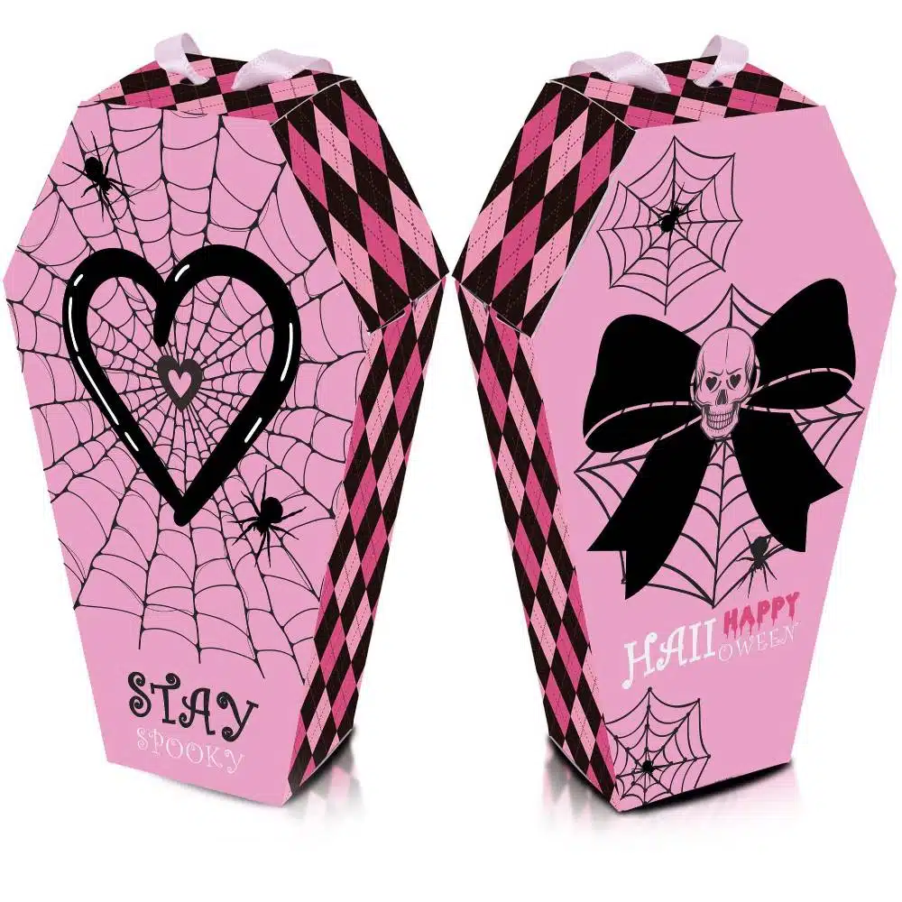
A similar shift is visible outside chocolate packaging. Pink Halloween decor has become increasingly visible in 2026 seasonal styling, often paired with black, deep plum, or metallic accents so the result still feels spooky rather than overly romantic.
Of course, home decor does not automatically prove that pink chocolate packaging is now an industry-wide trend. It is better understood as a broader visual signal: consumers appear increasingly open to Halloween colors outside the traditional orange-and-black formula.
So the more accurate conclusion is not, “Orange and black are being replaced.”
Halloween is gaining more color options.
2. The Box Shape Is Becoming Part of the Halloween Story
Color changes what happens on the surface of the box.
Structure changes the box itself.
The traditional approach to Halloween packaging is simple: take a standard rectangular box and print pumpkins, ghosts, bats, or spooky patterns across the surface.
There is nothing wrong with that. It is efficient, recognizable, and still widely used.
But some of the most memorable packaging takes the theme one step further:
Instead of decorating the box for Halloween, turn the box itself into Halloween.
L.A. Burdick Coffin Assortment
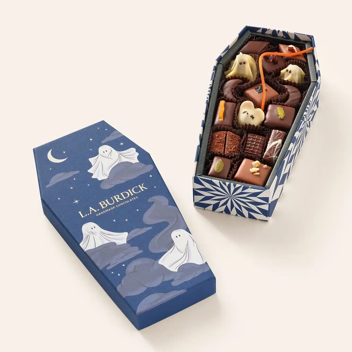
Rather than printing a coffin graphic onto a standard box, the entire package becomes the coffin. Once opened, the theme continues through Halloween characters and seasonal chocolates inside.
The storytelling does not stop at the lid. The structure, opening experience, and chocolates all belong to the same world.
Another Signal: Reese’s Pumpkin Bowl
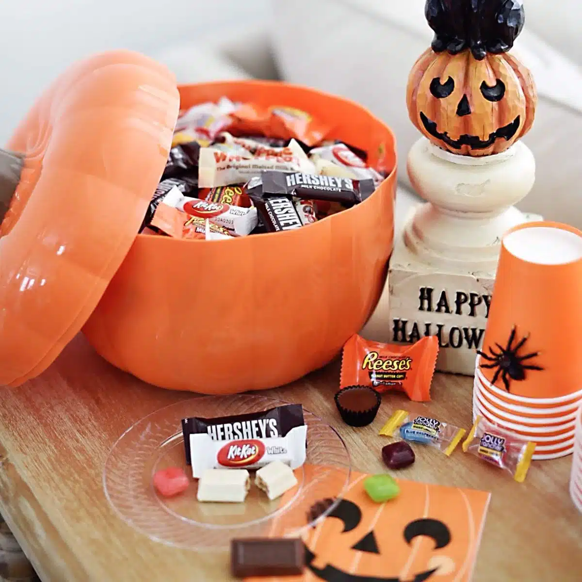
The Reese’s Pumpkin Bowl is not paper packaging, so it should not be treated as a direct paper-box example. But the reusable pumpkin-shaped container shows how confectionery packaging can become part of the Halloween environment itself.
Consumers are willing to treat candy packaging as part of the Halloween decoration.
And honestly, it is easy to understand why. Imagine a pumpkin-shaped storage box sitting on the table during a Halloween party. It already works as decoration before anyone opens it. After the holiday, it can still hold candy, ornaments, jewelry, or all those miscellaneous little things that never seem to have a proper place.
That kind of packaging is much harder to throw away.
For paper packaging, the same idea could become a coffin-shaped rigid box, pumpkin box, haunted-house drawer box, spell-book magnetic box, or tombstone-shaped carton.
So instead of only asking, “What should we print on the lid?”, it may be more useful to ask:
Can the packaging itself become the Halloween symbol?
3. Halloween Chocolate Is Moving Beyond the Candy Bag
When most people think of Halloween chocolate, trick-or-treat still comes first.
Individually wrapped chocolates are poured into large bags and handed out to children on Halloween night. That tradition is not disappearing.
But another occasion is becoming more visible: Halloween gifting.
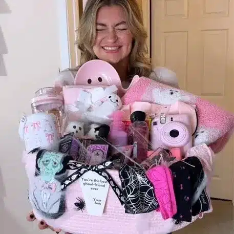
Boo Baskets, Spooky Baskets, Halloween Gift Boxes, and Halloween Care Packages are now easy to find across lifestyle media and online marketplaces. Chocolates are often mixed with cookies, candy, candles, socks, cards, and other seasonal gifts.
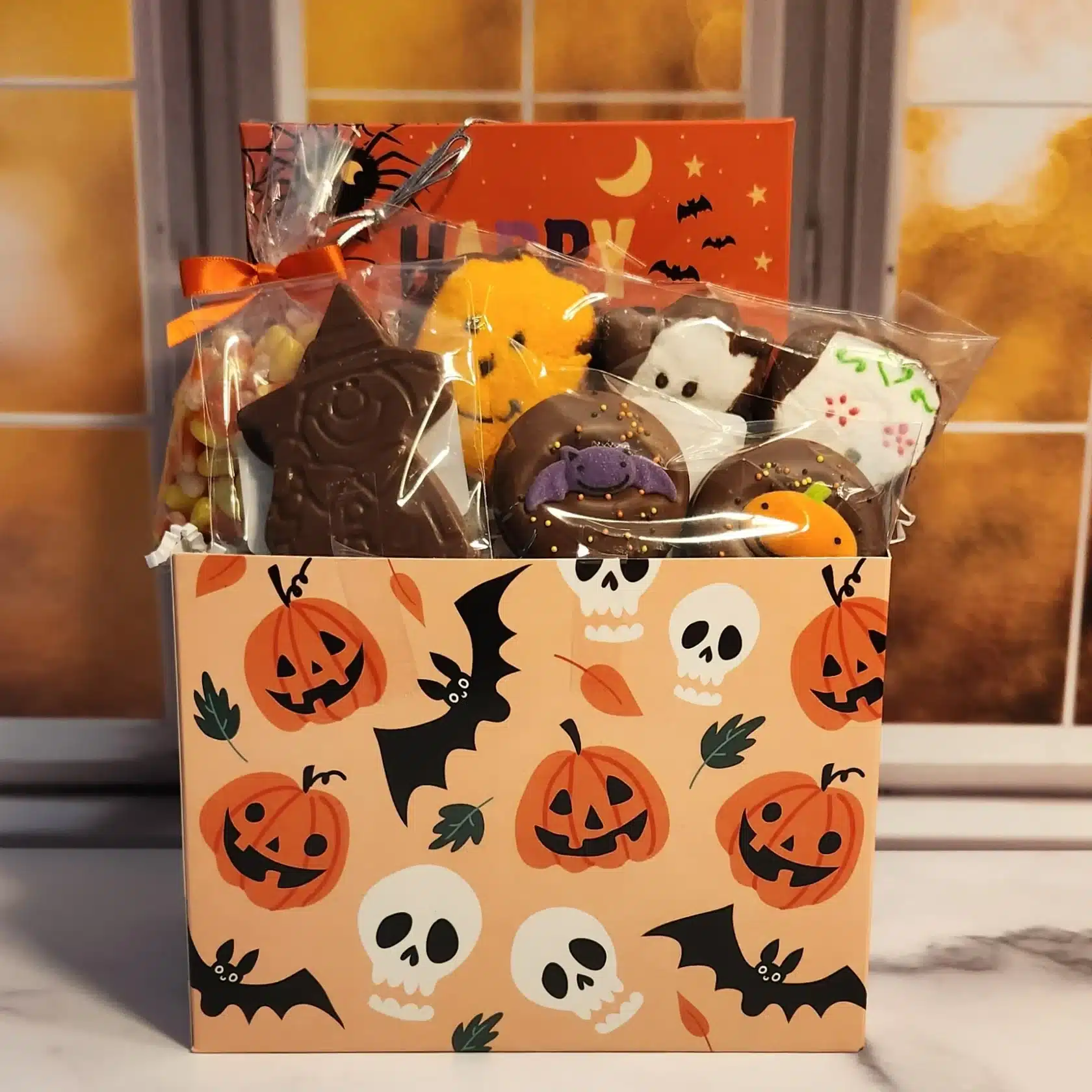
The difference between trick-or-treat candy and gifting chocolate can be summed up fairly simply:
Candy is distributed. Gifts are presented.
Once chocolate is purchased for a specific person rather than handed out in quantity, packaging expectations start to change.
Ribbon, message cards, personalization, rigid structures, decorative sleeves, drawer openings, and polished presentation all become more relevant. These are packaging languages we usually associate with Christmas, Valentine’s Day, or premium gifting, but they now have room to appear in Halloween too.
That does not mean Boo Baskets are about to replace trick-or-treat.
A better interpretation is that Halloween is gaining an additional gifting occasion.
For premium chocolate brands, this creates room for a small, beautifully designed box of chocolates that works as a hostess gift, a gift for a friend, or a party favor rather than another oversized bag of individually wrapped candy.
4. Dark Romantic Halloween: A Direction to Watch
The first three directions already have fairly direct evidence in chocolate packaging or Halloween gifting.
This one is different.
It is better treated as a design forecast than as an established chocolate packaging trend.
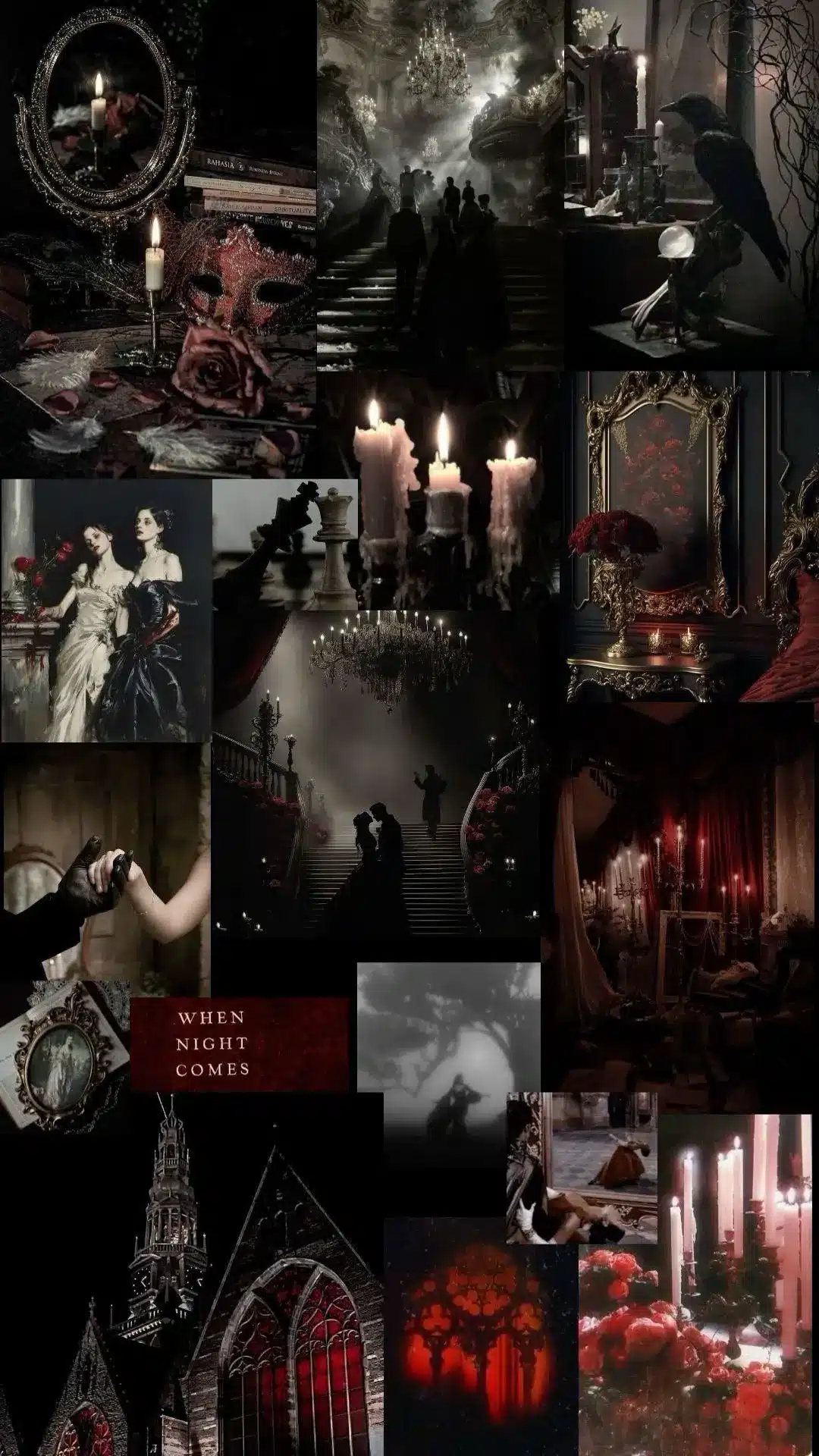
Pinterest’s official Pinterest Predicts 2026 report identifies a trend called Vamp Romantic. Related searches include dark romantic makeup, vampire beauty, and gothic coffin nails, pointing toward a polished, romantic, after-dark gothic aesthetic.
A beauty trend is not automatically a chocolate trend. But it is still a useful cultural signal.
Dark chocolate already carries associations with indulgence, mystery, craftsmanship, and luxury. If this sophisticated gothic aesthetic continues moving through fashion, beauty, interiors, and lifestyle categories, premium Halloween chocolate packaging is a natural place for it to appear.
Burgundy
Oxblood Red
Deep Plum
Jet Black
Antique Gold
Ivory
These colors can be paired with Victorian botanical illustrations, dark florals, moon phases, ornate frames, gothic typography, foil stamping, blind embossing, and textured paper.
The result may look closer to luxury perfume packaging than children’s Halloween candy.
Interestingly, that creates two very different directions at the same time.
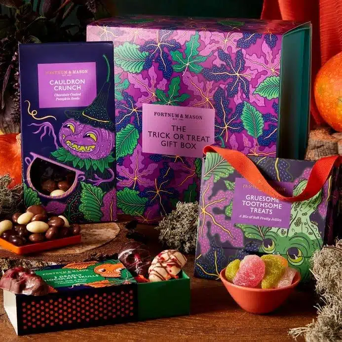
Playful Halloween: turquoise, pink, cute ghosts, cartoon cats, and bright illustration.
Sophisticated Halloween: burgundy, black, antique gold, dark botanicals, and premium finishes.
Both point to the same conclusion:
Halloween is not moving toward one new look. It is moving away from having only one look.
Christmas Chocolate Packaging: When the Box Becomes Part of the Gift
Once Halloween is over, Christmas plays by a very different set of rules.
Red, green, gold, ribbon, Christmas trees, and snow scenes return almost every year.
But Christmas packaging has one unusual advantage: consumers seem especially willing to accept a box that is a little more theatrical.
A three-dimensional house-shaped chocolate box might feel excessive in March.
At Christmas?
Perfectly reasonable.
Advent Calendars are especially important here because they are designed to stay in the home for weeks. That gives brands more freedom to turn packaging into decoration, ritual, or even a collectible object.
5. Advent Calendars Are Turning Into Miniature Architecture
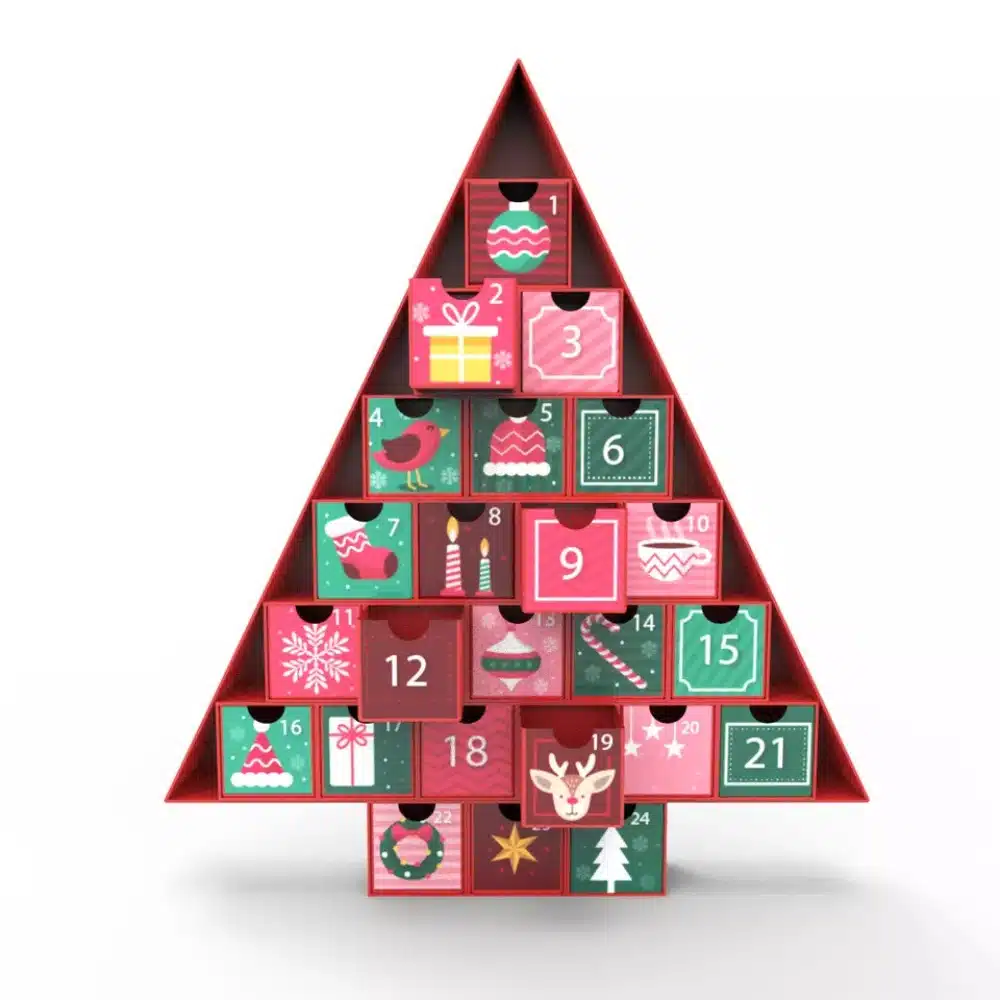
Traditional chocolate Advent Calendars are simple: a flat printed board, 24 numbered doors, and one chocolate behind each.
The format still works perfectly well.
But premium brands are increasingly treating the Calendar as a piece of miniature architecture.
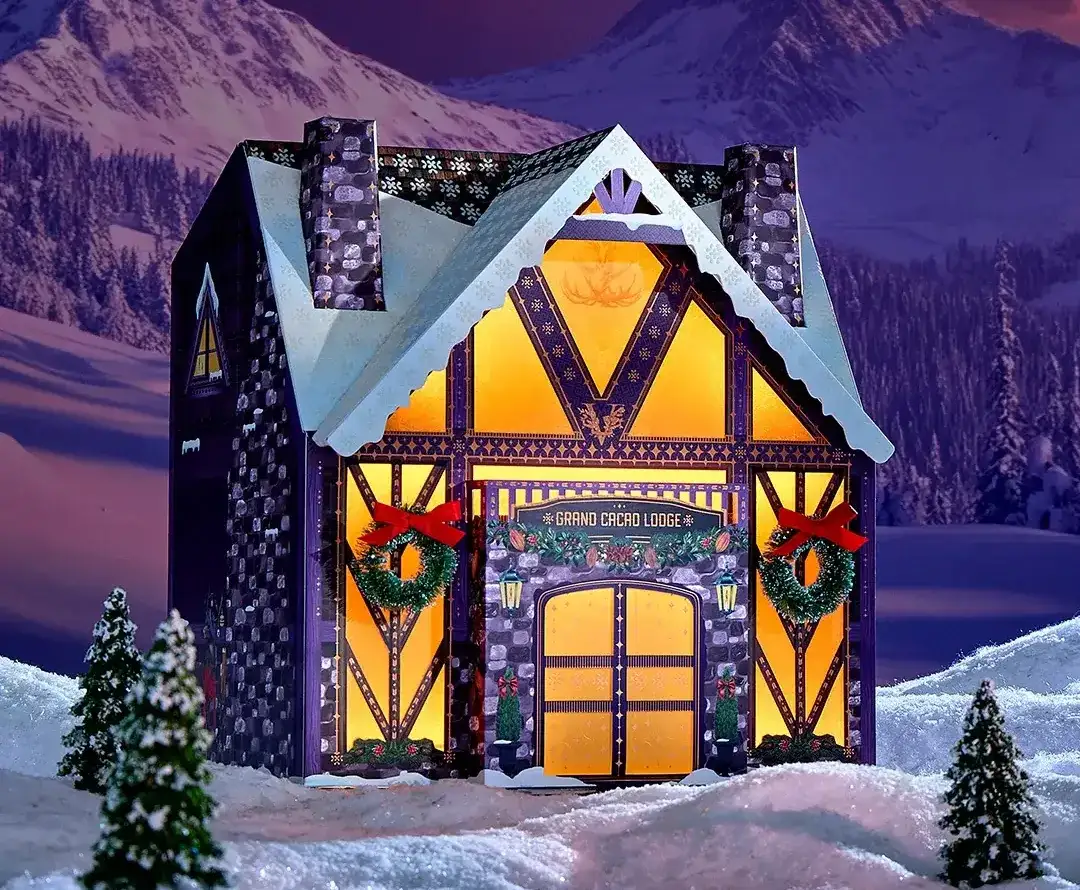
Vosges 2026: The Grand Cacao Lodge
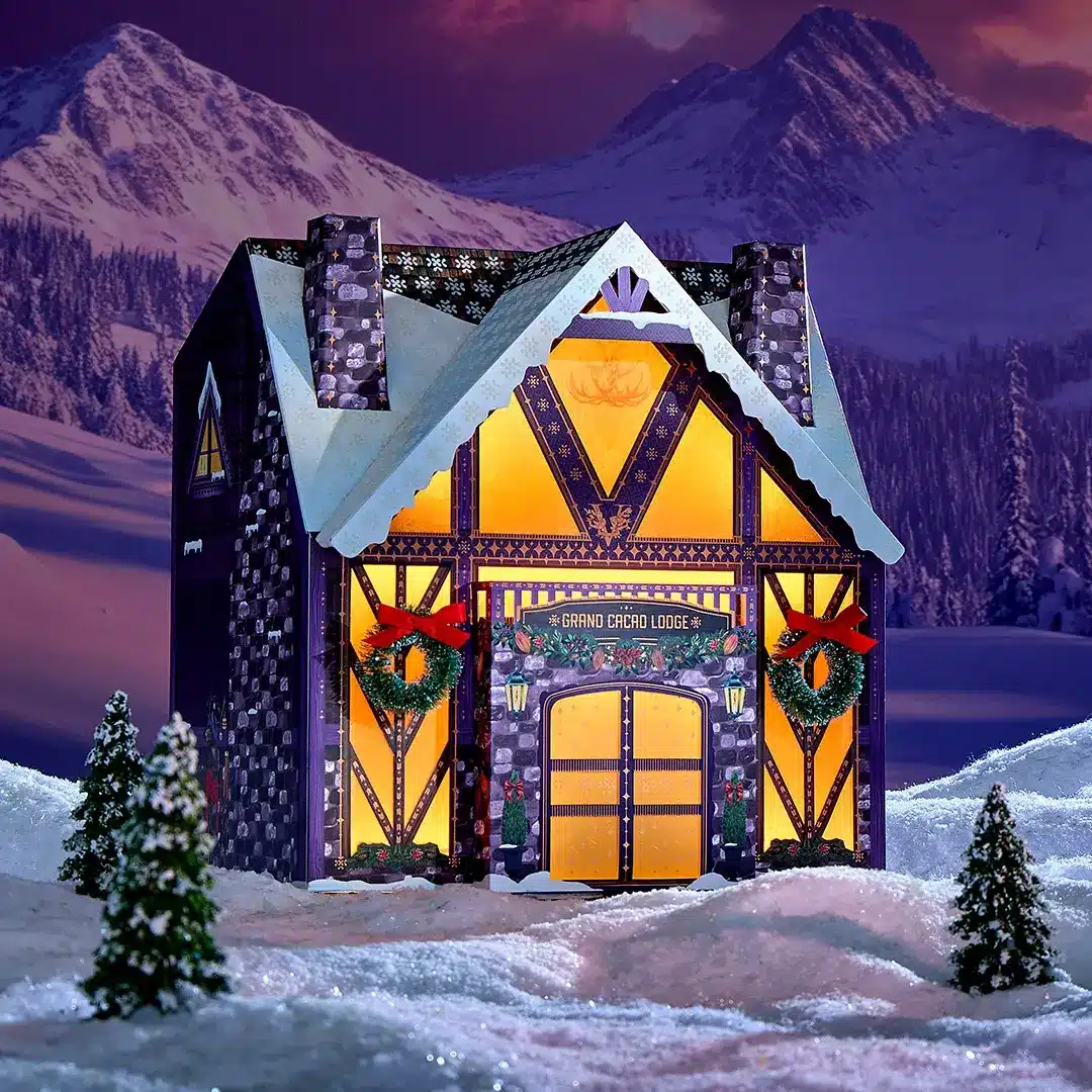
Rather than simply printing an alpine lodge on the front, the entire Calendar becomes the lodge.
The structure uses sturdy paperboard together with details such as copper foil, flocking, frosted windows, wreaths, ribbon, lighting, and sound elements. Inside, the chocolates are arranged behind individual drawers.
At that point, the package no longer feels like something designed to disappear on December 25.
It feels like a Christmas object that happens to contain chocolate.
Lily O’Brien’s: Keepsake Advent House
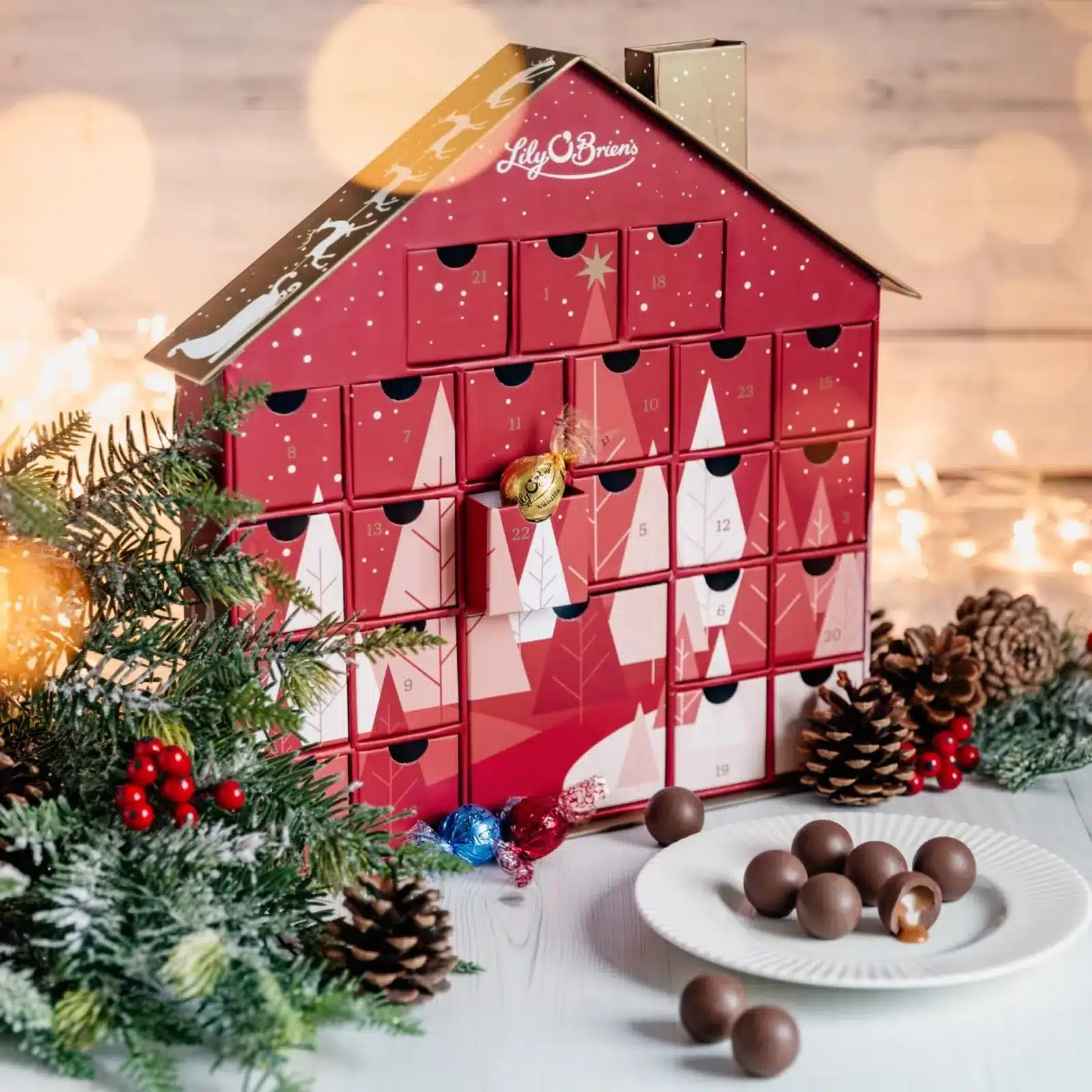
Lily O’Brien’s takes a simpler but equally clear approach. Its Keepsake Advent House uses the house itself as the packaging structure, with chocolates arranged inside.
The word “keepsake” says a lot. The package is clearly meant to feel worth keeping after the final chocolate is gone.
And to be fair, once a decorative Christmas house has been sitting in the living room for nearly a month, flattening it and throwing it away on December 26 can feel surprisingly wasteful.
Melt Chocolates: Turn the Neighborhood Into Packaging
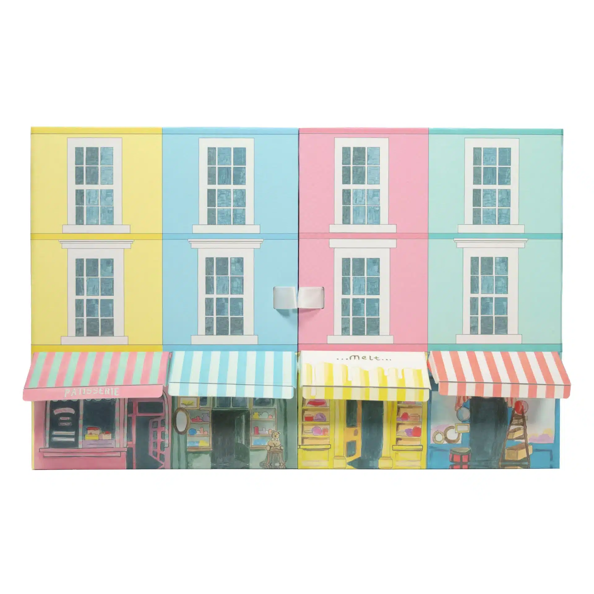
Melt Chocolates takes architectural storytelling in another direction.
Its Portobello Advent Calendar is not based on a generic snowy cottage. Instead, it recreates the colorful architecture of Notting Hill and Portobello Road, where the brand is based.
This opens up an interesting packaging idea. A house-shaped package does not have to mean “generic Christmas cottage”. It could become a flagship store, chocolate workshop, historic building, city street, ski lodge, or local landmark.
In other words, architecture can do more than create Christmas atmosphere.
It can tell the brand story too.
From Christmas Illustration to Christmas Architecture
In the past, brands printed houses onto boxes. Now, some brands are turning the box into the house itself.
6. Give the Chocolate Box a Second Life
This may be even more interesting than simply saying a package is recyclable.
Because it asks a very practical question:
What happens to the box after the chocolates are gone?
For a standard folding carton, the answer is simple: recycle it.
But what if the customer has purchased a beautifully made Christmas house with drawers, foil details, and enough structure to sit on display for a month?
Throwing it away immediately starts to feel wasteful.
See’s 2026: Designed to Return Year After Year
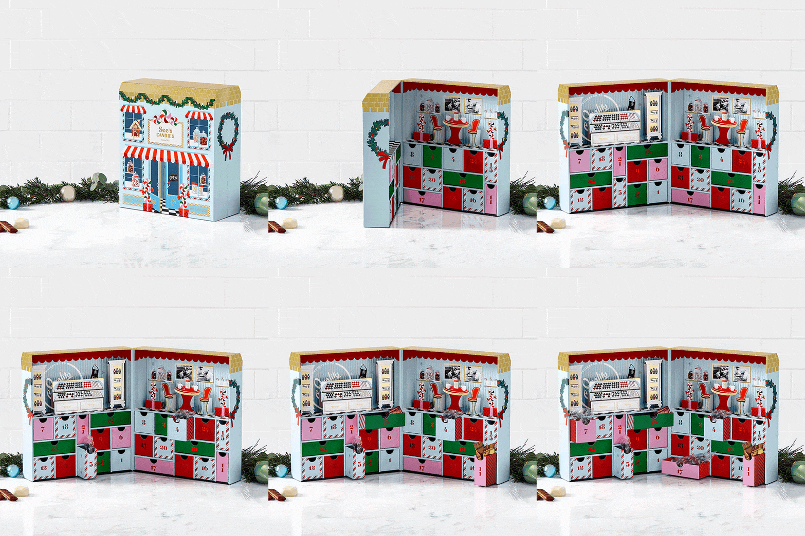
See’s 2026 Advent Calendar is designed as a reusable holiday keepsake, with dimensional illustration, foil details, and sturdy pull-out drawers.
Rather than feeling like disposable packaging, it is designed to come back with the Christmas decorations another year.
Vosges: Refill It Instead of Replacing It
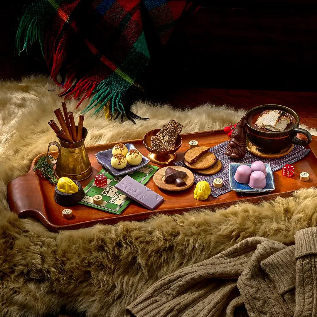
Vosges pushes the idea further with an actual refill model. Customers who already own a previous Calendar can buy a new chocolate refill and use the original packaging again.
The chocolates are consumable. The packaging does not have to be.
The Familiar Version: A Reusable Christmas Tin
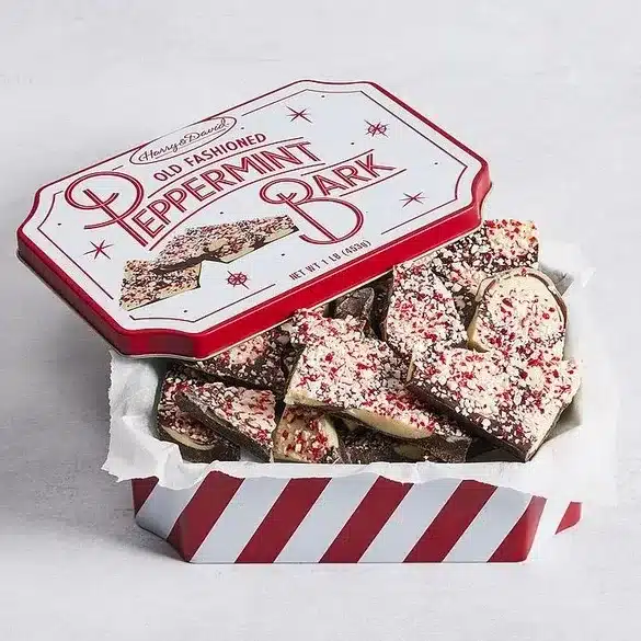
Christmas tins have been doing something similar for years.
They may end up holding ornaments, cards, cookies, jewelry, or eventually become that one miscellaneous box where everything seems to go.
Most homes have at least one.
Paper-based custom boxes can borrow the same idea through durable rigid structures, drawer constructions, magnetic book-style boxes, reusable compartments, and refillable Advent formats.
So sustainable packaging does not always need to ask only, “Can this box be recycled?”
It can also ask:
Does the customer have a reason not to throw it away?
7. Paper-Based Inserts Can Replace Plastic Trays
Of course, not every chocolate box needs to survive for three Christmases.
Some packaging is meant to complete its job and then move efficiently into the recycling stream.
That raises another practical question:
Can the packaging be easier to recycle?
A common chocolate-box structure is paper outer box + plastic inner tray.
The outside looks highly paper-based. Open it, and there is still a large thermoformed plastic insert inside.
Tony’s Chocolonely: Plastic Tray to Molded Fiber
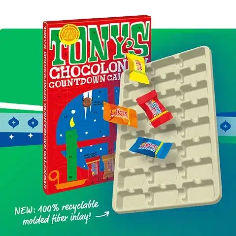
Tony’s Chocolonely’s Advent Calendar project offers a much more concrete alternative.
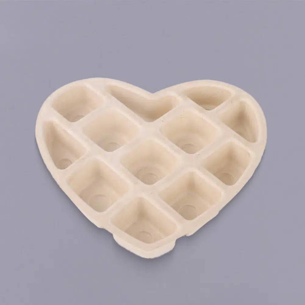
A molded fiber inlay was engineered to match the exact position of each chocolate behind the Calendar doors while still meeting the structural and production requirements of the packaging.
The resulting structure replaces the conventional plastic tray with a paper-based molded fiber insert.
Plastic tray → Molded fiber tray
This is far more meaningful than simply saying, “Sustainable packaging is trending in 2026.”
An actual packaging component changed.
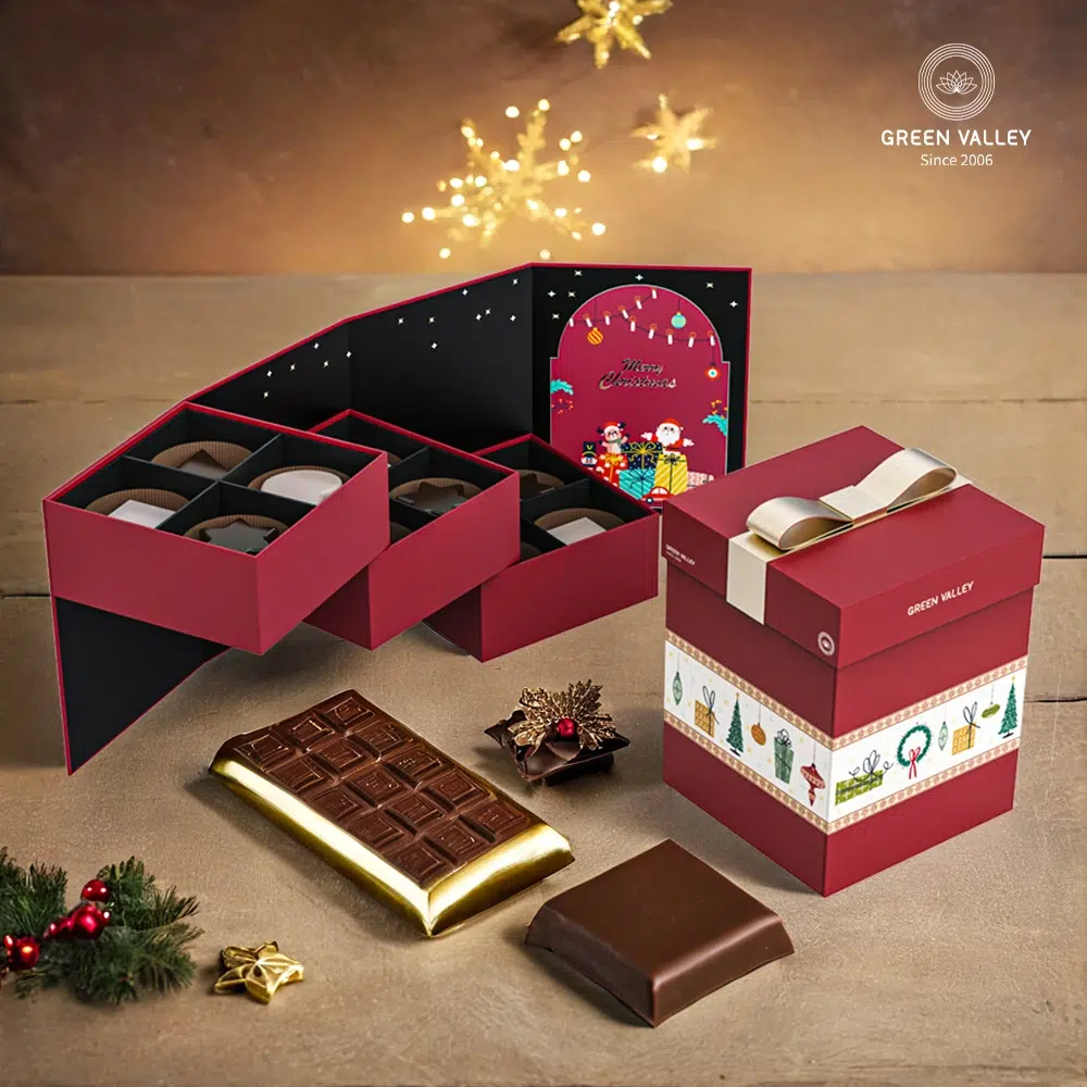
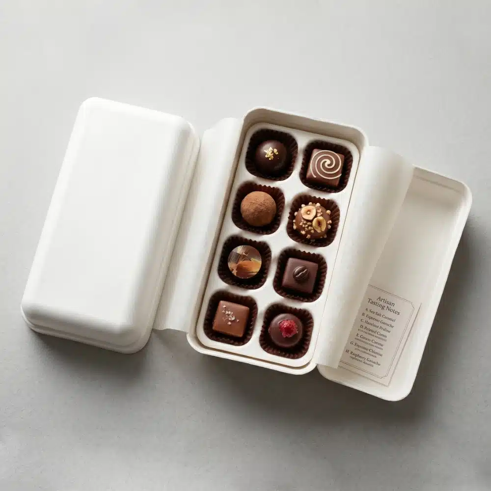
For Christmas chocolate packaging, molded pulp trays can still provide individual chocolate cavities, truffle wells, protective dividers, multi-level presentation, and even seasonal arrangements.
The outside can remain completely festive in red, green, gold, or illustrated paper packaging.
Inside, the structure becomes more paper-based.
There is also an aesthetic benefit. The soft, matte, slightly fibrous texture of molded pulp can pair surprisingly well with artisan chocolate and handcrafted confectionery.
Sustainable packaging does not have to look aggressively “eco”.
It can still look premium.
Paper-Based Chocolate Packaging Ideas
8. Some Christmas Classics Do Not Need Reinventing
At this point, it may sound as though every Christmas chocolate box in 2026 needs to become a house, a refill system, a drawer cabinet, or a molded fiber engineering project.
It does not.
Some Christmas packaging returns every year for one very simple reason:
It still works.
Ghirardelli: Red, Gold and a Big Bow
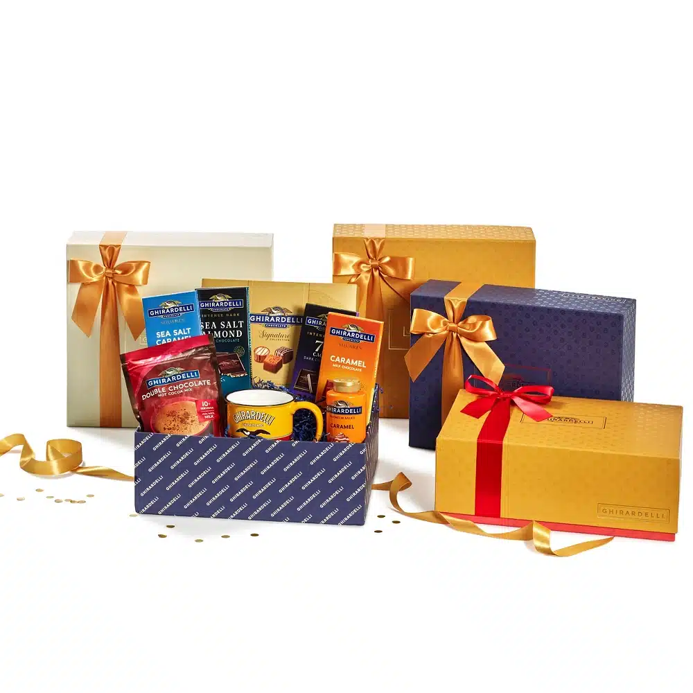
Red.
Gold.
Big bow.
Christmas.
There is no attempt to invent a “new 2026 Christmas color”. And there does not need to be.
Consumers can see the box from across the room and understand immediately that it is a holiday gift.
That instant recognition still has real value.
Hotel Chocolat: Upgrade the Details, Not the Entire Language
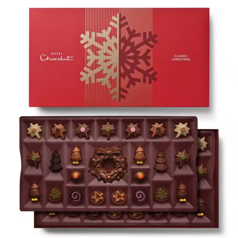
Hotel Chocolat follows a similar logic. Familiar premium Christmas cues remain, while the experience becomes more interesting through layered presentation, structural reveals, foil, embossing, and storytelling inside the box.
That may be the smarter approach for many brands.
Do not throw away a Christmas visual language that already works.
Deep red, forest green, gold foil, ribbons, snow, stars, Christmas trees, and nostalgic illustration can all stay.
Innovation can happen elsewhere.
Turn a standard box into a drawer box.
Keep the Christmas tree illustration but emboss it.
Keep the ribbon but add a second reveal inside.
Or simply use excellent paper, clean proportions, and refined foil details.
Not every package needs to shout that it is new.
Classic Christmas is still classic for a reason.
So, What Will the Next Box of Chocolates Look Like?
Halloween and Christmas are moving in slightly different directions.
For Halloween, the biggest change is choice.
The palette can remain orange and black, or move into turquoise, pink, lavender, or darker gothic tones. The packaging can serve trick-or-treat, or become a small seasonal gift. The Halloween symbol can sit on the box, or become the box itself.
Christmas is changing in another way.
The relationship between the customer and the package is getting longer.
An Advent Calendar may stay on display for nearly a month.
A decorative house may return next year.
A refillable box may be used again and again.
And when the package is not designed to stay, molded fiber and other paper-based structures can make the end of its life simpler.
Keep it.
Recycle it more easily.
Both lead to the same question:
What should happen to the box after the chocolates are gone?
That may be one of the most useful questions for brands developing new seasonal packaging in 2026.
And of course, there will still be pumpkins, ghosts, red ribbons, Christmas trees, and gold foil.
Good seasonal packaging does not need to reinvent Halloween or Christmas every year.
It simply needs to make an ordinary box of chocolates feel more giftable, more memorable, more enjoyable to open, and, when possible, more worth keeping.