Inclusive Packaging Trends 2026 – Top 4 Accessible Designs for the Silver Economy
March 3, 2026 · Marcus
There’s a quiet revolution happening in luxury packaging, and it has nothing to do with sustainability trends or minimalist aesthetics. It’s about something far more fundamental: Can your customers actually open the box?
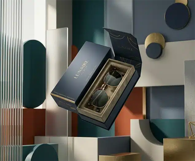
Walk into any high-end boutique today, and you’ll find beautifully crafted packaging that looks stunning on Instagram but fails spectacularly in real hands. Rigid boxes sealed tighter than bank vaults. Microscopic text that requires a magnifying glass. Inserts that grip products like they’re afraid of letting go. For the average 30-year-old, these are minor annoyances. For someone over 65 with arthritis? They’re deal-breakers.
Here’s what most brands miss: The people struggling most with your packaging are also the ones with the deepest wallets. The Silver Economy—consumers 60 and up—now controls more wealth than any other demographic. They’re buying $200 serums, $500 jewelry pieces, and $1,000 gift sets. But when they can’t access what they’ve paid for without calling for help, something breaks in the brand relationship that no amount of marketing can repair.
The 2025 European Accessibility Act didn’t just create new compliance requirements. It sparked a broader awakening: Exclusionary design isn’t premium—it’s just bad design. The brands winning in 2026 understand that true luxury removes friction, not creates it. Let’s explore what that actually looks like in practice.
Why the Silver Economy Matters More Than You Think
Forget what you know about “aging consumers” as a secondary market. In 2026, they’re the primary market for nearly every luxury category. The numbers tell a compelling story:
People over 60 hold trillions in assets and disposable income. They’re not just buying for themselves—they’re gifting to children and grandchildren, often choosing the most premium options available. In skincare alone, this demographic drives 40% of luxury purchases. In fine jewelry and premium food, the percentages climb even higher.
But here’s the friction point: Over 50 million Americans live with arthritis or reduced hand mobility. Simple actions younger people take for granted—pinching a tiny tab, pulling apart a tight-fitting lid, lifting a product from a deep cavity—become genuinely difficult or impossible. And nearly everyone over 50 experiences presbyopia, making tiny fonts on low-contrast surfaces essentially unreadable without reading glasses.
The psychology here matters. When someone pays premium prices, they expect a premium experience from the moment they touch the package. Struggling to open a box doesn’t feel exclusive—it feels embarrassing and frustrating. That emotional response sticks, coloring every subsequent interaction with the brand.
Rethinking Luxury Packaging: Four Practical Shifts
The good news? Making packaging accessible doesn’t mean making it look clinical or cheap. The best solutions are often invisible—they just work better for everyone. Here’s where to focus your efforts:
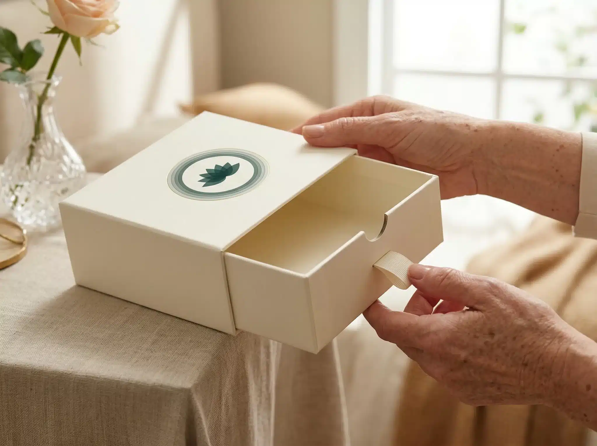
Rethink Opening Mechanisms
That satisfying “pop” when you pull apart a perfectly fitted rigid box? It requires more grip strength than you realize. Many luxury boxes create what engineers call a vacuum seal—air pressure literally working against the person trying to open it.
Better approaches exist. Magnetic closures that release with gentle pressure. Drawer-style boxes that slide open smoothly. Ribbon pulls that let users leverage arm strength instead of finger strength. These mechanisms feel just as premium as friction-fit designs—often more so, because they work effortlessly. The satisfaction comes from the smooth action, not from conquering resistance.
Small additions make huge differences. A subtle thumb notch carved into the lid’s edge. A slightly raised section that gives fingers something to grip. These details cost pennies to implement but transform the user experience completely.
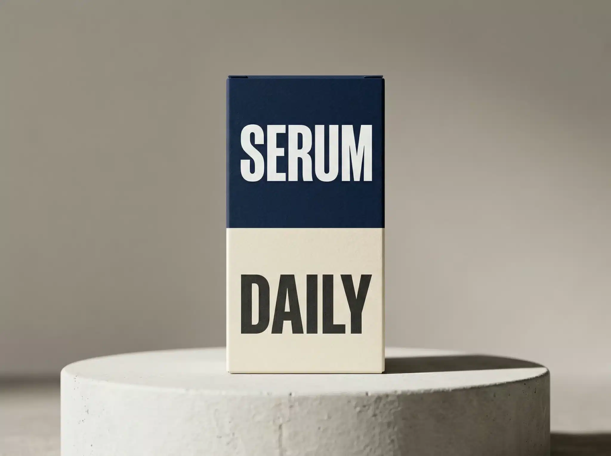
Make Text Actually Readable
Minimalism in design doesn’t have to mean illegibility. Yet somehow, luxury brands convinced themselves that 6-point grey text on silver foil looks more sophisticated than clear, readable typography. It doesn’t—it just looks like the brand doesn’t care if customers can actually read the information.
The fix is straightforward: larger type (minimum 10-12 points for essential information), higher contrast (black on cream beats grey on silver every time), and cleaner fonts. You can maintain a minimalist aesthetic while ensuring people can actually see what they’re buying.
For detailed instructions or ingredient lists, QR codes offer an elegant solution. Link to large-print PDFs, video tutorials, or audio descriptions. This approach keeps packaging clean while providing accessibility options for those who need them.
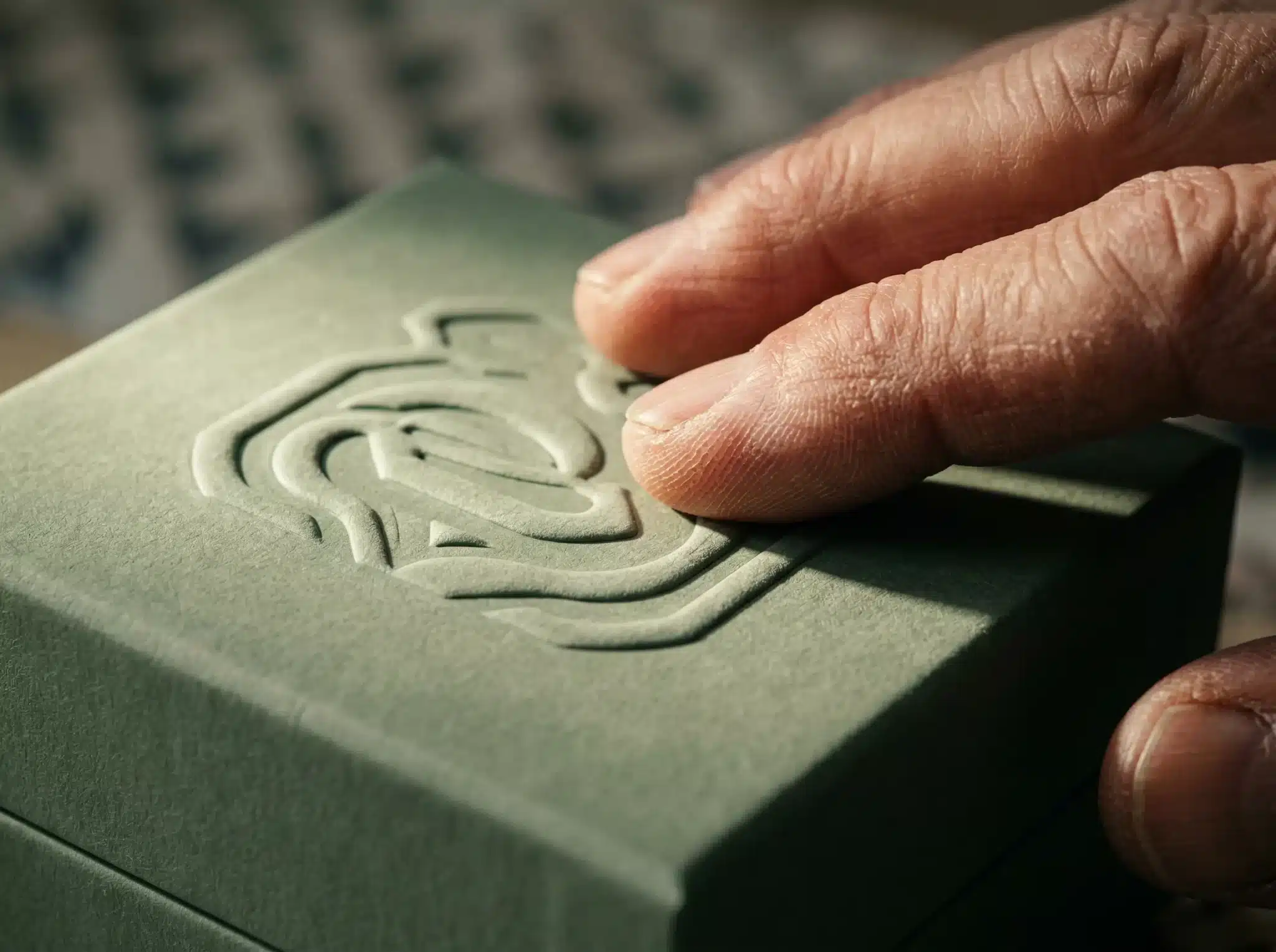
Add Tactile Guidance
People with low vision often rely on touch to orient objects and find opening points. Unfortunately, most luxury packaging offers no tactile cues whatsoever—it’s smooth and uniform in every direction.
Embossing or debossing serves double duty here. A raised logo doesn’t just look elegant—it helps users identify the top of the box by feel. Subtle texture differences can indicate where to grip or pull. For pharmaceutical or skincare products, discreet Braille labels add genuine utility while reinforcing the brand’s commitment to inclusivity.
These aren’t compromises. They’re enhancements that make packaging more engaging for everyone while providing essential guidance for those who need it most.
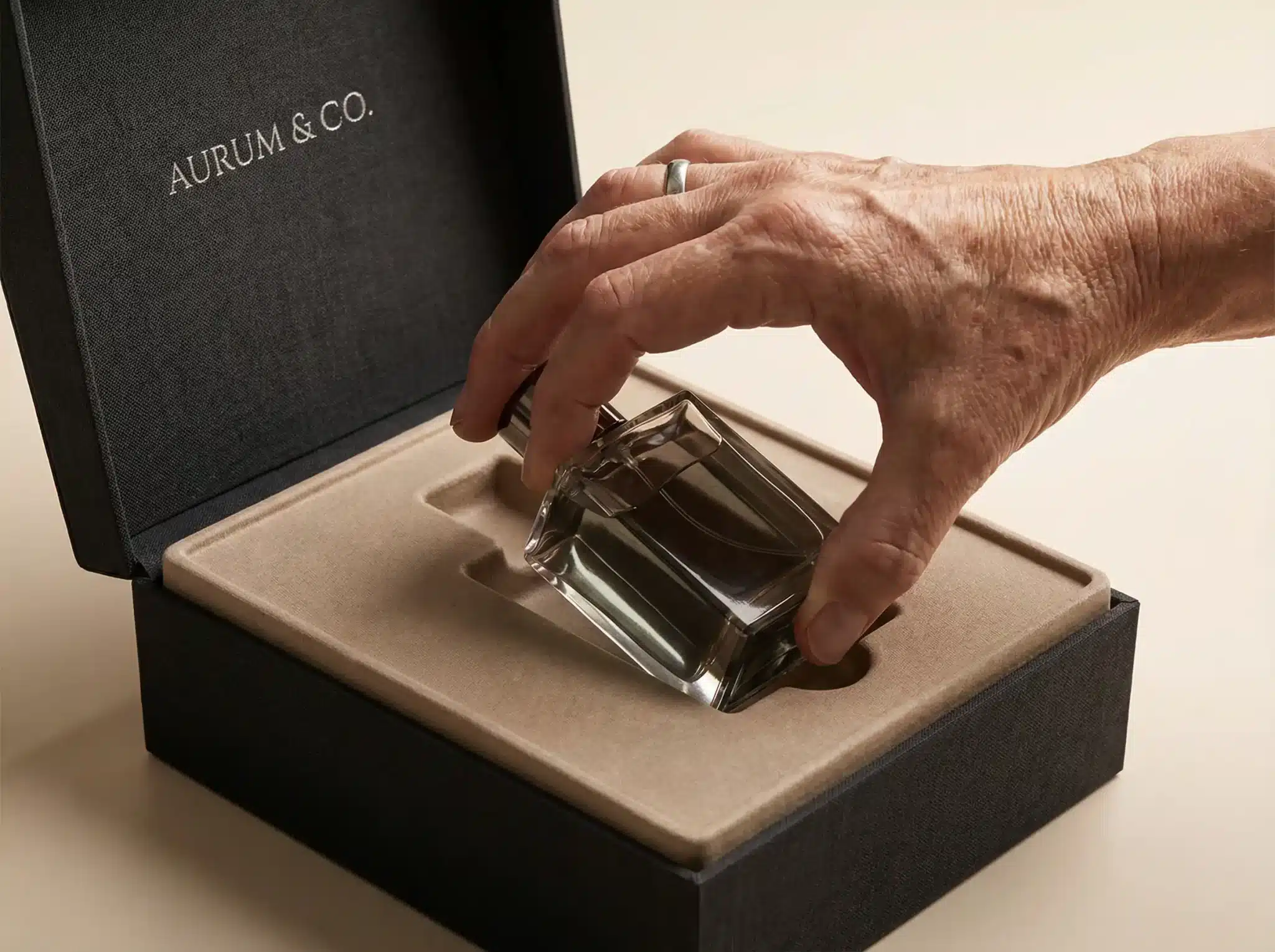
Design Smarter Product Inserts
Opening the box is only half the battle. Many luxury products sit in foam or paperboard inserts fitted so tightly that extraction becomes a delicate operation. Users worry about dropping expensive items or damaging them while wrestling them free from their packaging prison.
Better insert design balances security during shipping with ease of removal. Cut finger recesses around the product. Make cavities shallow enough that users can get underneath to lift rather than pinch from the sides. Design for a confident, one-handed removal motion rather than a two-handed struggle.
The product should feel secure when you shake the box but lift out smoothly when you want it. That’s not complicated engineering—it’s just thoughtful design.
The Real Difference: Old Luxury vs. New Luxury
Feature
Old Luxury Approach
New Luxury Approach
Why It Matters
Opening Method
Tight friction fit requiring force
Magnetic or pull-tab mechanisms
Works for users with limited grip strength
Text Size
6-8pt minimalist typography
10-12pt clear, readable fonts
Readable without glasses or strain
Contrast
Subtle, tonal color schemes
High contrast for key information
Visible in various lighting conditions
Surface
Glossy, slippery finishes
Matte or textured surfaces
Easier to grip and handle
Product Removal
Tight-fitting foam cavities
Easy-lift inserts with finger recesses
Reduces dropping and frustration
Why This Benefits Everyone (Not Just Seniors)
Here’s the fascinating part about accessible design: it rarely helps only the intended audience. Accessibility advocates call this the “curb cut effect,” named after sidewalk ramps that help wheelchair users but also benefit people with strollers, rolling suitcases, or delivery carts.
Packaging that opens easily for someone with arthritis also works better for someone with long nails, wet hands, or one hand occupied holding a phone. Clear, large text helps not just older eyes but anyone trying to read product information in dim lighting or while multitasking. Textured surfaces provide better grip for everyone, regardless of age or ability.
The business case is straightforward: when you design for the people who need it most, you create better experiences for everyone. That’s not charity—that’s smart product design.
Moving Forward: Accessible Luxury as Competitive Advantage
The brands that get this right in 2026 won’t just capture more market share—they’ll build deeper loyalty with the most valuable customer segment in luxury goods. When someone finds a premium brand that treats their needs with respect rather than as an afterthought, they become advocates. They tell friends. They gift products to family. They stay loyal for decades.
At GVPAK, we’ve spent years perfecting the balance between aesthetic excellence and functional design. Our structural engineering team knows how to build luxury paper boxes that look stunning and work flawlessly for all users. We can evaluate your current packaging and recommend specific improvements—from subtle structural modifications to complete redesigns—that maintain your brand’s premium positioning while dramatically improving accessibility.
The question isn’t whether accessible packaging matters.
The question is whether you want to lead this shift or play catch-up while competitors capture the Silver Economy. Contact us to explore how thoughtful packaging design can become your brand’s competitive advantage in 2026 and beyond.
Dedicated to providing customers with one-stop solutions, from creative design to meticulous production and secure delivery, ensuring perfection at every step.